Coming up with a great website design can be difficult.
When you can’t get the creative juices flowing on demand, it’s easy to feel stuck and become frustrated.
If that’s how you are feeling right now (or sometimes), this post is here to help you.
In the following, we provide you actionable ways to get over the designer’s block when the ideas are just not flowing.
Ready? Let’s get started…
12 Web Design Tips for When You Feel Stuck
In order to help you come up with good ideas, we start with web design tips you can use immediately to improve what you are working on.
1. Use Pinterest Mood Boards
Pinterest is a great tool to create mood boards. You can collect visual material that you think would be helpful in your project or will provide a direction. These can be images, color schemes, layouts, existing websites, and more.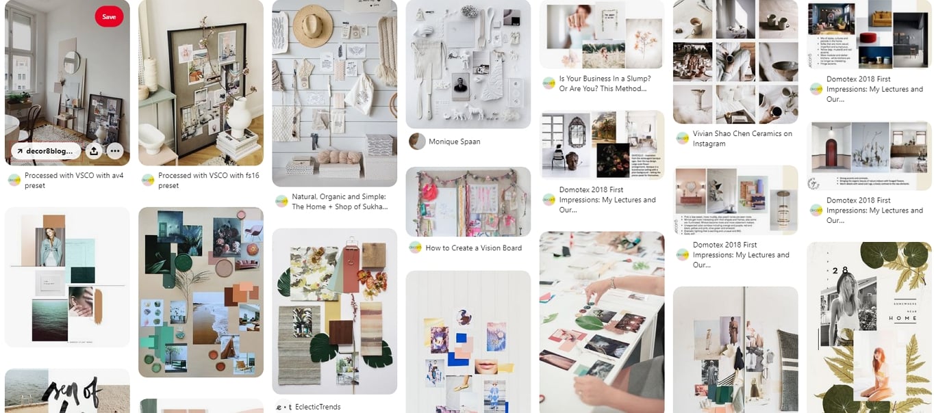
The mood board will act as a central hub for your design inspiration. You can also share it with clients or collaborators so they can contribute their own material. AI-powered mood board tools have become a mainstream addition to the modern design workflow – studies suggest the majority of web designers now use AI in some capacity, with over half using it specifically for image generation and design iteration. These tools can help you quickly generate color palettes, imagery variations, and layout concepts to complement your traditional inspiration gathering.
2. Create a Step-by-Step Plan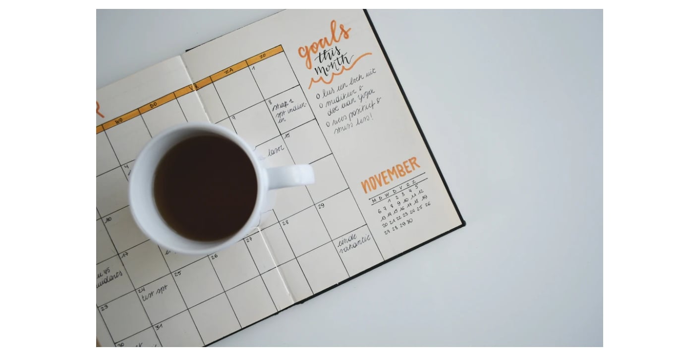
You know what they say: failing to plan is planning to fail. This is also true in web design. If the website design ideas fail to come around, maybe it’s because you haven’t dealt with the fundamentals yet. Only when the basics are in place, will you be able to put creative touches on top. Here’s what planning can look like:
- Define the website’s goal: You need to know what the site is actually supposed to accomplish. If you don’t, what the hell are you designing towards? Good goals are SMART: Specific, Measurable, Attainable, Relevant, and Timely.
- Sketch out the buyer’s journey: Besides the overall goal, you also need to figure out what road you want visitors to take. From when they hit your site all the way to whichever objective you have in mind. That way, you can create a structure to guide them along the way. HubSpot has a great article on that.
- Come up with a style guide: Creating a style guide will help you stay consistent in your design. It defines fonts, colors, and other design elements. Using one promotes uniformity, especially when working with others. Google’s Material Design is a good example.
- Plan your SEO: Planning is also important for SEO. Create a website map to understand how to structure your information for both visitors and search engines.
3. Focus on the Structure First
Just like making a plan, concentrating on your website’s structure first helps you step away from the process and get more of a bird’s eye view.
It can help to work with a different medium than your computer. For example, by making sketches on paper with a single pen, you can forget about colors and other details for the moment. If you are using flipcharts or a whiteboard, you can even make the whole thing collaborative.
A great exercise can also be to draw the website on a post-it note. This will force you to stick to essentials. A variation of this is to create your design in shades of gray first and only add color later. This way, you are forced to establish a visual hierarchy without relying on color.
If you are hell-bent on using your computer to design, you can use the “squint test”. That means moving away from the screen and squinting your eyes. The blurred image will show you what is most obvious on your site and what first-time visitors will most likely notice first.
4. Stick With Web Standards
It’s in the nature of designers to want to be creative. That’s generally a good thing. Keep in mind that it’s necessary to set some boundaries within which to be creative.
For example, in web design, there are a number of established standards. Visitors are used to certain design tropes and website elements. When you break those rules too much, it might confuse them and turn them off.
Among those established standards are:
- Consistency in branding and design across all pages
- Website logo in the top left corner
- Contact information in the top right or center
- Main navigation across the top of the screen
- Main headline/value proposition and call-to-action high up on the homepage
- The search feature in the header
- Social media icons in the website footer
- A sticky table of contents for long-form content pages (increasingly common and expected by users)
We’re sure as an avid Internet user, you are already aware of more standards websites adhere to. If not, you can find more of them here.
That said, there is also a growing trend toward “anti-design” that deliberately breaks conventional rules with asymmetrical layouts and extreme visual contrasts. While some experimental studios pull this off brilliantly, it requires a deep understanding of the rules you’re breaking. For beginners, mastering the standards first is always the safer bet.
5. Focus on Minimalism and CTA Buttons
When you know the objective of your site and pages, this also allows you to get rid of everything that doesn’t serve that purpose. This streamlines your design and makes it more pleasant to look at.
There is research to back this up. Studies consistently show that users prefer clean, uncluttered designs – with industry data suggesting the vast majority of users favor minimal layouts over busy ones – reinforcing the importance of stripping away what isn’t needed. Simplifying your design is also good for website speed.
Here are a few things you can safely eliminate:
- Menu items – Of course, you want others to explore more of your site. However, an overloaded menu can be super confusing and have negative effects. Stick with the essentials!
- Sidebars – More and more websites are phasing out the sidebar. What do you have in your sidebar? Is that really important?
- Muddy jargon – The same thing that goes for stock photos goes for language. Overused phrases, clichés, and hollow words make people tune out. Stop using them, inject some personality in your writing, learn some power words, and learn copywriting.
Additionally, personalized CTAs convert significantly more users than generic ones. According to HubSpot’s analysis of over 330,000 CTAs, personalized calls to action convert 202% better than default ones. Tailor your call-to-action buttons to your specific audience and context rather than relying on vague “Click Here” or “Submit” labels.
6. Start With Mobile
Mobile devices have completely transformed web usage. As of early 2026, mobile accounts for roughly 60-64% of all global web traffic, far surpassing desktop. Mobile phones now account for close to 60% of the world’s web traffic, and 96% of internet users access the web on a mobile device at least some of the time.
Google’s mobile-first indexing is now fully rolled out, meaning the search engine judges every website on its mobile presence first. If your mobile experience isn’t doing its job properly, you will take a hit in the search rankings.
For that reason, when designing a website, start with the mobile experience first. Mobile users are your primary audience, and your design decisions should reflect that. The SEO case is equally compelling: every single site ranking in Google’s top 10 results has a mobile-friendly design – while only around two-thirds of sites in positions 11–20 do. Mobile optimization isn’t just good for users; it’s table stakes for search visibility.
At the same time, it’s good practice for coming up with website design ideas. Starting with mobile forces you to concentrate on the essentials and think through the purpose of your design. You can then further unfold and add elements as the screen size grows bigger. Designers are particularly focusing on “thumb-friendly” navigation in 2026, placing key interactive elements within easy reach of users’ thumbs and ensuring tap targets are generously sized.
7. Pay Attention to Content Formatting
Content formatting is an underestimated tool for web designers. Content is the most important element of your site, be it in the form of blog posts or sales copy. In the end, that is what you want visitors to consume. Your design’s purpose is to present it in a way that they do.
Unfortunately, by now people are so saturated that few of them read everything on your page. Instead, most visitors scan. Furthermore, they tend to do so in an F-shaped pattern.
It means that you need to make your content fit their consumption habits to make it more impactful.
Here’s how to do that:
- Include headings: Headings are a great way to break up content. Many readers use them as anchor points for scanning and read only those parts under headings that seem interesting. Make sure to use headings and make them descriptive. For longer content, consider adding a sticky table of contents so readers can jump to sections that interest them most – this is quickly becoming standard on the best-designed blogs.
- Use paragraphs and lists: Nobody wants to read one large blob of text. Paragraphs divide content into little chunks. Open up a new one whenever you open up a new point. Lists have a similar function and make information more accessible. Use them as well.
- Don’t skimp on media and visuals: Visual information is much more approachable for the human brain than text. For that reason, it’s a good idea to use images, videos, and other media to underline the points made in your copy. It’s also a great way to break up longer pieces of text.
- Optimize your fonts: Your use of fonts greatly influences legibility. The most important tools you have here are the size and line-height. Go for at least 16px and make sure to add more line-height the smaller the font you are using.
If you investigate this article, you can see all of the above in effect.
8. Try Out One-Page Design
Back in the day, website design was all about the fold. Everything important had to be above the limit from which users would start scrolling. There’s still something to be said about it since that’s still where users spend most of their time. 
That doesn’t mean that the fold is the be-all and end-all of your page. People will indeed scroll. In fact, they will scroll down your whole page if you give them a reason to.
Crazy Egg tried this out when they replaced their original sales page with a 20 times longer one.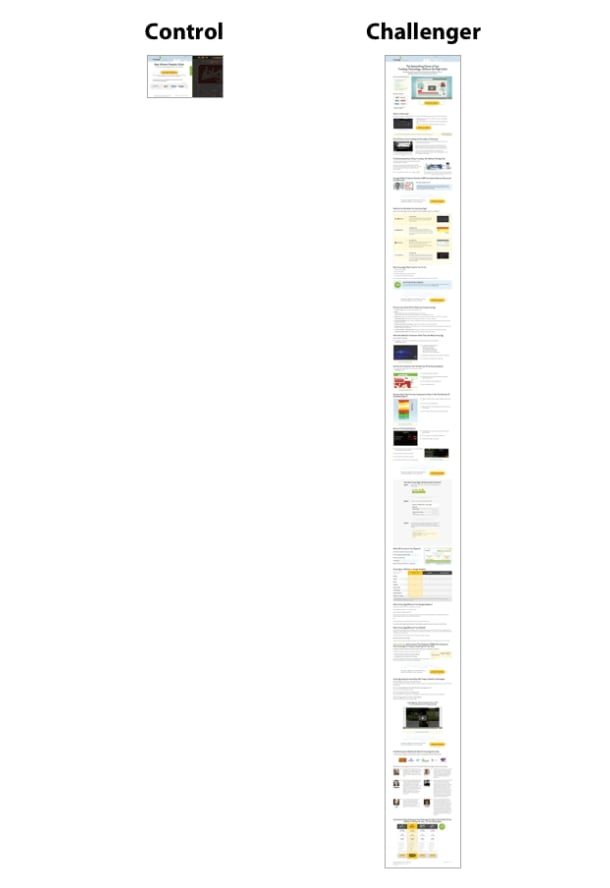
The result: the conversion rate went up by 30 percent! If your current buyer’s journey goes across several pages, consider consolidating them all into one place instead. This might be one of those website design ideas that makes all the difference. Some of the best-performing single-page sites now integrate content with commerce, letting users learn and take action (like purchasing or signing up) without ever leaving the page.
Taking this further, businesses that have rebuilt their mobile experience as a Progressive Web App (PWA) – a site that behaves like a native app without requiring a download – have seen particularly strong results. According to the TOP 30 PWAs benchmarking report, businesses adopting PWAs saw an average 36% increase in mobile conversion rates compared to their previous mobile sites. It’s a compelling case for reducing friction at every step of the mobile journey.
Don’t bury content in slideshows/carousels or tabs/accordions – they don’t work!
9. Employ A/B Testing
Sometimes when evaluating different website design ideas, it can be hard to decide which is the right way to go. You think back and forth, make tweaks, yet stay unsure of your decision. At some point, thinking will no longer cut it. You will have to let users decide.
A/B testing can be a great way to see what makes your website better. It means serving different versions of your design up to visitors at random, then checking how they are reacting. You can make decisions based on the results.
You can test pretty much anything. From entire page designs over color changes, calls to action to images, article titles, and fonts. All of these can make a huge difference in the performance of a page. Yet, if you don’t test it, you’ll never know! In 2026, AI-powered testing tools can automatically generate and evaluate multiple design variations simultaneously, dramatically reducing the time needed to find winning combinations.
These tools and plugins will help you in doing the tests.
10. Embrace Dark Mode Options
Dark mode has gone from a nice-to-have to something users actively expect. Offering a light and dark mode toggle on your website shows that you care about comfort and accessibility. It’s also a practical design exercise that forces you to think more carefully about contrast, color usage, and readability.
From a creative standpoint, designing for dark mode can actually spark fresh ideas. Elements that look flat on a white background can feel dramatic and elevated against a dark one. Neon accents, glowing highlights, and high-contrast typography all come alive in dark mode.
If you’re stuck on your current design, try flipping it to a dark background and see what happens. You might discover a completely new direction. At minimum, you’ll strengthen your understanding of how color and contrast work together.
A few dark mode best practices:
- Don’t just invert colors – pure white text on pure black backgrounds causes eye strain. Use off-whites and dark grays instead.
- Test your images and icons in both modes to make sure they still look good.
- Use your brand’s accent color strategically to guide attention in the darker palette.
11. Use Bold, Intentional Typography
Typography is one of the fastest ways to give a design personality and hierarchy. If you’re stuck staring at a blank canvas, start with the type. Choose a strong headline font and build the rest of the page around it.
In 2026, bold typography is everywhere – oversized hero text, high-contrast font pairings, and expressive serif-sans combinations are defining the look of modern websites. You don’t need to use wild experimental fonts to benefit from this. Even a well-chosen Google Font set at a generous size with proper weight variation can transform a bland layout into something engaging.
Practical typography tips when you’re feeling stuck:
- Start with the headline: Set your main headline in a bold, large font. If it looks compelling on its own, you’re on the right track.
- Limit yourself to two typefaces: One for headings, one for body text. This constraint actually makes decisions easier.
- Play with scale: Increasing the contrast between your headline size and body text size creates instant visual hierarchy without needing extra design elements.
- Use font weight to guide the eye: Bold for important elements, regular for supporting text, light for captions or metadata.
If you want to see bold typography done well, browse the examples on Awwwards or Behance (listed in our inspiration section below) and pay attention to how the best sites use type as a core design element, not an afterthought.
12. Add Purposeful Interactive Elements
If your design feels flat or lifeless, consider whether a touch of interactivity could bring it to life. We’re not talking about flashy animations for their own sake. We mean purposeful interactive elements that serve the user and support your goals.
These could include:
- Hover effects on cards or buttons: Subtle movement or color shifts confirm to users that something is clickable.
- Scroll-triggered animations: Elements that fade in or slide into place as the user scrolls can make a long page feel more dynamic.
- Interactive tools or calculators: If your site is in finance, health, ecommerce, or any niche where users need to compare options, embedding a simple interactive tool can massively boost engagement and time on page.
- Micro-animations on form fields: Small animations on input fields (like a checkmark appearing when a field is valid) improve the user experience without adding clutter.
The key is restraint. One or two well-placed interactive elements will impress visitors far more than a page overloaded with motion. If you’re feeling stuck, pick one section of your design and ask: “Would a small animation or interaction make this clearer or more engaging?” If the answer is yes, try it.
10 Inspiring Websites to Generate New Website Design Ideas
If at this point you still feel stuck, in this final part we will go over a number of websites chock full of web design inspiration.
1. Awwwards.com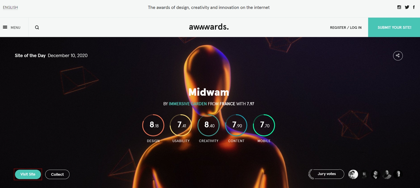
This website gives out awards for web designers, developers, and agencies around the world. They have a huge and searchable archive of web design examples. Additionally, there is a blog where they introduce designs in detail and a section where you can vote on the site of the month nominees. It’s all high quality and truly inspirational! Awwwards remains one of the top destinations for web design inspiration, especially if you want to see how today’s designers push boundaries with parallax effects, micro-animations, and interactive storytelling.
2. WebDesign-Inspiration.com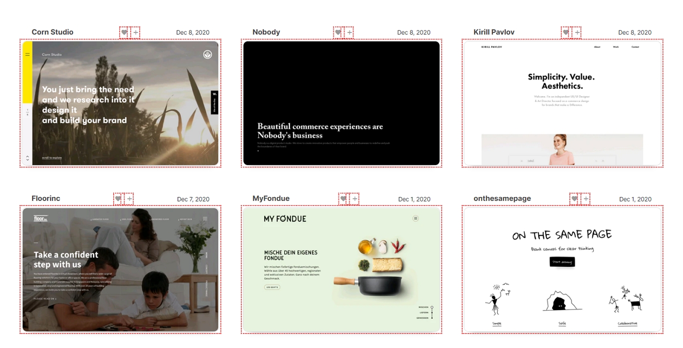
It’s a gallery of finished web design projects. You can filter it in many different ways to find what you are looking for — by industry, type, color palettes, or styles. Their archive is so large that it’s often the only page you need to come up with your own website design ideas.
3. SiteInspire.com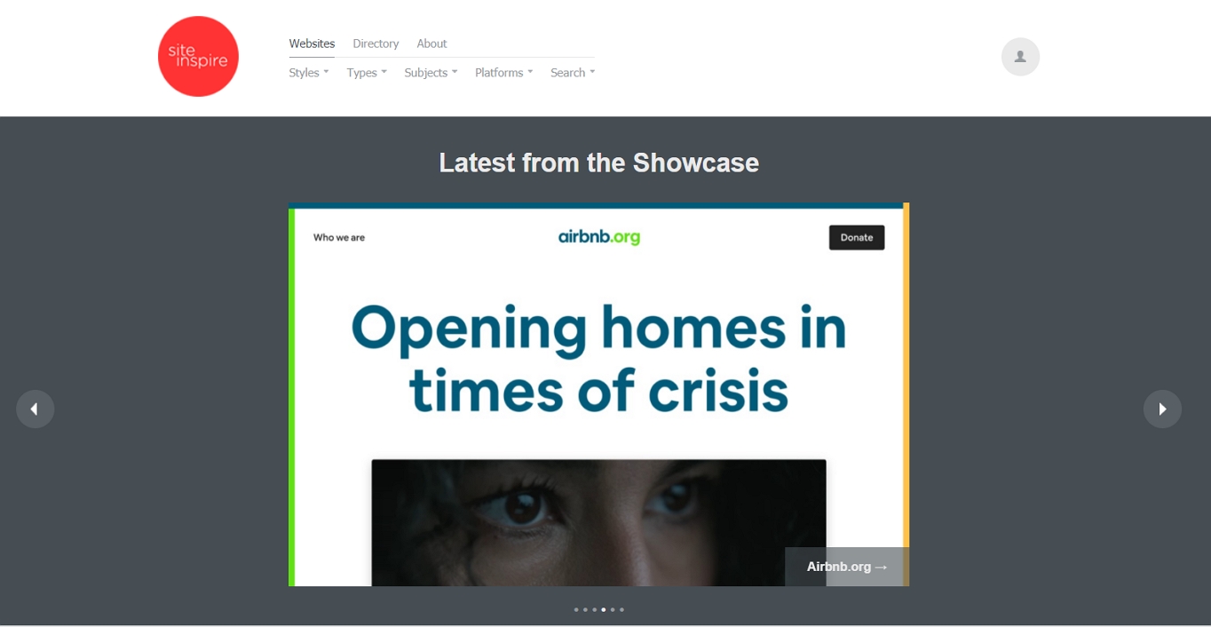
This website showcases both web and interactive design. Like the previous example, you are able to filter the entries in different ways including style, type, subject, and even platform. If you create an account, you can also set up collections of your favorite designs.
4. OnePageLove.com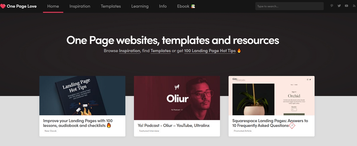
This example is a web design inspiration site specifically made for one-page designs. We mentioned the idea earlier in the article. You can browse the gallery or search specifically for things you are looking for. One Page Love is one of the best resources for designers seeking fresh ideas. It’s devoted to one-pagers, which means it leans towards apps, tech startups, and smaller independent projects.
5. Dribbble.com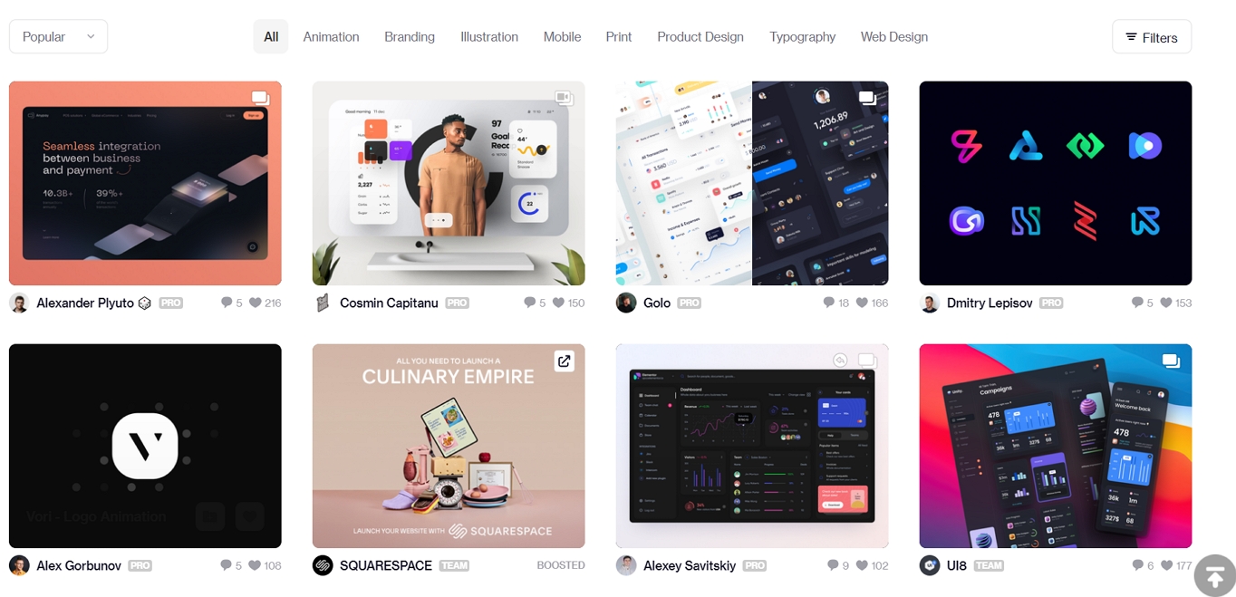
At Dribbble designers show off their work. This can be anything from apps to icons, illustrations, and other examples. You can use it for general inspiration or use the tags to find what you are most interested in, such as web design.
One thing to keep in mind: Dribbble showcases are often polished mockups. Look beyond the surface-level visuals and consider which designs actually solve real problems, follow UX best practices, and could work as fully developed websites.
6. Behance.net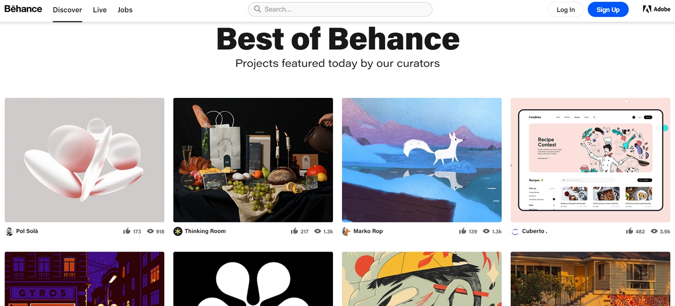
This website is very similar to Dribbble. It’s also a place for designers to connect and show off their portfolio. You have plenty of web design examples and can use the search function to look for them. Given that it’s part of Adobe, Behance boasts perhaps the world’s largest and most active creative community – and with its online job and freelancer marketplace, it’s understandable why designers and hirers alike flock to the platform.
7. Godly.website
Godly is a curated gallery of the best web design inspiration, updated frequently with modern, cutting-edge examples. What makes it stand out is its focus on landing pages and marketing sites that are both beautiful and functional. Each entry includes a direct link to the live site, so you can interact with the design rather than just viewing a screenshot. It’s an excellent resource when you need ideas for a specific page type like a homepage, pricing page, or product launch.
8. Mobbin.com
If you’re designing mobile-first (and you should be), Mobbin is invaluable. It’s a library of real mobile app and web design patterns pulled from live products. Instead of curated “best of” showcases, Mobbin shows you how actual products handle specific design challenges – onboarding flows, navigation patterns, search interfaces, and more. It’s particularly useful when you’re stuck on how a specific feature should work, not just how it should look.
9. Typewolf.com
When your design block is specifically about typography, Typewolf is the go-to resource. It showcases real websites with exceptional typography and tells you exactly which fonts they’re using. You can browse by font, foundry, or classification. It also publishes guides on font pairing and trending typefaces, making it a practical tool when you need to make confident font choices rather than just browsing pretty screenshots.
10. Landbook.com
Land-book is a curated gallery that lets you filter designs by type (landing page, blog, portfolio, ecommerce, etc.), color, and style. What makes it especially useful for beginners is how it organizes designs by the specific page type you’re building. If you’re stuck on, say, your pricing page or your about page, you can find dozens of real examples to study. It’s a focused, practical complement to the broader galleries listed above.
Key Web Design Trends to Watch in 2026
Staying aware of current trends can help spark ideas when you’re feeling stuck. You don’t have to chase every trend, but understanding what’s popular right now gives you a broader palette to work with.
Here are the trends defining web design in 2026:
- Clean layouts with high-contrast typography: Minimalism isn’t going anywhere, but it’s getting bolder. Designers are pairing generous whitespace with oversized, high-contrast type to create pages that feel both spacious and impactful.
- Purposeful motion and micro-interactions: Subtle scroll-triggered animations, hover effects, and page transitions are now expected on polished sites. The key word is purposeful – motion that guides attention rather than distracting from it.
- AI-assisted design workflows: AI tools are now integrated into most major design platforms, helping with everything from generating layout variations to writing microcopy to producing placeholder imagery. They don’t replace creative thinking, but they help you move past blank-canvas paralysis.
- Human-centered storytelling:The best sites in 2026 feel personal. Real photography, authentic brand voices, and narrative-driven page structures are replacing generic stock imagery and corporate tone.
- Accessibility-first design: Designing for accessibility is no longer an afterthought. Color contrast compliance, keyboard navigation, screen reader compatibility, and generous touch targets are baked into the process from the start.
- Dark mode as default or option: As mentioned above, offering dark mode is becoming standard. Many new sites launch with dark mode as the primary theme, with a light alternative available.
- Content-commerce integration: Especially for blogs and editorial sites, weaving product links, “add to cart” buttons, or signup forms directly into content is becoming more common and more effective than siloing content and conversion into separate pages.
Use these trends as starting points, not mandates. The best designs borrow from what’s current while staying true to the site’s purpose and audience.
FAQ
How do I start a website design when I have no ideas?
Start with the fundamentals rather than the visuals. Define the site’s goal, sketch out the user journey, and establish your content hierarchy. Then browse inspiration galleries like Awwwards or Dribbble to get your creative wheels turning. Often, constraint (starting with gray tones, sketching on a post-it note, or designing mobile-first) is the best cure for a blank canvas.
Should I follow web design trends or stick to proven standards?
Both. Stick to established web standards for navigation, layout, and usability – these are what users expect, and breaking them without good reason hurts the experience. Use current trends (like bold typography, dark mode, or micro-interactions) as creative flavor on top of that solid foundation.
How important is mobile design in 2026?
Extremely. Mobile accounts for the majority of global web traffic, and Google evaluates your mobile site first for search rankings. If you’re only designing one version, it should be mobile. Design for small screens first, then expand for larger ones.
What’s the biggest mistake beginners make in web design?
Trying to be too original too soon. Beginners often skip fundamentals like clear navigation, readable fonts, and strong calls-to-action in pursuit of a “unique” look. Master the basics first – they’re the foundation that makes creative flourishes actually work.
Can AI tools replace a web designer?
Not yet, and likely not anytime soon for quality work. AI tools in 2026 are excellent assistants – they can generate layout suggestions, color palettes, placeholder content, and even code snippets. But they can’t understand your brand’s nuances, your audience’s needs, or the strategic thinking that makes a design truly effective. Use AI to accelerate your workflow, not to replace your judgment.
Wrapping Up
Web design ideas don’t grow on trees. Sometimes you need a little help to come up with something good. Thankfully, there are posts like these to help you get back on track.
With first impressions heavily influenced by design – research shows that 94% of initial reactions to a website are design-related, and users form those opinions in as little as 0.05 seconds – every detail matters. The good news is that you don’t need to reinvent the wheel. Start with the basics: plan your goals, nail your structure, prioritize mobile, and study what’s working on the best sites right now.
Hopefully, the web design tips, tools, and resources mentioned in this post have nudged you back into creativity land. Obviously, there is plenty of more useful stuff out there, which is why we want to hear from you!