How to add CSS to a page
CSS is the language that styles HTML. It controls color, spacing, layout, typography, and motion, so the same markup can look like a stark document or a polished product. There are three ways to attach it, and they are not equal. If you are new to building sites, start with a plain how to create a website walkthrough, then come back here for the styling layer.
Inline styles live on a single element. They win most specificity fights, which makes them hard to override, so keep them for quick tests only.
<p style="color: #d97757;">One styled paragraph</p>
Internal styles sit in a <style> block in the document head. Fine for a single page or a demo.
<style>
  p { color: #1f2430; }
</style>
External styles are the way you want to work. One file, linked from every page, cached by the browser. Change one rule and the whole site updates.
<link rel="stylesheet" href="style.css">
Selectors
A selector picks the elements a rule applies to. Master a handful of these and most styling becomes routine. Combinators (descendant, child, sibling) let you target elements by their place in the tree instead of tagging every one with a class.
| Selector | Matches |
|---|---|
p |
Every element of that type |
.box |
Elements with class=”box” |
#nav |
The element with id=”nav” |
* |
Every element (universal) |
a b |
b inside a, at any depth (descendant) |
a > b |
b that is a direct child of a |
a + b |
b immediately after a (adjacent sibling) |
a ~ b |
Any b after a (general sibling) |
[type="text"] |
Elements with that attribute value |
h1, h2 |
Both, in one rule (grouping) |
Pseudo-classes and pseudo-elements
Pseudo-classes style an element in a certain state or position. Pseudo-elements style a part of an element, or inject content that is not in the HTML. The newer logic functions are worth knowing: :is() and :where() shorten long selector lists, and :where() adds zero specificity so it never fights your other rules. The :has() selector finally gives CSS a parent selector; it has been Baseline since December 2023, so it is safe now.
| Selector | Purpose |
|---|---|
:hover :focus :active |
Interaction states |
:first-child :last-child |
First or last child in its parent |
:nth-child(2n) |
Every second child (patterns) |
:not(.active) |
Everything except the match |
:is(h1, h2, h3) |
Shorthand for a selector list |
:where(...) |
Like :is() but 0 specificity |
:has(> img) |
Parent selector, matches on children |
::before ::after |
Injected content, need content:"" |
::first-line |
First rendered line of text |
::selection |
Highlighted text |
::placeholder |
Input placeholder text |
Box model and box-sizing
Every element is a box with four layers: content, then padding, then border, then margin. By default width and height size the content only, so padding and border get added on top and boxes end up wider than the number you typed. Switch to box-sizing: border-box and the width you set includes padding and border. Almost everyone applies it globally as a first rule.
* { box-sizing: border-box; }

.card {
  width: 300px;      /* full box is 300px, padding included */
  padding: 20px;
  border: 1px solid #ccc;
}
Units
CSS mixes absolute and relative units. For font sizes, reach for rem: it is relative to the root font size, so text scales predictably and respects a user’s browser settings. Use em when you want a value tied to the current element’s font size, but remember it compounds when nested (an em inside an em inside an em keeps multiplying). Viewport units size against the window, which is handy for hero sections.
| Unit | Relative to |
|---|---|
px |
Absolute pixels |
em |
Current element font size (compounds) |
rem |
Root font size (stable, preferred for type) |
% |
Parent’s value |
vw vh |
1% of viewport width or height |
vmin vmax |
Smaller or larger viewport side |
ch |
Width of the “0” character |
Colors
Color accepts several formats, and modern browsers support all of them. Hex is compact. The space-separated rgb() and hsl() forms carry an optional alpha after a slash. The newer oklch() space gives more even, perceptually consistent colors, which helps when you build a palette by hand. For a full color reference, keep a chart of hex, RGB, and HSL values handy.
color: #333;                        /* hex */
color: rgb(255 0 0 / .5);           /* red at 50% alpha */
color: hsl(210 50% 40%);            /* hue saturation lightness */
color: oklch(70% 0.15 250);         /* perceptual color space */
Typography
Type is most of what people read, so these properties earn their keep. Set a sensible line-height (around 1.5 for body text), stack fonts so there is always a fallback, and use letter-spacing sparingly. text-transform changes case for display without editing your HTML.
body {
  font-family: system-ui, "Helvetica Neue", Arial, sans-serif;
  font-size: 1rem;
  font-weight: 400;
  line-height: 1.5;
  letter-spacing: 0.01em;
  text-align: left;
}
a { text-decoration: underline; }
h1 { text-transform: uppercase; }
Backgrounds and gradients
Backgrounds go behind an element’s content. A single element can hold a color, one or more images, and gradients at once. For a full-bleed photo, the trio of cover, center, and no-repeat handles almost every case. Gradients are generated images, so they slot in wherever a background image would.
.hero {
  background-color: #1f2430;
  background-image: url(photo.jpg);
  background-size: cover;
  background-position: center;
  background-repeat: no-repeat;
}
.stripe {
  background: linear-gradient(90deg, #000, #fff);
}
Flexbox
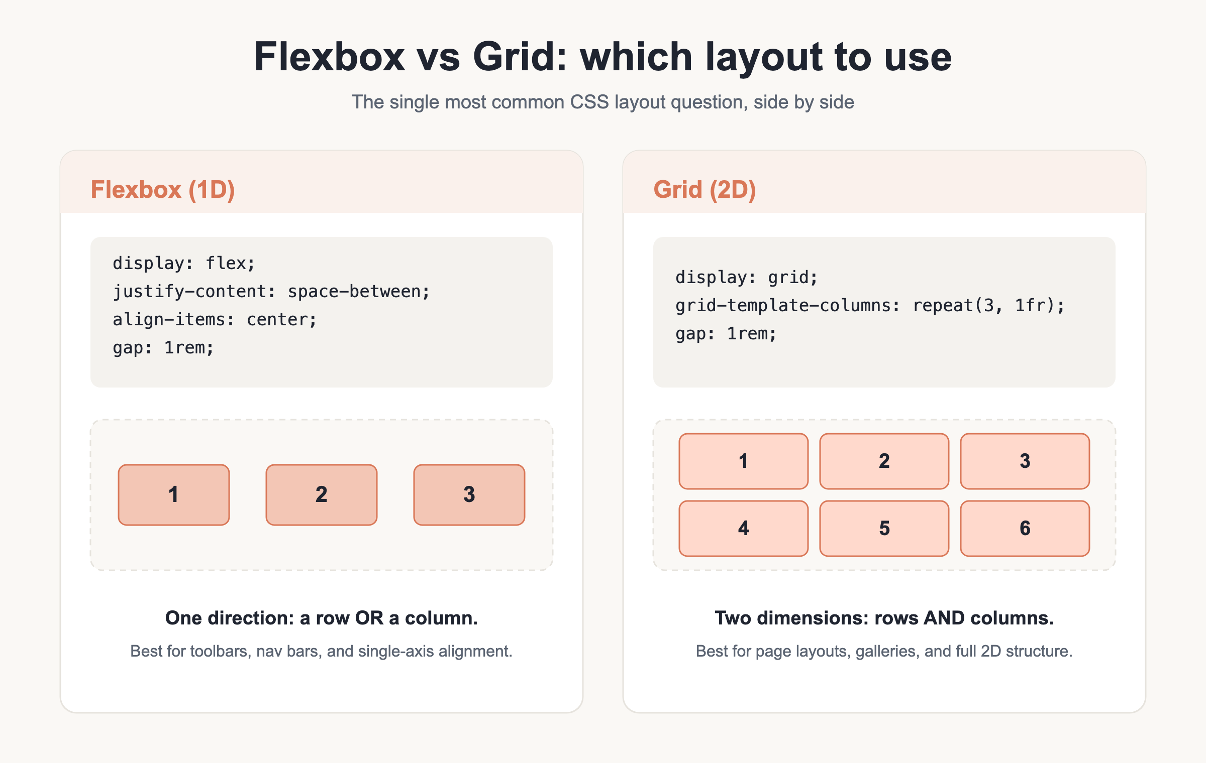
Flexbox lays items out along one axis, a row or a column, and is the fastest way to build navigation bars, button groups, and card rows. Set display: flex on the parent, choose a direction, then use justify-content for spacing along the main axis and align-items for the cross axis. The gap property spaces children without margin hacks. On a child, flex: 1 tells it to grow and share leftover space.
.bar {
  display: flex;
  flex-direction: row;         /* or column */
  justify-content: space-between; /* start | center | space-around */
  align-items: center;         /* start | stretch */
  gap: 1rem;
  flex-wrap: wrap;
}
.bar .grow { flex: 1; }        /* takes remaining space */
Grid
Grid works in two dimensions at once, rows and columns together, which makes it the right tool for page layouts and any real grid of content. Define columns with grid-template-columns, and use fr units to split free space. The auto-fit plus minmax() pattern below builds a responsive grid with no media queries at all: columns wrap on their own as the container narrows. Named areas let you sketch a layout in plain text.
.grid {
  display: grid;
  grid-template-columns: repeat(3, 1fr);
  gap: 1rem;
}
.responsive {
  display: grid;
  grid-template-columns: repeat(auto-fit, minmax(200px, 1fr));
  gap: 1rem;
}
.feature { grid-column: 1 / 3; }  /* span two columns */

.layout {
  display: grid;
  grid-template-areas:
    "header header"
    "sidebar main";
}
Positioning
The position property decides how an element is placed and whether top, right, bottom, and left apply. relative nudges an element from where it would sit and creates a reference for absolutely positioned children. absolute pulls an element out of flow. fixed pins it to the viewport, and sticky is the useful hybrid that scrolls until it hits a threshold, then holds. Use z-index to control stacking.
.menu   { position: sticky; top: 0; z-index: 10; }
.badge  { position: absolute; top: 8px; right: 8px; }
.dialog { position: fixed; inset: 0; }
Display, visibility, and overflow
The display property sets how an element flows: block takes a full line, inline sits in text and ignores width, inline-block flows inline but accepts width and height, and none removes the element entirely. Note the difference between display: none (gone, no space) and visibility: hidden (invisible but still occupies space). Overflow controls what happens when content is too big for its box.
.hidden   { display: none; }
.ghost    { visibility: hidden; }
.scrollbox { overflow: auto; }   /* hidden | scroll */
Transitions, animations, and transforms
These three add motion. A transition smooths a change between two states, so a hover color fades instead of snapping. For anything looping or multi-step, define @keyframes and attach them with animation. Transforms move, scale, and rotate elements cheaply because the browser can do them on the GPU without reflowing the page.
.btn { transition: all .3s ease; }
.btn:hover { transform: scale(1.05); }

@keyframes spin {
  from { transform: rotate(0); }
  to   { transform: rotate(360deg); }
}
.loader { animation: spin 2s linear infinite; }

.move { transform: translate(10px, 0) rotate(5deg); }
Responsive design
Build mobile-first: write your base styles for small screens, then add width to layouts as space allows with min-width media queries. That keeps the default light and layers complexity on top. Container queries are the modern companion: instead of asking about the whole viewport, a component reacts to the size of its own container. Set container-type on the parent, then query it. Container queries have been Baseline since 2023.
@media (min-width: 768px) {
  .grid { grid-template-columns: repeat(4, 1fr); }
}

.wrapper { container-type: inline-size; }
@container (min-width: 400px) {
  .card { flex-direction: row; }
}
Custom properties (CSS variables)
Custom properties let you name a value once and reuse it everywhere. Define them, usually on :root so the whole document sees them, then read them with var(). Unlike Sass variables, these are live: change one at runtime with JavaScript or inside a media query and everything that uses it updates. The second argument to var() is a fallback if the property is not set.
:root {
  --brand: #0a7;
  --space: 1rem;
}
.button {
  color: var(--brand, #000);
  padding: var(--space);
}
Modern functions
These functions let CSS do math and pick values on the fly. calc() mixes units, which fixed numbers cannot. clamp() is the one to learn first: it sets a minimum, a preferred (often fluid) value, and a maximum, so a font size or width grows with the screen but never gets absurd. min() and max() pick the smaller or larger of their arguments.
width: calc(100% - 2rem);
font-size: clamp(1rem, 2vw, 2rem);
width: min(90%, 1200px);
padding: max(1rem, 3vw);
Modern CSS (2023 to 2026)
CSS has changed a lot lately, and the following are broadly supported across current browsers in 2026. Native nesting lets you nest rules the way Sass does, with no build step. Cascade layers (@layer) give you explicit control over which rules win, which tames specificity in large codebases. Logical properties replace left/right and top/bottom with inline and block directions, so layouts adapt to right-to-left languages automatically. And :has(), covered earlier, is the parent selector people asked for over many years.
.card {
  & .title { font-weight: 700; }   /* native nesting */
}

@layer base, utils;                 /* utils wins over base */

.box {
  margin-inline: auto;              /* logical: left + right */
  padding-block: 1rem;              /* logical: top + bottom */
  inset: 0;                         /* all four offsets */
}
Sass and SCSS
Sass is a preprocessor: you write in its syntax, and it compiles down to plain CSS the browser reads. SCSS is the common flavor, saved as .scss, with braces and semicolons. Because SCSS is a superset of CSS, any valid CSS is already valid SCSS, so you can adopt it gradually. Its headline features are variables, nesting with the & parent reference, partials you split across files, mixins, functions, and loops.
$primary: #333;

.nav {
  color: $primary;
  &:hover { color: lighten($primary, 20%); }  /* & = parent */
}

@use 'buttons';        /* modern module import */
@forward 'theme';      /* re-export for others */

@mixin flex-center {
  display: flex;
  justify-content: center;
  align-items: center;
}
.hero { @include flex-center; }

@function double($n) { @return $n * 2; }

@each $name, $color in (ok: green, err: red) {
  .badge-#{$name} { background: $color; }
}
@for $i from 1 through 3 {
  .col-#{$i} { width: 100% / 3 * $i; }
}
One note that trips people up: @use and @forward replace the old @import, which is deprecated in Sass and being removed. Reach for @use in new work. Native nesting and custom properties now cover some of what Sass used to be needed for, but Sass still earns its place for mixins, functions, and loops that CSS cannot do on its own.
Gotchas and common mistakes
A short list of the traps that catch most people, so you can skip the debugging.
- Forgetting the box-sizing reset. Without
* { box-sizing: border-box; }your widths will not add up once padding and borders join in. - Specificity fights. The order is inline > id > class > element. When a rule will not apply, a more specific selector is usually winning. Keep
!importantas a last resort, not a habit. - Mixing up rem and em.
remis root-relative and stable;emis parent-relative and compounds when nested. Use rem for font sizes unless you have a reason not to. - Choosing the wrong layout tool. Flexbox is one-dimensional (a row or a column). Grid is two-dimensional (rows and columns at once). Pick by the shape of the problem.
- Doubting modern features.
:has()and container queries are safe to ship in 2026. You do not need a polyfill for the browsers people actually use. - Old Sass imports.
@importis deprecated; use@useand@forwardinstead. - Desktop-first media queries. Prefer mobile-first
min-widthqueries so the base styles stay simple and you add, rather than undo.
Download the CSS Cheat Sheet (PDF) and related guides
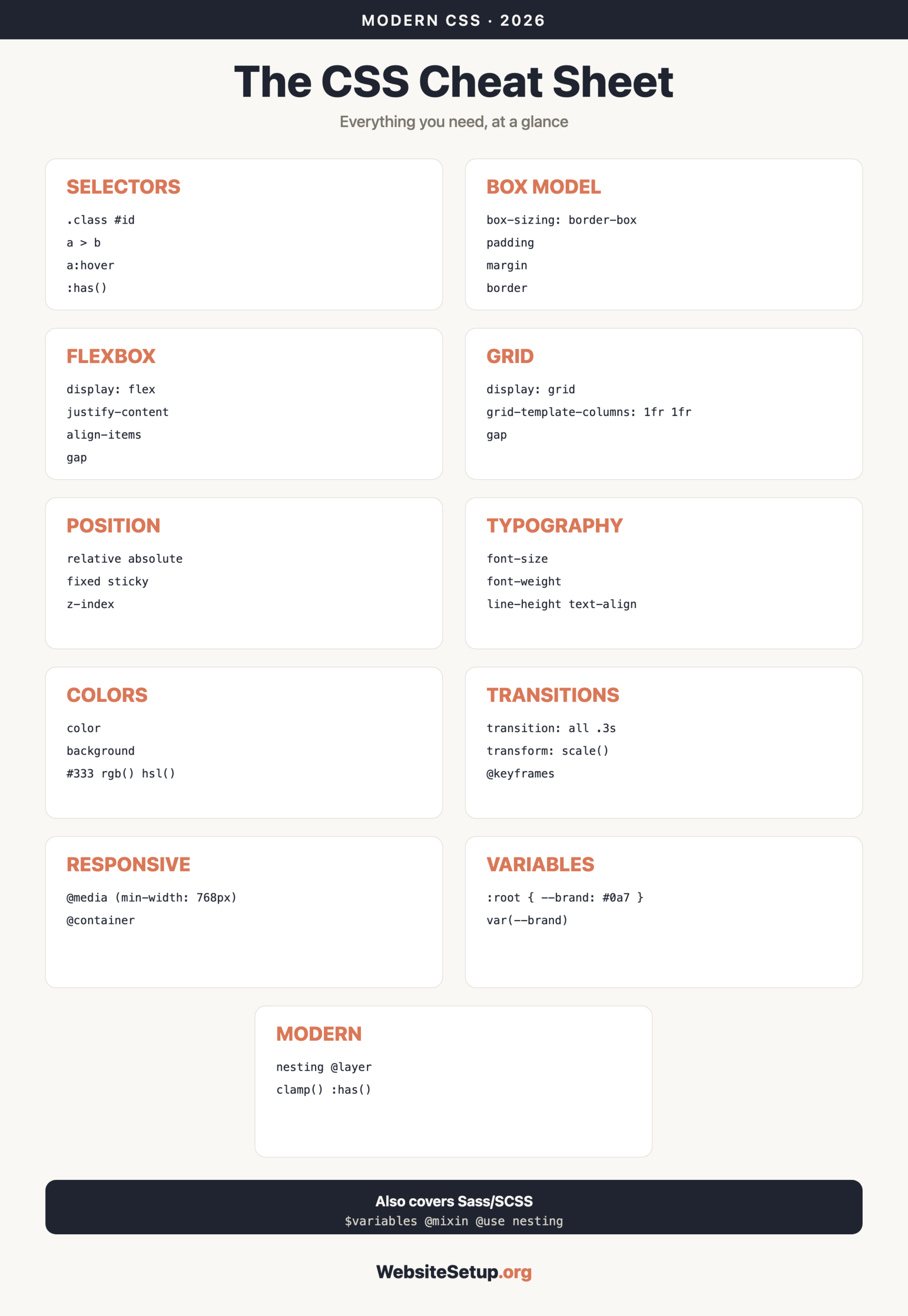
Grab the printable version to keep this reference at your desk. It gathers every table and snippet above into a few pages you can pin up or search offline.
Download the CSS Cheat Sheet (PDF)
Want to go wider? Pair this with our HTML cheat sheet for the markup that CSS styles, and the Bootstrap cheat sheet when you want a CSS framework that ships ready-made components.