1. Arial

Arial remains the de facto standard for most applications in 2025.
It’s one of the most widely used sans-serif fonts (which means no little curls at the end of each letter). It’s commonly used as a fallback on Windows devices when other font choices aren’t available.
2. Times New Roman
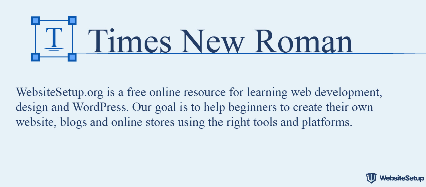
Times New Roman is to serif what Arial is to sans serif.
It’s among the most popular serif fonts on Windows devices and continues to be a standard choice for formal documents and traditional web content heading into 2026.
3. Courier New
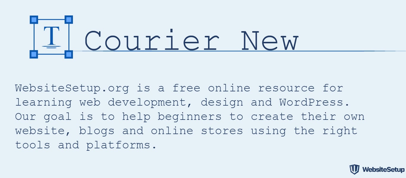
Courier New is a refined variation of the classic Courier typeface. It’s a monospaced font (as opposed to the serif vs. sans serif categories), making it ideal for displaying code and technical content.
4. Courier
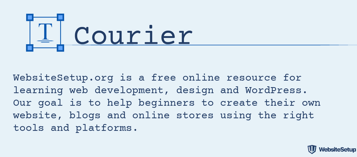
Courier is the original monospace standard available on virtually all devices and operating systems in 2025, maintaining near-universal compatibility.
5. Verdana

Verdana excels as a web font because of (1) its clean sans serif lines and (2) its generous sizing. The letters are almost elongated, which maintains excellent readability across all screen sizes.
6. Georgia

Georgia shares Verdana’s philosophy with larger-than-usual letterforms compared to fonts of the same size. While it’s excellent for readability, avoid pairing this serif font with others (like Times New Roman) which might look noticeably smaller in comparison.
7. Palatino

Palatino’s design heritage traces back to Renaissance calligraphy. Its large letterforms make it web-friendly, traditionally used for headings and editorial-style content.
8. Garamond

Garamond’s design roots trace to 16th century Paris. Modern digital versions have been bundled with Windows and adopted across platforms, making it widely accessible for elegant serif typography in 2025.
10. Tahoma
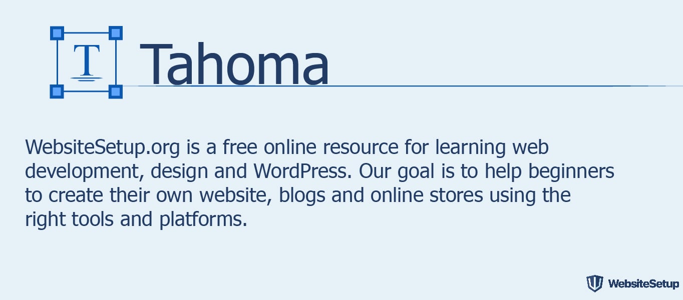
Tahoma is a sans-serif typeface that gained prominence as an Arial alternative. It was the default system font for earlier Windows versions and remains widely installed across devices in 2025.
11. Trebuchet MS
Trebuchet is a humanist sans-serif typeface named after a medieval siege machine. Released in 1996, it remains one of the more popular body text fonts on the web nearly three decades later.
12. Arial Black

Arial Black is the bold, high-impact version of standard Arial. It shares proportions with Helvetica, which originally allowed it to serve as a license-free Helvetica substitute for print applications.
13. Impact

Impact is a bold headline font that excels in short, punchy phrases but becomes difficult to read in longer text blocks. Use sparingly for maximum effect.