First impressions are everything, especially when it comes to your website.
Research shows that 62–90% of purchase decisions are based on colors alone.
Choosing the right website color scheme can make your website more memorable, trustworthy, attractive, and profitable.
Clueless about where to even begin?
In this article, you’ll learn the basics of color theory, get practical tips for choosing your palette, and find 51 real-world examples of website color schemes to inspire your next design.
The Psychology of Color in Web Design
Before diving into examples, it helps to understand why colors matter. Color psychology studies how different hues influence human emotions, perceptions, and decisions. When you pick colors for your website, you’re shaping how visitors feel the moment they land on your page.
Here’s a quick overview of what common colors communicate:
- Blue – Trust, reliability, and professionalism. Popular with finance, healthcare, and tech brands.
- Red – Passion, urgency, and energy. Often used for call-to-action buttons because it grabs attention.
- Green – Nature, growth, and calm. Common for eco-friendly, wellness, and organic brands.
- Yellow – Optimism, warmth, and cheerfulness. Great for brands that want to feel energetic and approachable.
- Orange – Enthusiasm, creativity, and youthfulness. Works well for playful or action-oriented brands.
- Purple – Luxury, creativity, and wisdom. A solid choice for premium or imaginative brands.
- Black – Sophistication, elegance, and authority. Widely used by luxury and fashion brands.
- White – Simplicity, cleanliness, and space. The go-to background for minimalist and clean designs.
- Gold – Wealth, prestige, and success. Commonly used as an accent by luxury brands.
Understanding these associations helps you make intentional choices rather than guessing. A children’s toy website will use very different colors than a law firm – and both can be right if the colors match the brand’s message.
Types of Color Schemes
When designers talk about color schemes, they usually mean one of these established types. Knowing them gives you a framework for building your own palette.
Monochromatic – Uses different shades, tints, and tones of a single color. This creates a clean, harmonious look. Example: light blue, medium blue, and dark navy.
Analogous – Uses colors that sit next to each other on the color wheel (like yellow, yellow-green, and green). This produces a serene, natural feel.
Complementary – Uses colors that are opposite each other on the color wheel (like blue and orange). This creates high contrast and makes elements pop.
Triadic – Uses three colors evenly spaced around the color wheel (like red, yellow, and blue). This offers vibrant variety while staying balanced.
Split-Complementary – Uses one base color plus the two colors adjacent to its complement. This gives you contrast without the intensity of a full complementary scheme.
You don’t need to memorize these – just know they exist so you can recognize patterns in the examples below and apply them to your own site.
How to Choose a Color Scheme for Your Website
Picking colors can feel overwhelming, but following a simple process makes it manageable:
1. Start with your brand identity. If you already have a logo or brand colors, build your website palette around those. Consistency between your logo, social media, and website builds recognition and trust.
2. Consider your audience. Who are you trying to reach? Younger audiences often respond to bolder, brighter colors, while professional audiences may prefer muted or neutral tones. Cultural context matters too – colors carry different meanings in different parts of the world.
3. Pick one dominant color. Choose a primary color that represents your brand’s core feeling. This color will appear most often across your site.
4. Add 1-2 secondary colors. These complement your primary color and add visual interest. Use the color scheme types above (analogous, complementary, etc.) as a guide.
5. Choose an accent color. This is a bold or contrasting color used sparingly for CTAs, buttons, and elements you want users to notice.
6. Follow the 60-30-10 rule. A time-tested formula: use your dominant color for 60% of the design, your secondary color for 30%, and your accent color for 10%. This creates visual balance without effort.
7. Test on real content. Colors look different on buttons, backgrounds, and text. Always test your palette with actual page layouts, not just swatches side by side.
51 Examples of Trendy Website Color Schemes
We analyzed some of the best-designed websites on the web to uncover which color schemes are most effective and on-trend in 2026.
Here are 56 examples to inspire your website’s color scheme.
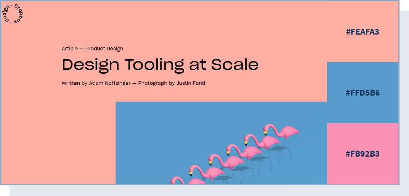
1. Bright Accent Color
If you want to direct the user’s attention to a particular section of your page (for example, a CTA), you can do that by using an accent color – this is a color that you use in smaller quantities compared to the rest of the color scheme.
While you can also use vivid, bold, or neutral colors for this purpose, using a very bright color with a neutral color like grey will likely create a staggering effect, as you can see in this example.
2. Natural Color Scheme
The Eleven Plants for Dum-Dums & Cool Ppl website relies on different shades of green and some brown hues on a neutral cream background. As green is associated with prosperity and nature, it lends itself beautifully to all kinds of organic or natural products and brands focused on the outdoors and nature.
Brown is often used by food and agriculture companies – typically paired with green – to convey natural and organic ideas.
3. Colorful and Fun
Low Five Brewing combines several different colors on its visuals and backgrounds to create a fun and unusual environment for the user. In particular, this website uses very bright colors, which help create a unique experience.
One study found that saturated and bright colors are associated with arousal. Consider using bright colors to grab your users’ attention and communicate enthusiasm.
4. Balance with a Bright Accent Color
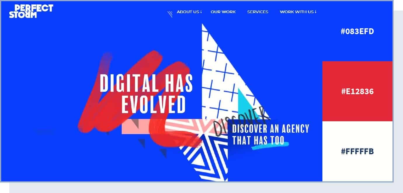
Digital marketing agency Perfect Storm created a balanced color scheme on their site, but also added a bright red accent to highlight important elements. In fact, using red color for call-to-action buttons across your website can help increase your conversion rate and make the UI design more intuitive.
5. Colorful yet Calm and Balanced
The Fabulatorij website uses many colors but manages to create a relaxing vibe by using pastel shades. Warm and cool colors are combined to create a colorful but approachable atmosphere.
Choose a combination like this if you want to make your website colorful but not overwhelm your users with colors that are too bright or vivid.
6. Fresh and Organic
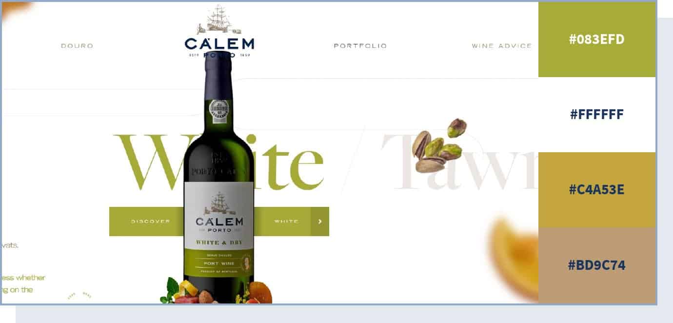
The saying that we eat with our eyes first is spot-on. Color is often the first element that our eyes notice about a food product, which determines how we perceive the taste and flavor of what we’re about to eat.
In this example, you can see how using a natural color scheme – dominated by a soft pistachio green – on a neutral background creates an organic and fresh look, which works well for wine company Calem.
7. Cool and Fresh
eCommerce brand Collagerie’s website relies on lilac and cream colors to create a fresh and cool vibe, suitable for this fashion website that targets a younger audience. These colors create a peaceful environment. Consider using them if you’re trying to target a younger audience.
8. Elegant and Simple
The Chanel website relies on neutral colors – black and white – to convey an idea of elegance and, simultaneously, simplicity. In particular, black symbolizes elegance and sophistication, and is perfect for a premium – but not flashy or excessive – luxury brand.
9. Earthy and Organic Color Scheme
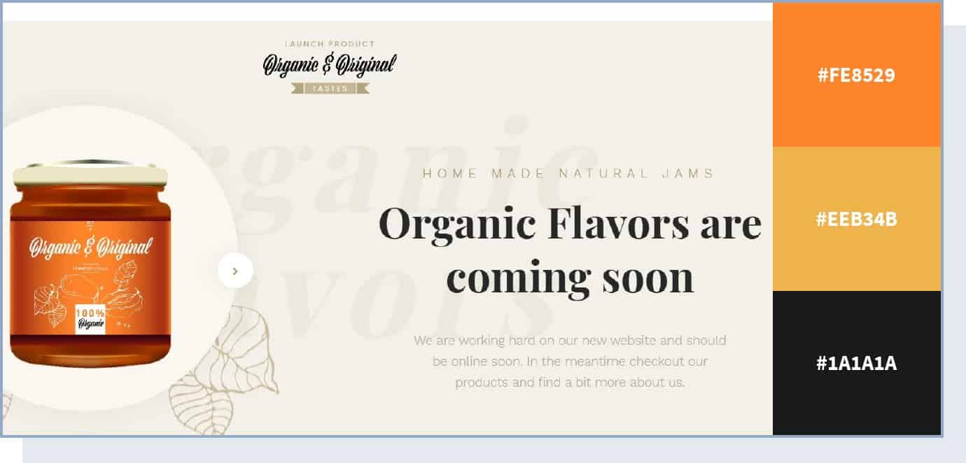
This website color scheme uses a neutral color background to bring out the peachy color of the product. Here, the orange shade is used to highlight the actual product, and the light brown shades symbolize genuineness.
10. Lively Color Scheme
The Versace website uses a completely neutral white background to highlight the many other colors used to showcase its products: gold, red, black, and various shades of blue. The result is a lively and colorful experience.
But there is one particular color used on this website that we want to highlight – gold. While here it’s used as an accent color for the brand’s products, gold is one of the most common colors for luxury brands. As 99designs COO Pam Webber said, gold creates “an impression of wealth, prosperity and success that resonates well with audiences targeted by luxury brands.”
11. Electric Accent
The Apple website uses neutral black or white as a background to highlight important elements like CTAs. For these, it uses electric blue as an accent color. The choice probably lies in the fact that blue is a serious color, but an electric shade of it helps capture the attention of potential buyers.
For the background, the Apple website uses white. White is one of the best colors to create contrast and make other elements stand out, so consider using it for your website’s background.
12. Calm and Simple
The Work Responsibly website’s mission is to share resources for a healthy approach to work. This idea is conveyed through a calm color scheme, consisting of green and black on a white background, and no use of potentially distracting accent colors. An experiment found that green has a calming and relaxing effect, so consider including it if you’re looking to create a calm and simple color scheme.
This is a great example of how a limited color palette can still be powerful in making an impact on a visitor’s mood and behavior.
13. Elegant and Futuristic
If you want to create an avant-garde web design but keep an elegant look, take a look at how the Haus website makes use of multiple, electric colors to create a futuristic vibe.
14. Fresh and Relaxed
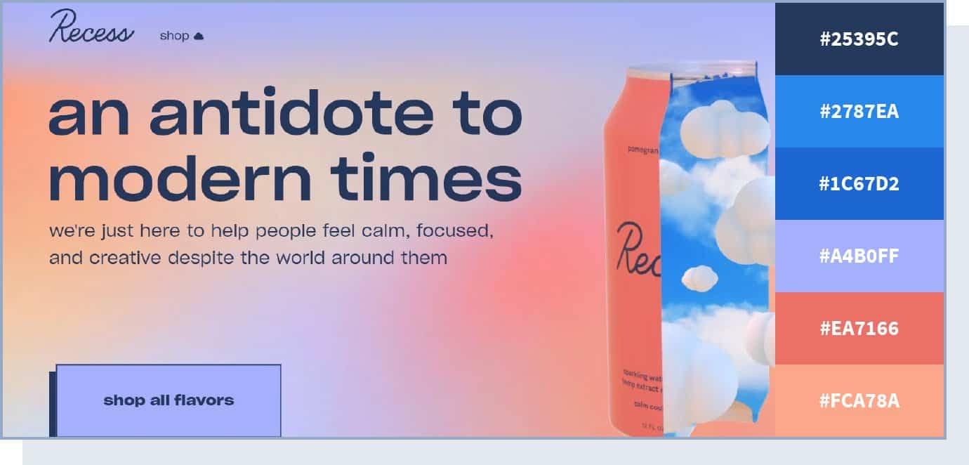
This hemp and adaptogens-infused sparkling water company chose colors that are simultaneously vivid and relaxing. Pairing different shades of blue with matching pastels, this sleek website color scheme creates a calm and dreamy browsing experience.
15. Minimal and Premium
Dental products brand Swissdent takes a minimal approach to colors by using one single color, along with its variations, in each of the website’s pages. Consider using a similar color scheme for a premium brand with a minimal website design.
16. Colorful yet Peaceful
The Headspace website makes great use of stark colors against white space, to both maintain order and highlight important content. This results in a colorful yet peaceful color scheme, perfect for a meditation app.
17. Pastel and Muted
Using a soft, pastel color scheme, this website design manages to create an impression of organic flow and visual structure.
It’s eye-pleasing and well-balanced, enticing the visitor to stick around and continue browsing. The dark steel grey color is used to show formality. The website also uses a bright shade of blue to make its call to action stand out.
18. Genuine and Professional
The non-profit organization Green Beetz uses different pastel shades of blue and green colors and relies on yellow to highlight CTAs. The result is a professional-looking website.
19. Feminine and Strong
Corporette is a lifestyle blog supporting corporate women. The warmth of the pink color (a symbol of femininity) accompanied by the stronger tones of fuchsia and blue (symbols of seriousness and trust) reflects the diversity of feelings that this brand wants to convey.
20. Calm and Inviting
This website color scheme utilizes pastel shades of different colors – pink, blue, orange, and green – to create a relaxed atmosphere where users can explore the creative technology lab’s work.
In particular, the combination of pink and white gives an idea of calm and simplicity. In web design, using white helps to create clean and simple pages.
21. Vibrant and Bold
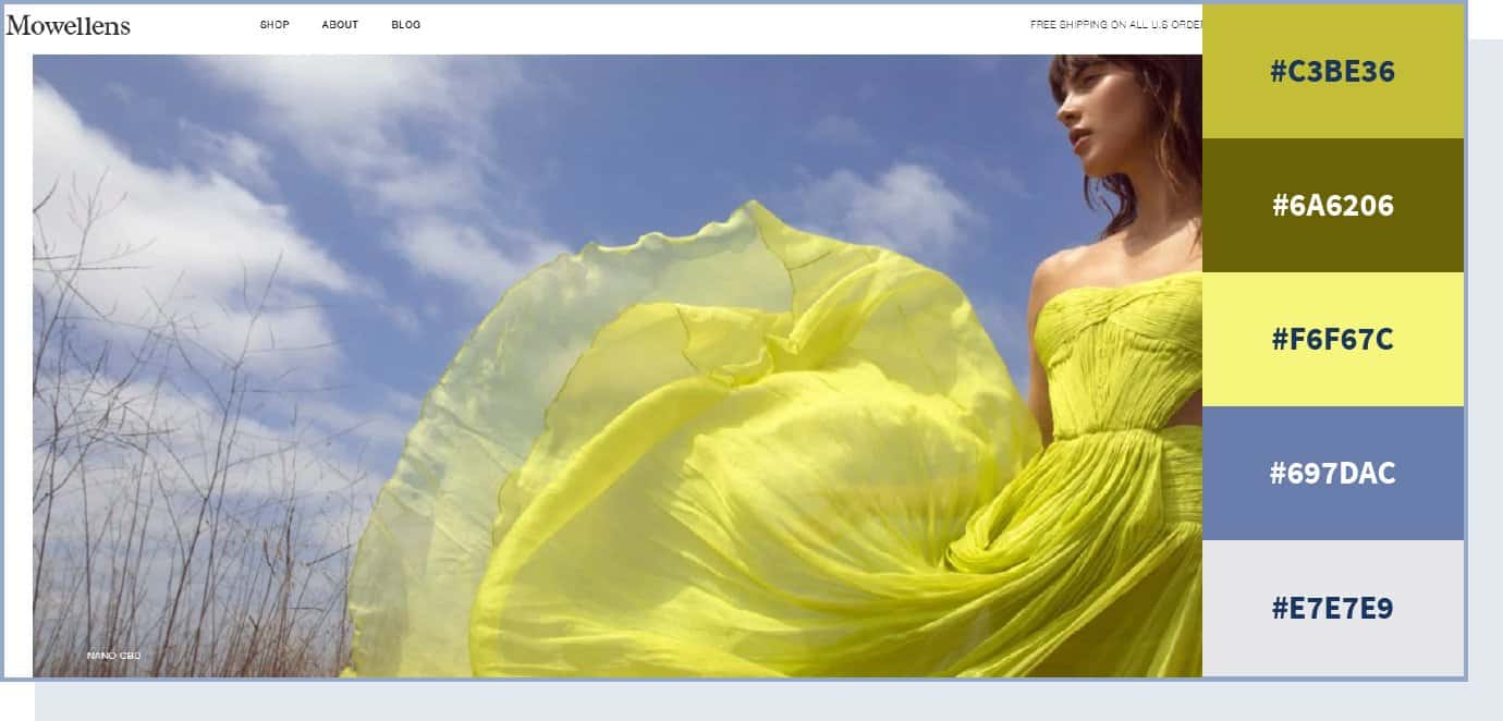
Bursting with color and energy, this vibrant color palette brings together bright yellow and vibrant blue, creating a powerful combination.
In particular, this website uses different shades of yellow, like buttercup and sunglow, which are not just eye-catching, but also communicate energy, cheerfulness, and fun. With vivid colors and interesting design elements, the website leaves a long-lasting impression with its citrusy theme.
22. Flat and Clean
If you want to keep your website clean and simple, the Playbook website is the perfect example of a flat color scheme — no drop shadows, no gradients, and no use of three-dimensional elements. Notice how this website uses very muted and calm colors (mostly white) but then uses red to shift the attention to the CTAs, inviting users to get early access to the product.
23. Creative and Unexpected
Brattle Street creates contrast by putting together a neon blue with yellow as the primary colors. The result is an unexpected and extreme look that can’t go unnoticed – the perfect color scheme for an agency focused on creativity.
Apart from blue and yellow, this website also uses bright green and orange colors. The main goal here is to energize users by using unexpected color combinations of very bright colors.
24. Vibrant Contrast
In this color scheme, two vibrant colors – pink and blue – are used to create an eye-catching contrast. Despite the color contrast, both colors come together to convey the same meaning of calm and seriousness. These are, in fact, two of the most relaxing colors.
25. Vivid and Organic
We’ve briefly touched on the importance of using fresh and organic colors when it comes to food. However, Organix takes this to another level and uses vivid colors not only for the product images but in the background too, and manages to convey realism and freshness.
In particular, this website uses raw shades of green, the ones you’d mostly see in nature, for a feeling of freshness and genuineness.
26. Colorful and Modern
This site pulls off a sophisticated and modern design by combining brightly colored products with neutral backgrounds. With one accent color for CTA buttons, the website design works brilliantly at guiding the visitor to the desired action.
27. Contemporary Color Scheme
Westbound Mag focuses on neutral colors like black and different shades of white (e.g., white smoke) to create a minimalist style, but then uses bright and bold colors in the pictures to make them stand out and create a contemporary vibe.
28. Pure and Trustworthy
Baby health products brand Libenar‘s website uses different pastel shades of pink and blue for its background. This color scheme is perfect to assure and relax the brand’s main audience – parents looking for pure and trustworthy products for their children’s health.
29. Fun and Playful
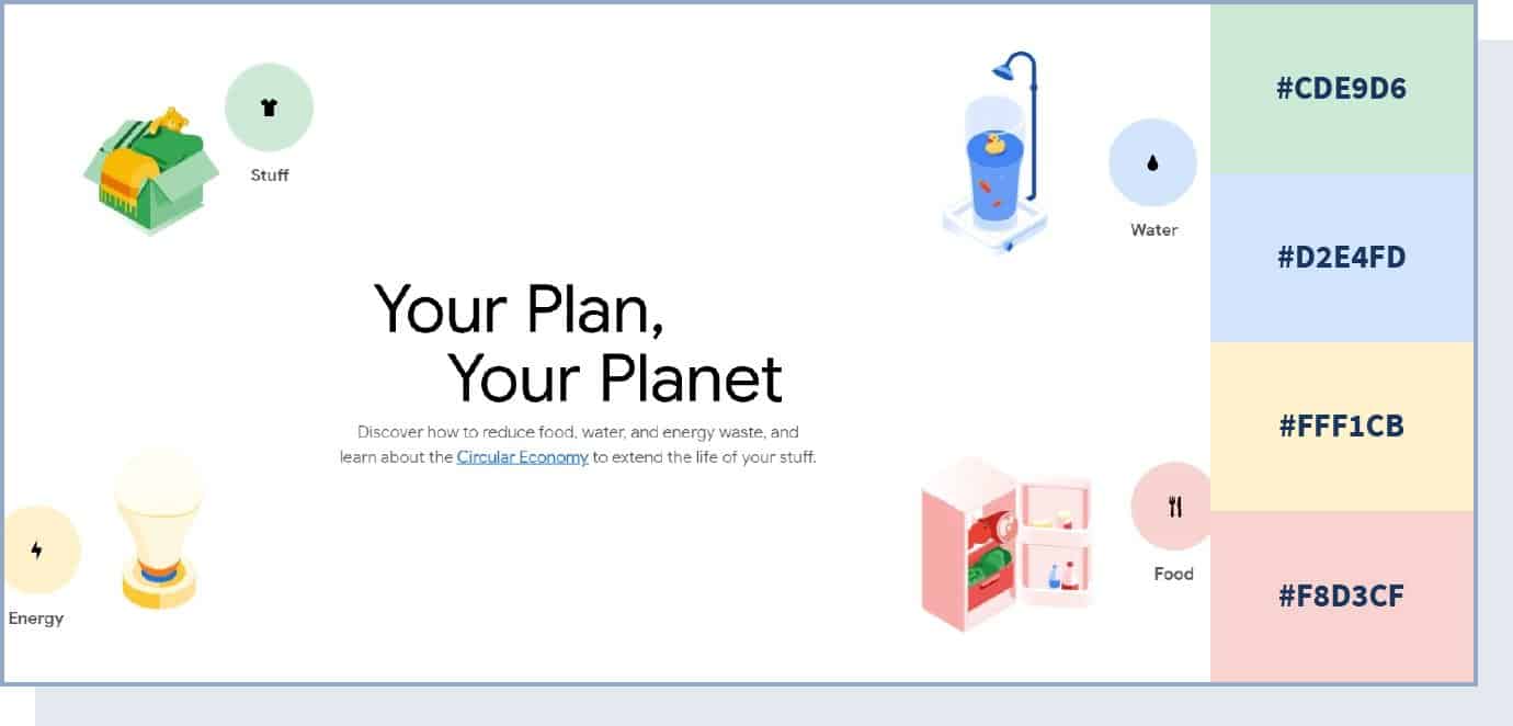
Combining many different colors and hues, this website pulls off a playful color scheme that uses color to create information categories – red for food, yellow for energy, blue for water, and green for stuff.
30. Futuristic Color Scheme
For his online portfolio, web developer Yusuke Fukunaga chose to use neon colors to create a futuristic look that goes well with the overall ultra-modern web design.
31. Professional and Fun
The Animus Studio agency website uses different colors on each page to make the website eye-catching and interesting. Their “about us” page says it all: “we can keep it professional, but we’re hoping you’ll want to hang out with us on the weekends.”
The colors used here vary from calmer yellow and blue to exciting and fun red, but they’re all very bright and bold – a great color scheme website example you can take inspiration from if you’re in a creative industry.
32. Monochromatic Color Scheme
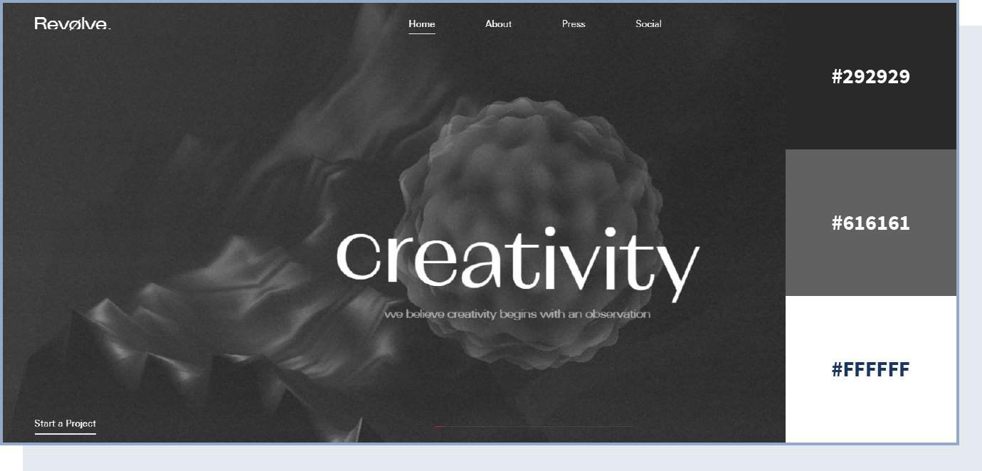
Playing with texture and various shades of black and grey, this color palette helps to create a mysterious yet approachable website design. The lack of color in this web design forces the visitor to focus on other elements, including copy, shapes, and visuals.
33. Bright and Engaging
The Globalance World website uses bright yellow as an accent color to make important content stand out. The result is an engaging look, which is perfect for a website with interactive elements.
34. Elegant and Peaceful
Playing with a few shades of green and yellow, this website design creates depth and uses a calm, clean color scheme to keep visitors engaged. Plus, there are happy feelings associated with yellow that are conveyed to visitors.
35. Serious yet Lively
The real estate website April Group mostly uses neutral colors like black and white to keep a serious and professional tone. The unusual aspect of such a serious website is that it manages to make it more interesting and convey an idea of enthusiasm by adding a vivid orange color to some of the site’s sections – specifically, the “our properties” section, which requires the most attention.
36. Vivid and Sharp
Channeling a sharp color scheme, this website design makes a strong first impression. Unafraid to lead with vivid colors, the website design combines different shades to create a stark contrast and attract the visitor’s eye – from deep pink to teal green and rich blue, the color scheme is eclectic yet balanced.
37. Dark with Contrast
The National Geographic’s Atlas of Moons website’s primary color is the one we see in space – solid black – but then it uses multiple bright colors to provide contrast and shift the attention to specific elements, such as planets and moons.
38. Vivid and Engaging
The Human interaction company – dedicated to making interactions between humans and computers more joyful – uses extremely vivid colors to make its website engaging and fun to navigate, which is in line with the company’s mission statement.
39. Bold and Catchy
This website color scheme makes a bold impression with high contrast and three vibrant colors at play. Green and blue are both associated with safety and reliability, so they are great choices for technology brands.
40. Corporate and Serious
For its website, NexBank chose to use a monochromatic color scheme, which is perfect to create an idea of seriousness. A study found that achromatic colors cause a short-term heart rate deceleration, so they can help calm down the user. They can be a good choice for a serious banking website to not overwhelm visitors and assure them that they’re in good hands.
41. Unusual and Cool
The Spotify: Your 2025 Wrapped website uses cool colors – like green and pink – along with unusual and bright shades to create feelings of excitement and fun. This website’s color scheme’s goal is to simply grab users’ attention. Notice that the neon shades are controlled and not disturbing to the eye.
42. Elegant and Luxurious
This beautiful color scheme pulls off a regal, elegant look by combining deep blue with shades of gold. It’s a classic color scheme with a modern twist that delivers a powerful visual experience and immediately positions the brand as a high-end player.
43. Colorful yet Professional
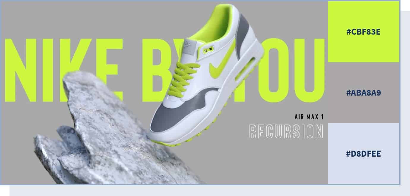
If you take a look at Nike’s corporate communication website, Nike Purpose, you’ll see that despite no use of neutral colors – except for a very dark shade of grey in the footer – the website maintains a serious and professional look, thanks to other web design features like navigation, content, and interactivity.
Besides, the designer managed to create a playful and user-friendly atmosphere by utilizing a wide range of pastel, vivid colors, and an ecru white background.
44. Strong and Timeless
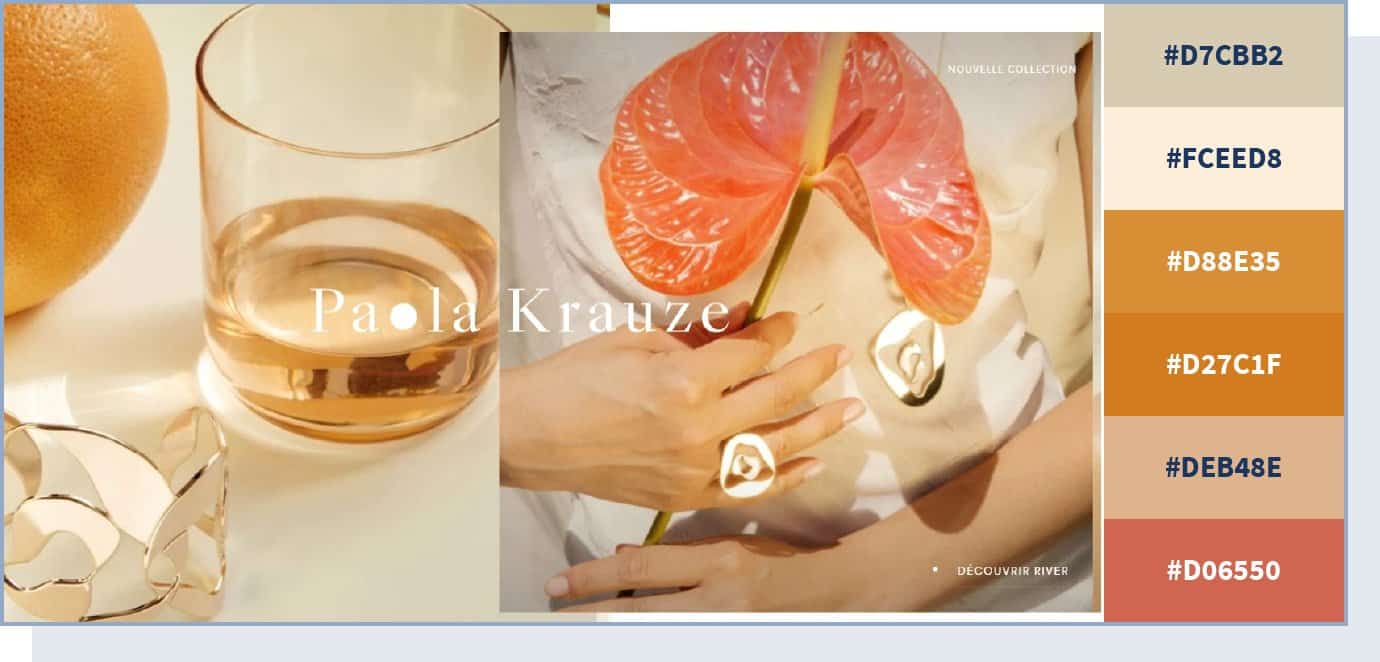
This premium jewelry brand website demonstrates how throwing in a color that has strong cultural associations – in this case, gold – can change the dynamics of the whole design and make it look more majestic. Paola Krauze‘s website uses different shades of gold and other similar colors, like orange and pink, to describe its premium and timeless products and convey a feeling of elegance and strength.
45. Black on Black
Take a look at how high-end luxury garments manufacturer JY BH uses different shades of black and grey for the color scheme for its homepage. A very uncommon combination – black on black – is not always a good idea, but can help you create a feeling of exclusivity and seriousness.
Black is one of the best colors to communicate elegance, style, and sophistication. But keep in mind that, in many cultures, the black color can be associated with negative emotions like fear, death, and sadness. Always be wary of who your customer is when creating your website color scheme.
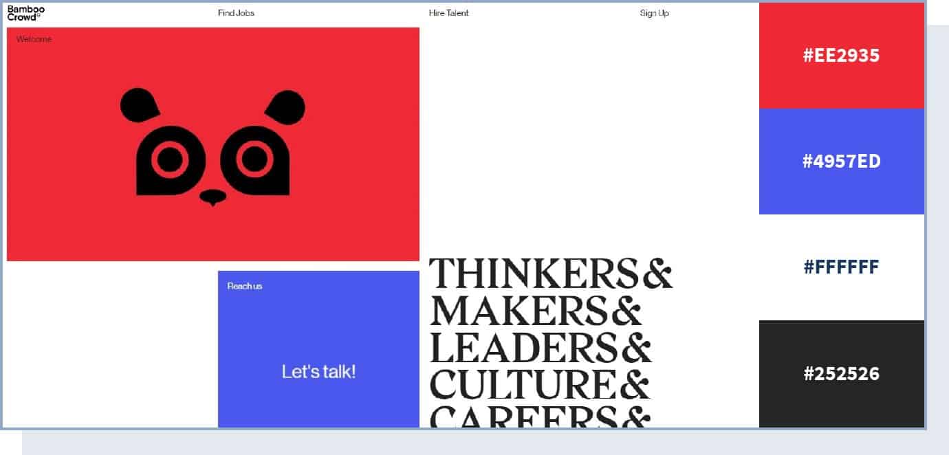
46. Corporate yet Energetic
Who said a corporate website has to be boring?
Using a traditional yet vivid color palette, this website manages to evoke trust – thanks to the blue color – while creating an impression of a forward-thinking, modern brand. The combination and contrast of vivid red and blue colors give the website a dynamic and powerful vibe.
47. Fashionable and Contemporary
If you want some inspiration for your fashion label, have a look at the website color scheme that swimwear and ready-to-wear brand Peony is using. The website uses white and pampas colors for its background, but it mostly uses different shades of hot pink for the rest of its design.
48. Soft Neutrals with a Warm Accent
In 2026, soft neutral palettes are having a moment. Inspired by the trend toward calm, breathable backgrounds, this type of color scheme pairs warm off-whites and creamy tones with a single confident accent color – like terracotta or burnt sienna. The result feels grounded, modern, and effortlessly sophisticated.
This approach works especially well for service businesses, personal brands, and portfolios where you want the content (not the colors) to do the talking.
49. Dark Mode Done Right
Dark mode has matured beyond pure black backgrounds. The best dark-mode websites in 2026 use deep charcoal or dark navy as a base, paired with muted accent colors that are easy on the eyes. This creates a premium, immersive feel without sacrificing readability.
If your audience spends long sessions on your site (think SaaS dashboards, portfolios, or media sites), a refined dark palette can reduce eye strain and feel more modern.
50. Accessibility-First High Contrast
With accessibility becoming both a legal requirement and a competitive advantage, some of the best-designed sites in 2026 lead with high-contrast palettes that meet WCAG AAA standards. Deep navy or charcoal text on a clean white background, paired with a vivid accent for interactive elements, ensures every visitor can read and navigate your content.
This isn’t just about compliance – it’s about making your site usable for the widest possible audience, which is good for conversions too.
51. AI-Inspired Gradient
As AI-powered tools become part of everyday life, a new visual language has emerged: smooth gradients that transition between cool purples, teals, and soft pinks. These palettes feel futuristic and innovative without being cold. They’re showing up on tech startups, AI product pages, and forward-thinking agency sites.
Use this type of gradient color scheme when you want to communicate innovation and modernity.
Website Color Scheme Accessibility
A great-looking color scheme means nothing if your visitors can’t read it. Accessibility isn’t just a nice-to-have – in 2026, it’s increasingly a legal requirement and a genuine competitive advantage.
Here are the key rules to follow:
Meet minimum contrast ratios. The Web Content Accessibility Guidelines (WCAG) recommend a minimum contrast ratio of 4.5:1 for regular text and 3:1 for large text (18px bold or 24px regular). Use a free tool like WebAIM’s Contrast Checker to test your color combinations.
Don’t rely on color alone to convey meaning. If an error message is shown only in red, users with color blindness may miss it. Always pair color cues with text labels, icons, or patterns.
Avoid problematic color combinations. Red/green and blue/yellow pairings are difficult for many colorblind users. If you use these colors, make sure there are other distinguishing cues.
Test with color blindness simulators. Free tools like Coblis let you see your design through the eyes of users with different types of color vision deficiency.
Keep color usage consistent. If blue means “clickable link” on one page, it should mean the same on every page. Consistency helps all users navigate your site more easily.
Best Color Scheme Tools and Generators
You don’t have to pick colors from scratch. These free tools help you build, test, and refine your website’s color palette:
- Adobe Color – Create palettes using a color wheel, explore trending combinations, or extract color themes from uploaded images. One of the most versatile free tools available.
- Coolors – A fast, intuitive palette generator. Press the spacebar to cycle through random palettes, or lock specific colors and generate around them. You can also explore palettes by topic or style.
- Paletton – Build color schemes based on complementary, triadic, or analogous relationships. Includes a live preview of how your palette looks in a sample website layout.
- ColorZilla – A browser extension for Chrome and Firefox that lets you pick any color from any website and get its hex code instantly. Perfect for identifying colors on sites you admire.
- Palette Generator – Upload any photo and this tool extracts a color palette from it. Great if you have a mood board image or product photo you want to build your scheme around.
Frequently Asked Questions
What is a website color scheme?
A website color scheme is the combination of colors used throughout your site’s design – including backgrounds, text, buttons, headers, and other elements. A well-chosen color scheme creates visual harmony, reinforces your brand identity, and guides visitors toward important actions like signing up or making a purchase.
How many colors should a website have?
Most well-designed websites use 3 to 5 colors: one dominant color, one or two secondary colors, and an accent color for buttons and CTAs. Using too many colors can feel chaotic, while too few can look flat. The 60-30-10 rule (60% dominant, 30% secondary, 10% accent) is a reliable starting point.
What is the best color for a website?
There’s no single “best” color – it depends on your industry, audience, and brand personality. That said, blue is the most popular website color because it communicates trust and professionalism. If your competitors all use blue, consider a complementary color to help your brand stand out.
Can I create my own color scheme?
Yes. You can use free tools like Adobe Color or Coolors to experiment with different palettes. Start by choosing one color you like, then use the tool to find complementary or analogous colors that work well together.
Why does color accessibility matter for my website?
Roughly 8% of men and 0.5% of women have some form of color vision deficiency. If your color choices create poor contrast or rely solely on color to communicate information, a significant portion of your audience will struggle to use your site. Meeting WCAG contrast guidelines improves readability for everyone – including people browsing in bright sunlight or on low-quality screens – and can improve your conversion rates as a result.