The layout of your website can define its success.
Get the wrong design and people will be confused and disoriented, destroying the user experience. They are likely to miss critical content or fail to see a call to action.
So before you build a website, make sure you have the layout idea right.
But the importance of your layout goes further. The design has to fit the content of your site. With the right layout, your content can shine, but with the wrong one content can become crowded, hard to read, and uninspiring.
It is worth saying that you do not need to stick to one approach. You can easily combine multiple layouts across your site or even on a single page such as a landing page.
That said, let’s start with the fundamentals and then look at the most common layout options available to you.
What Is a Website Layout?
A website layout is the arrangement of visual elements on a web page. It determines how text, images, navigation, and calls to action are positioned and how they relate to one another.
Every website has an underlying grid system that sits beneath the website design. These columns and rows provide order to your content and guide the user’s eye around the page. Within these grids, you can create a wide range of different approaches.
Think of your layout as a map that gives visitors directions. A clear, well-organized map helps people find what they need quickly. A confusing one sends them looking elsewhere.
Why Your Website Layout Matters
Your layout is often the first thing visitors judge, even before they read a single word. Research consistently shows that first impressions are largely design-driven. Here is why getting it right is so important:
- Readability: A good layout uses headings, white space, and strategic placement to make content easy to scan and absorb.
- Usability: When a layout flows naturally, visitors can navigate your site without stopping to figure out where to go next.
- Visual hierarchy: Like a well-organized store, a strong layout guides users’ eyes to what matters most first, then leads them to secondary content in order of importance.
- Engagement: When your layout makes sense and feels intuitive, visitors stay longer instead of bouncing away.
Understanding Eye-Tracking Patterns
Before diving into specific layout types, it helps to understand how people actually look at web pages. Eye-tracking research has identified several common scanning patterns that influence which layouts work best in different situations.
The Z-Pattern
When visitors land on a visually driven page with minimal text, their eyes tend to move in a Z shape: from the top left to the top right, then diagonally down to the bottom left, and finally across to the bottom right.
This is why you commonly see logos in the upper left corner and primary calls to action toward the bottom right. Layouts that leverage this pattern, such as hero layouts and landing pages, place their most important information along this natural path.
The F-Pattern
On text-heavy pages, visitors tend to scan in an F shape. They read across the top of the page, then move down the left side, making shorter horizontal scans as they go.
This pattern is especially relevant for blog posts, news sites, and search results pages. You can work with it by placing your most important content at the top and using headings, bullet points, and images along the left side to keep readers engaged as they scan downward.
Applying These Patterns
You do not need to force your entire site into one scanning pattern. Instead, think about what each page is trying to accomplish:
- Visual pages with a single call to action benefit from Z-pattern thinking.
- Content-heavy pages with lots of text benefit from F-pattern thinking.
- The size and visual weight of elements also matter. Larger, bolder, higher-contrast elements naturally draw the eye first, regardless of the pattern.
With these fundamentals in mind, let’s look at the most common layout options available to you.
12 Website Layout Types (With Examples)
1. Single Column Layout
Although the most uncomplicated layout you will find, the single column layout has grown significantly in popularity alongside the mobile web. That is because the website can use the same design on mobile devices, tablets, and desktops, reducing development time. With the majority of global web traffic now coming from mobile devices, this approach is more relevant than ever.
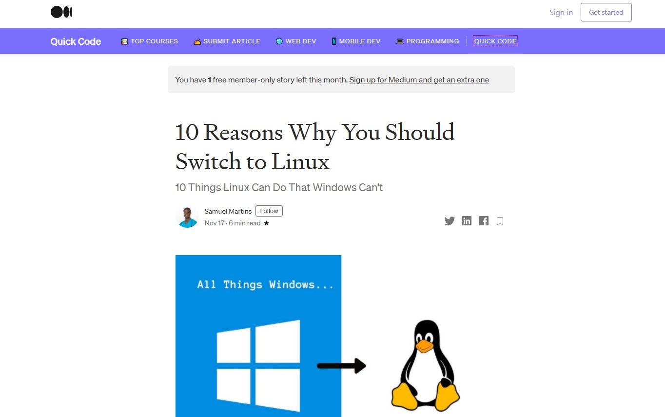
Also, single-column layouts work well for creating a great reading experience because they focus the user on the content with no distractions to either side. That is why blogging site Medium continues to adopt it for all their articles.
When combined with imagery, a single column layout can make a powerful impact because it allows you to show those images as large as possible.
With these factors in mind, consider using a single column layout if you want people to spend a lot of time reading on your site or if you have imagery that needs the room to shine. This approach aligns well with minimalism and content-focused design trends.
Because of its simplicity, there are few challenges around a single-column layout. However, you do need to consider the flow of information carefully. What order does the user need to see your content?
For example, it is helpful to give users a summary of what the page covers at the top to draw them in and offer a clear call to action towards the end.
Also, think about how you can keep the user scrolling down the page. Single column layouts tend to be longer, and it is not always apparent to the user that there is more content below the fold. A visual indicator such as an arrow, a “back to top” button, or a sticky navigation menu can all help.
If a single column layout seems a little restrictive, but you still have a lot of content to communicate, consider adopting a design that focuses on the content.
2. Content Focused Layout
Web designers often use the content focused layout on news sites or blogs, and it usually has a primary column for content and one or more side columns for additional information.
The advantage this layout has is that it can help you manage the line length of the central content by varying the width of side columns. That matters because if the line length of the text is too long or short, it becomes harder to read, reducing comprehension and retention of the information.
However, done right, the content focused layout is ideal for any copy-centric website. The secret is to break up the content within this layout into small, easy to digest chunks.
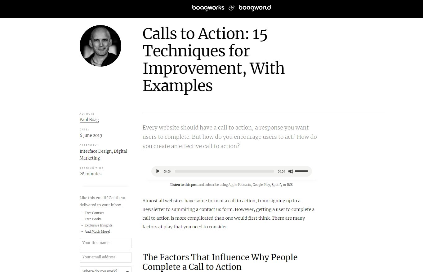
For example, on my blog, you will find that my average post is punctuated by headings, lists, imagery, and pull out quotes. These are all techniques for helping the user scan the article, finding parts that are of interest.
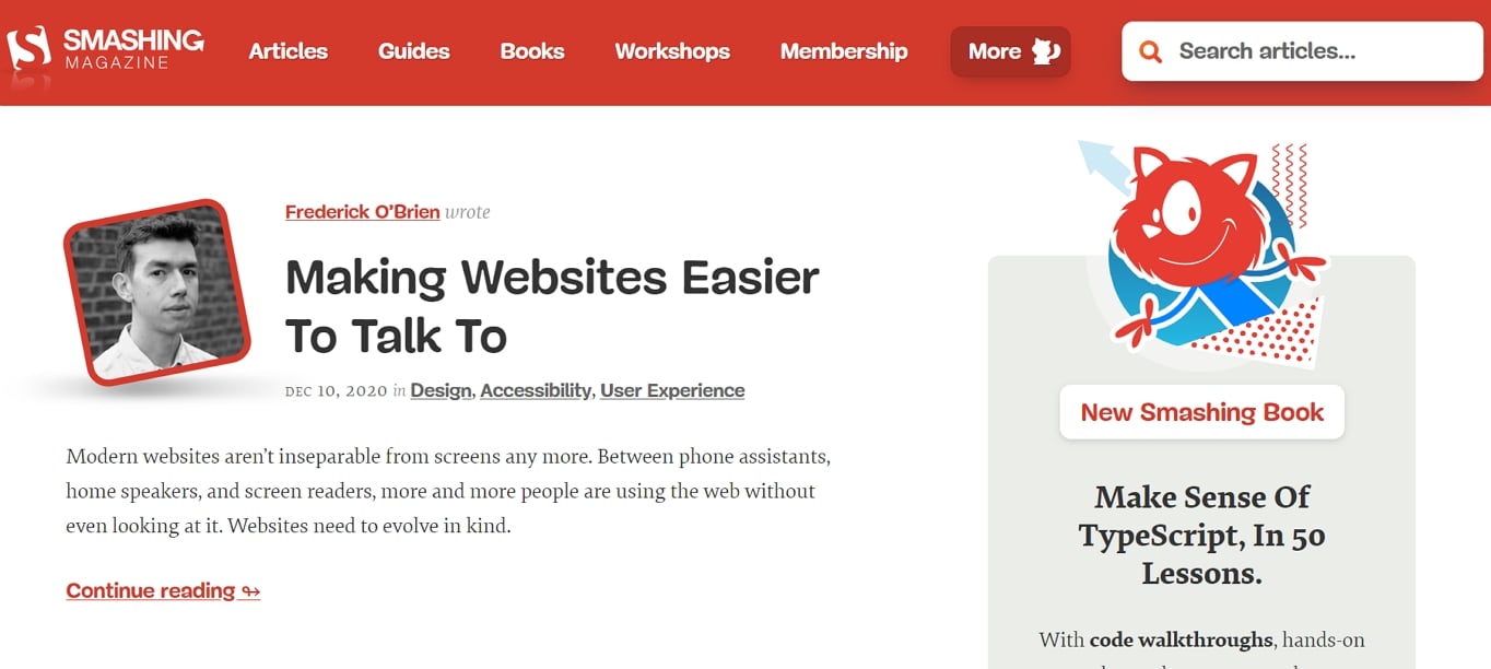
Careful consideration also needs to be given to the side columns. It is essential that the web designer places the right content in these columns and that they visually have the correct weighting.
The problem is that users expect to find secondary content in the side columns and so give them less attention. Therefore, if you plan to include something like a call to action in a side column, it needs to be strong enough to draw attention.
For example, notice how Smashing Magazine uses a colorful illustration of a cat to draw attention to their newsletter sign up form in the right column.
Not that the content focused layout is appropriate for every page of your site. Websites often pair this layout with a magazine-style design.
3. Magazine Layout
As the name implies, this layout approach is used extensively in magazines or news sites to show a large number of different stories.
Inspired by print layout, they allow for the combination of headlines and imagery to introduce stories. That can be an engaging way of conveying what is essentially a list of links.
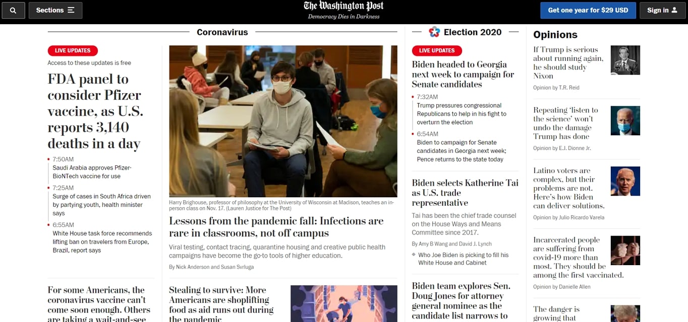
It is also an excellent layout for highlighting content that regularly changes. That is why news websites like The Washington Post continue to favor it.
However, the layout is not without its drawbacks. A magazine layout can be challenging to make responsive, often requiring a complete change in design for smaller screen devices. This is particularly important now that responsive design is a baseline expectation rather than a nice-to-have feature.
This website layout style can also be somewhat overwhelming, with a large number of images and headlines shouting for attention.
The most effective way of addressing this problem is to create a clear visual hierarchy. In other words, make some of the ‘stories’ larger than others.
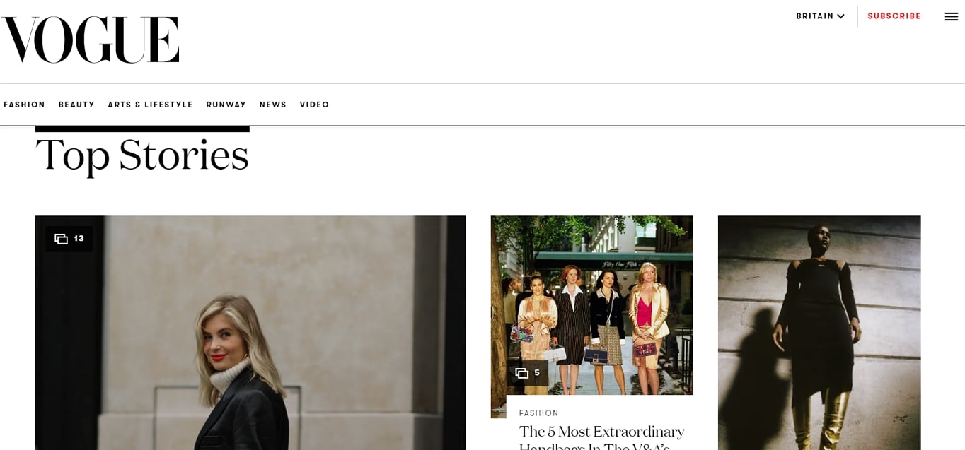
For example, notice how the Vogue website focuses attention on the left-hand image by making it considerably larger. They are effectively telling the user where to look first.
It also helps that the rest of the user interface is straightforward, with clean typography and simple navigation bars. If you are going to use the magazine layout, you will need to work hard to keep things simple. Research consistently shows that users are far less likely to return to a site after a bad experience, so clarity is essential.
Another potential downside of the magazine layout is that it can look ‘boxy’ because the grid that underlays it is so visible. However, you can mitigate that by taking inspiration from our next layout type.
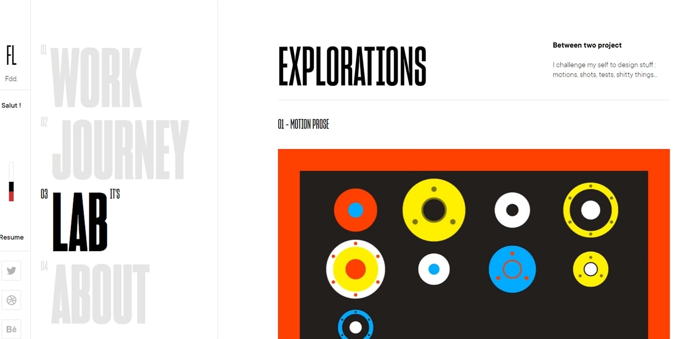
4. Grid Breaking Layout
Layouts that appear to break their underlying grid can be visually much more interesting than more traditional approaches. They are also excellent for drawing attention to particular screen elements that break out of the usual columns. This approach aligns with the broader trend toward asymmetric layouts and breaking perfect grid rules to add personality to a design.
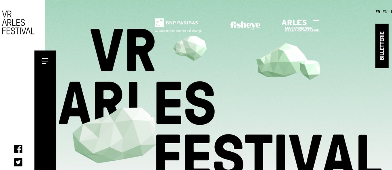
Take, for example, the VR Arles Festival website. Notice how they draw your attention to their navigation bar by having it overlap two columns.
Another practical use of the grid breaking layout is to overlay text on an image in such a way to pull attention to the copy. When a webpage completely overlays text on an image, it can often be lost. However, as you can see from the example below, if the text partially overlaps the picture, it stands out a lot more.
The downside of grid-breaking layouts is that they are hard to get right, especially when websites need to be responsive. In truth, most grid-breaking designs are nothing of the sort. There is still an underlying grid, and all screen elements fit into it. It is just that the grid is much more complex and so it is not so obvious. That makes them hard to design.
Their inherent complexity is why you tend to see them used by design-led companies such as design agencies or fashion brands. They demonstrate a degree of design sophistication that appeals to a particular audience.
If a grid breaking layout feels too complicated for your situation, but you still want to do something more innovative and unusual, consider a full-screen design.
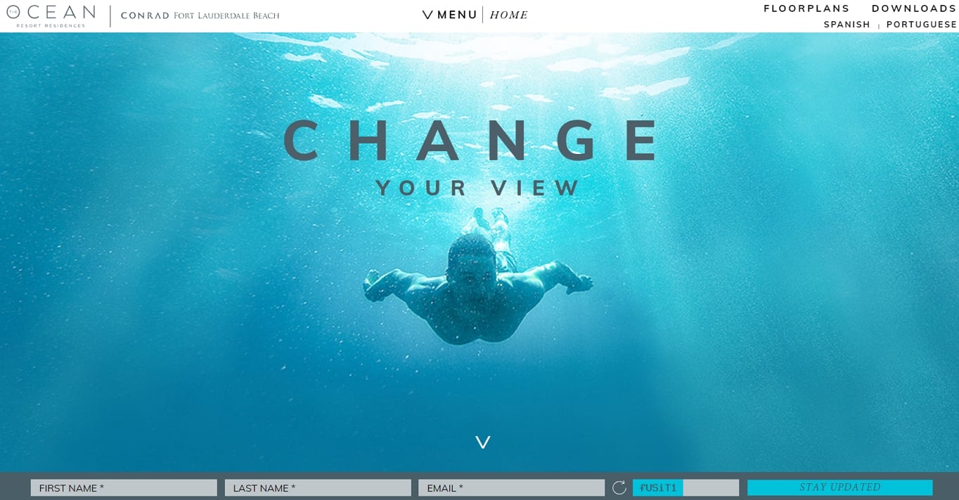
5. Full-Screen Layout
Full-screen layouts, as the name suggests, fit on a single screen with no need for the user to scroll. That makes them ideal for storytelling or presentations. They work especially well when paired with powerful imagery, video backgrounds, or interactive elements.
Take, for example, Species in Pieces. This rich and interactive presentational experience tells the stories of 30 endangered species.
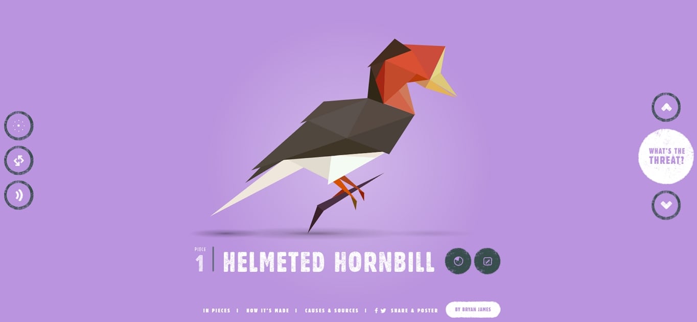
As you can see, full-screen layouts are at their best when accompanied by powerful imagery. That makes them a great choice for websites rich in photography, illustrations, or video.
Not that you have to stick to the single screen approach strictly. At first glance, the Roux at Parliament Square website appears to be a full-screen website in the same sense as Species in Pieces. Their gorgeous imagery fills the entire viewport.
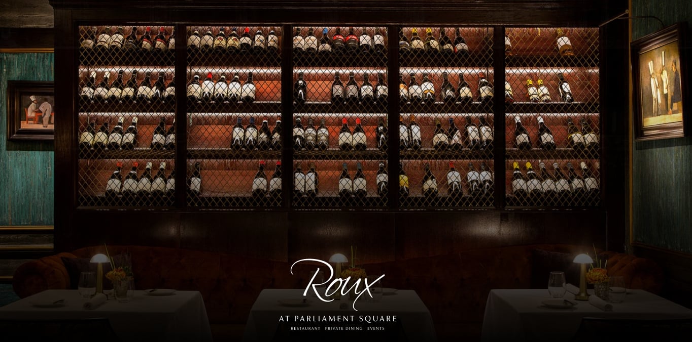
However, it is possible to navigate further down the page to see additional content. Unfortunately, that highlights one potential drawback with this layout approach. Users do not always realize they can scroll and so can miss valuable content.
You also need to put careful consideration into how the layout will adapt at various sizes. For example, will the full-screen approach work on a mobile device? Also, will images crop as the screen size changes or simply shrink? You can quickly find the focal points of images being cropped out of the viewable area at smaller sizes.
That said, if you have stunning images to show off, you will struggle to find a better layout design. But, if you want the option to add some description and calls to action alongside those images, you may want to consider an alternating layout.
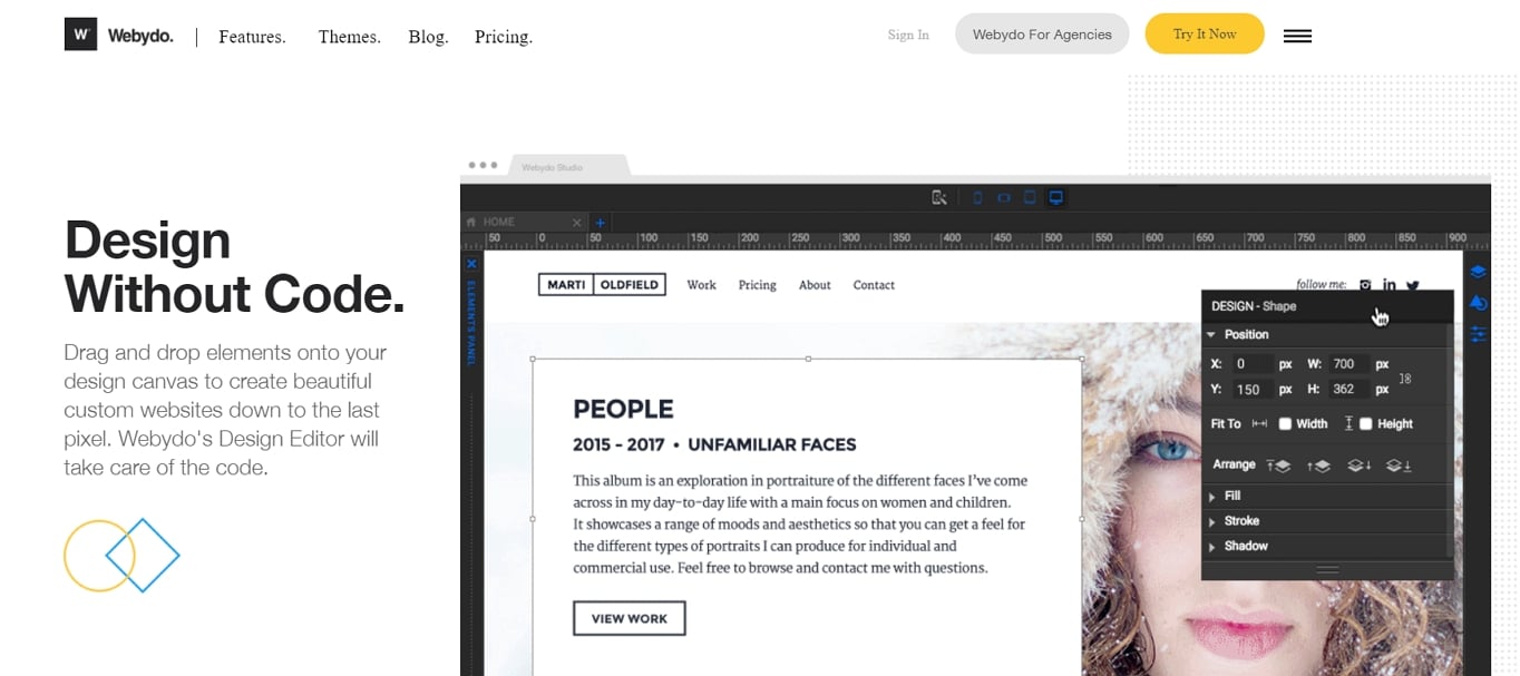
6. Alternating (Zig-Zag) Layout
The alternating layout pattern is one of the more commonly found on the web. You will find it is made up of a series of content blocks, each of which has a two-column layout. The blocks are typically made up of an image on one side and text on the other.
What gives it its name is that the image alternates side. So the first block will have content on the left and the image on the right, while the next block reverses that layout. This zig-zag pattern taps into the natural Z-shaped eye-tracking behavior discussed earlier, guiding visitors through your content in a way that feels effortless.
It is a layout approach particularly favored when explaining the features or benefits of a product. For example, software products like Webydo will use the image to show a feature and then the copy to explain how it works or the benefit it provides.
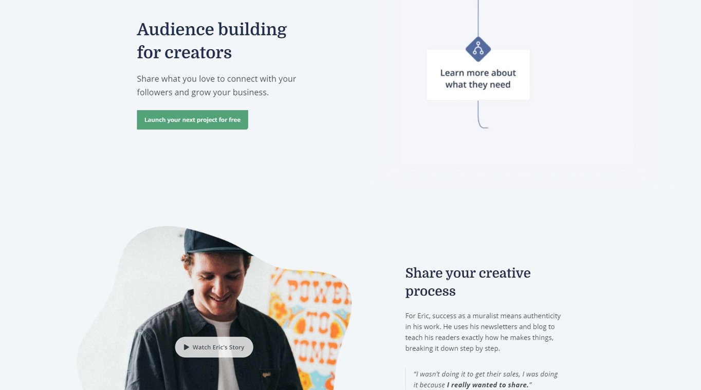
Not that these content blocks are limited to images and text. Sometimes sites replace the image with a video. Equally, the content side of the element could include everything from icons to testimonials or calls to action.
For example, some platforms include a testimonial and call to action alongside their text in each content block.
Part of the reason alternating blocks are so common is that they are a simple layout approach with few drawbacks. If you need to communicate several selling points, it is almost always a reliable layout option.
Of course, your requirements might be different, so another option to consider is the card-based layout.
7. Card-Based Layout
Card-based page layouts are another common layout approach you will see all across the web. Card UI design has evolved from a trend in the mid-2010s to a core feature of modern web interfaces, particularly with the widespread adoption of Material Design principles.
Card-based layouts are a great way to give people a series of options to choose between, presenting them with enough information on each choice to make a decision.
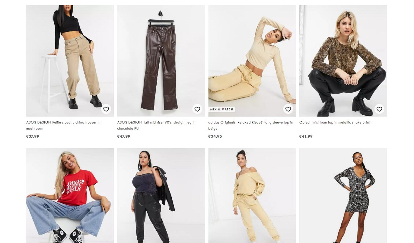
That makes them a popular choice for the product listings pages of eCommerce sites. It allows the website to display an image of the product, a description, and the price. You can even add functionality like “save for later” as you can see from the ASOS website.
However, you will find websites using card-based layouts in any situation where users need to select from a list. For example, another typical use would be displaying a list of articles on a blog or news site.
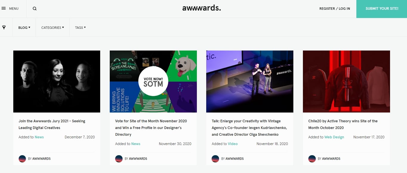
A card-based layout allows you to display an image of the story, title, and description, as well as any additional details about the post you wish to include. Awwwards blog is an excellent example of this kind of use in action.
Best of all, card-based layouts work well responsively, with the number of cards in a row slowly reducing as the available width goes down. This makes them particularly valuable given how much web traffic now comes from mobile devices.
There are a couple of minor drawbacks to the approach, however. First, cards work best when you include an image. That means if you are struggling to find suitable photos for each of your list items, you might be better with a different design.
The other slight problem is with varying amounts of content. If one card has more content than another, it can leave white space either within the card or between each row.
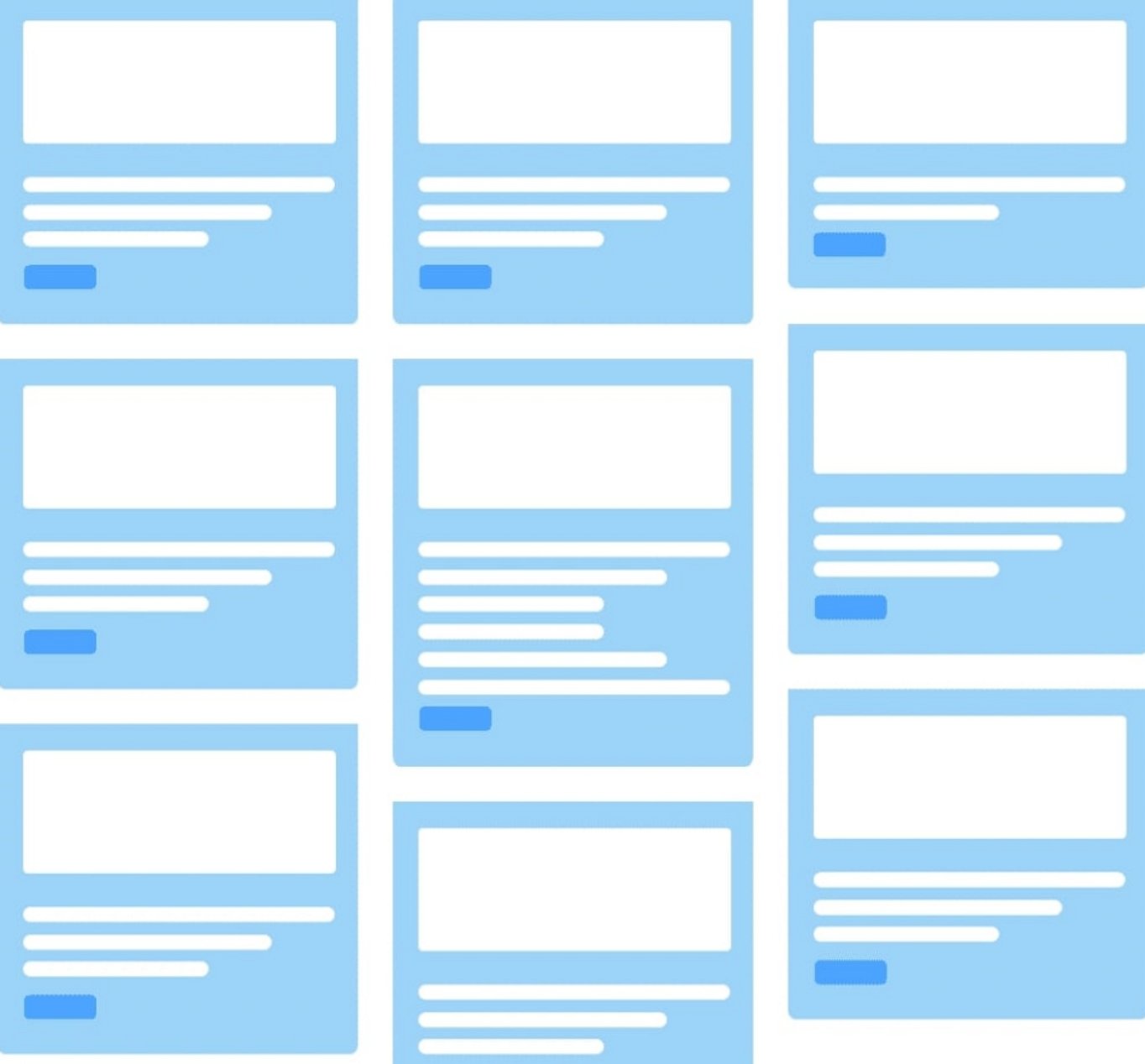
One way to mitigate this issue is not to try and keep cards on the same row, as shown in the example below. This masonry-style approach allows cards to fill empty space, creating a more aesthetically pleasing design.
Nevertheless, this is a minor issue, which explains the widespread adoption of this layout approach.
Another equally popular design is the hero image layout.
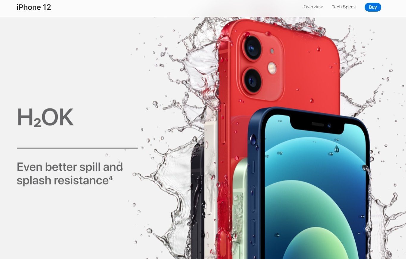
8. Hero Layout
The hero layout is named after hero images, those large images with text overlays that dominate the homepages on so many websites. Apple continues to make excellent use of the classic hero image approach.
Pixave for MacOS takes the hero layout even further by having it dominate its homepage design.
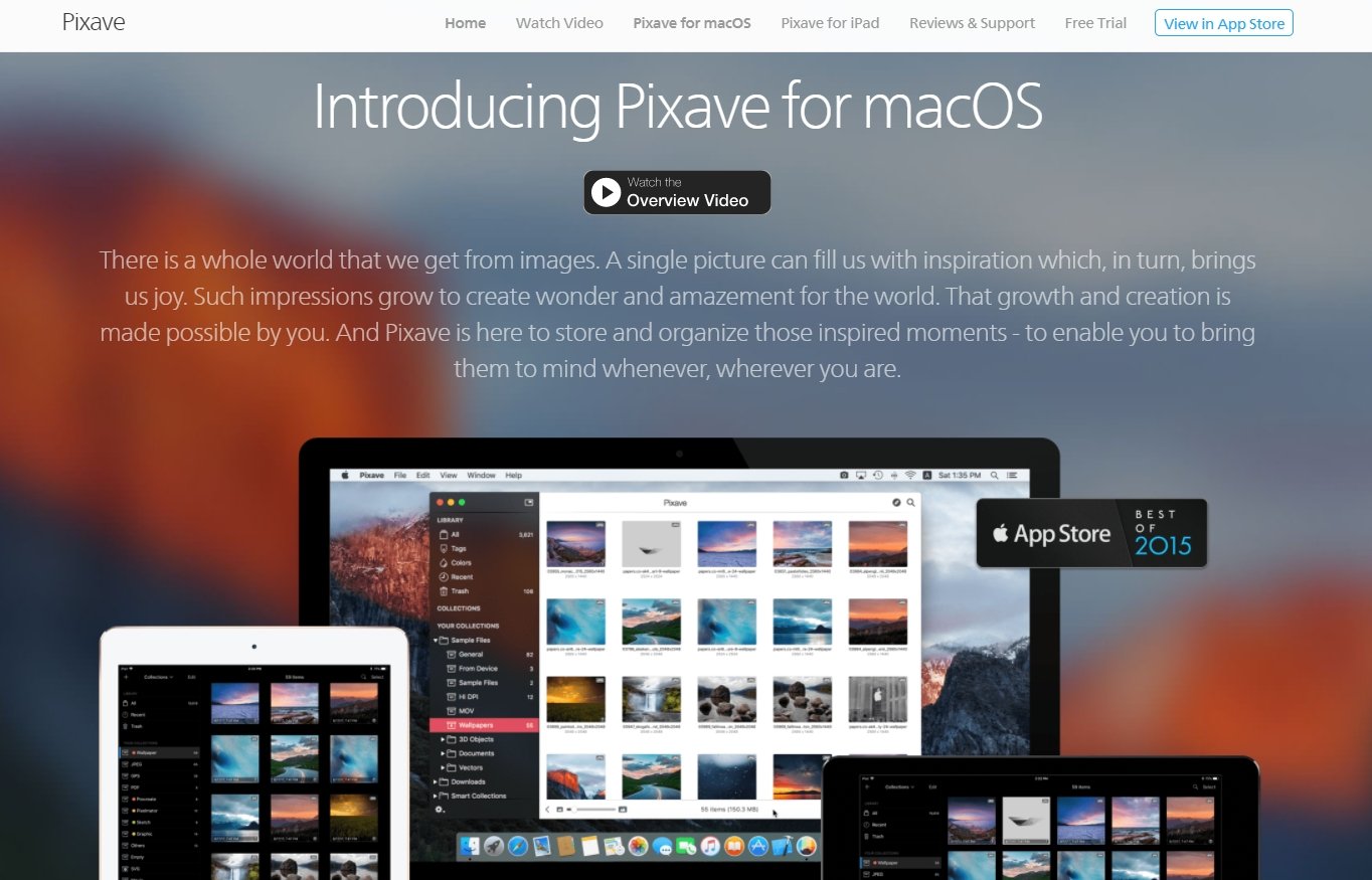
What makes hero images so prevalent is that they allow you to lay out your value proposition in an impactful way right at the entry point of your website. Full-page headers create an immediate visual impact and remain one of the most prominent features in modern web design.
As you can see from the Pixave and Apple websites above, they usually consist of a large background image, a title or strapline, and a description. Hero layouts also often come with a prominent call to action.
If you need to clearly explain what you offer on your homepage or landing page in a way that will grab attention, then a hero image could well be the way to go. However, that is probably the extent of their use.
Occasionally you will see the hero layout used on subsequent pages. But, in most cases, the hero image simply draws attention away from more valuable content. So use with care.
Aside from that, there is little drawback to using a hero layout. Yes, they are common, but users are familiar with them, and they are effective. The approach has proven its staying power and continues to be a reliable choice for many websites.
A considerably less common layout option is the split-screen layout.
9. Split Screen Layout
Like the full-screen layout, a split-screen is a great way to grab attention when users first arrive on your website. As you can see from the web design company’s homepage below.
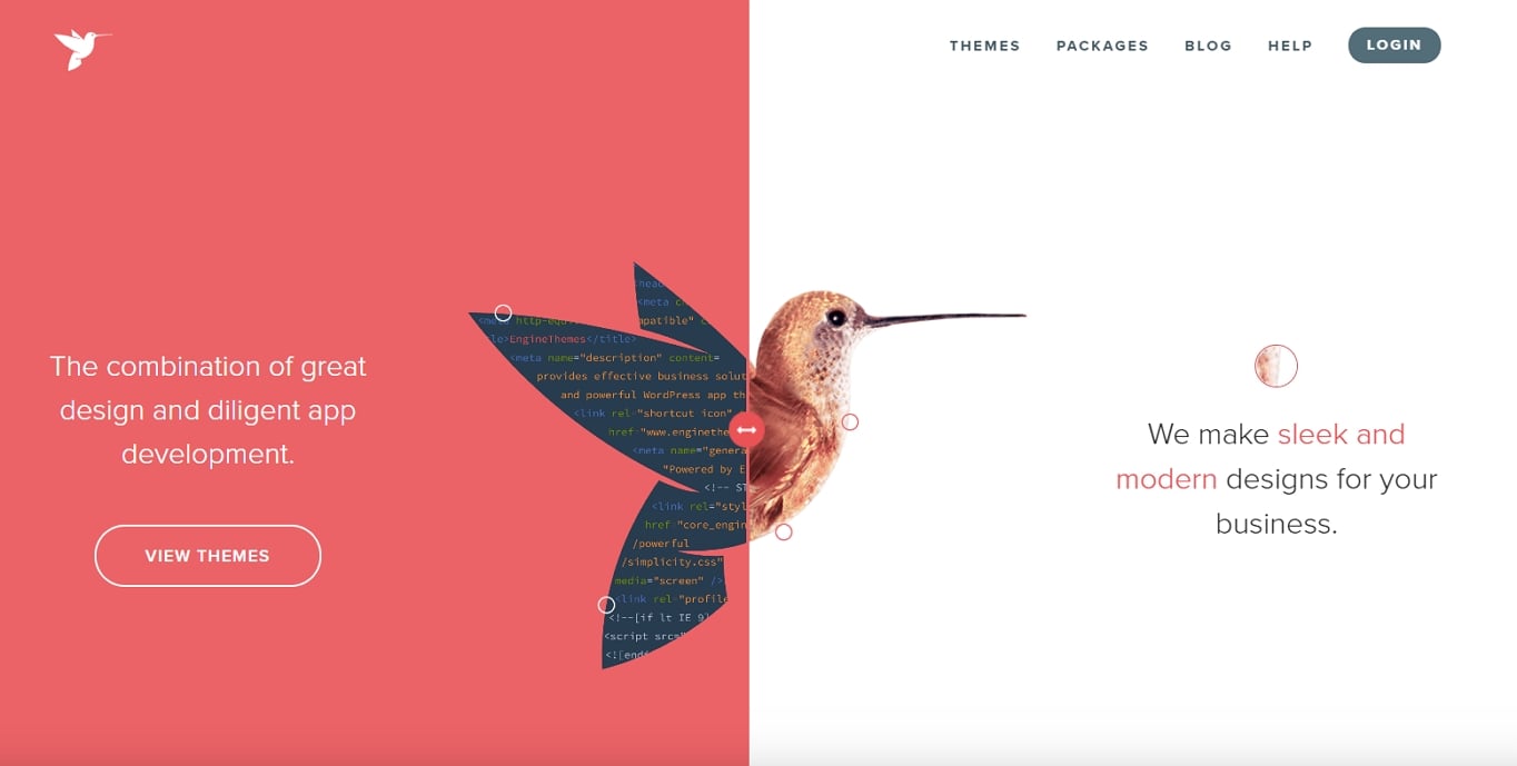
What makes the example above so effective is there is a clear reason for the split-screen layout. The website is making it clear there are two sides to their business – design and development.
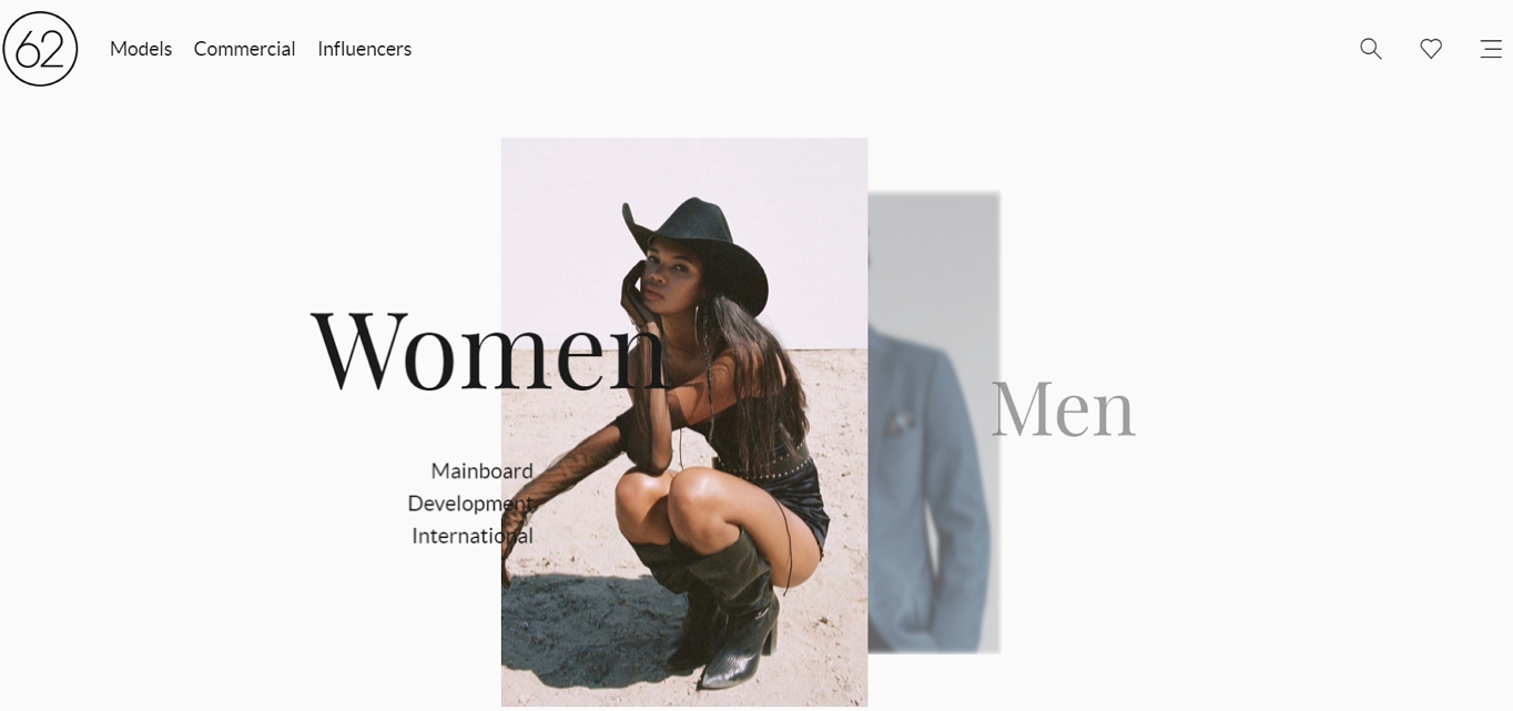
A similar example is when you want to give users a clear binary choice. A split-screen makes a lot of sense in that situation as it divides the screen equally between the two options.
For example, the modeling agency 62 Management uses a split-screen to encourage users to identify whether they are looking for a male or female model.
Split-screen layouts are also useful for registration and comparison pages. For instance, a sign-up page might show a form on one side and a summary of plan features on the other, making decision-making simple and quick.
Unfortunately, beyond these limited number of applications, there is little reason to adopt a split-screen design. It is a relatively limiting layout option, and there are simply not that many scenarios where it is appropriate. It also does not scale well on mobile, where the two halves typically need to stack vertically. However, in those cases where it fits, it is by far the best choice.
A similar option that would provide a bit more flexibility is the asymmetrical layout.
10. Asymmetrical Layout
Whereas the split-screen layout forces an equal split down the middle of the viewport, an asymmetrical design allows you to divide the screen however you see fit. Designers increasingly embrace asymmetric grids to add personality while keeping layouts structured.
The advantage of this layout over split-screen is that it allows adding emphasis to a particular side of the page. The more real estate a side has, the more focus you are placing on it. That, in turn, allows you to identify primary and secondary content.
With the premise of primary and secondary columns in place, you can use the approach in multiple ways. For example, some designers use the method on their portfolio sites to divide between content and navigation.
By contrast, the Nourish Eats website uses the second column to allow you to see the next section of its website.
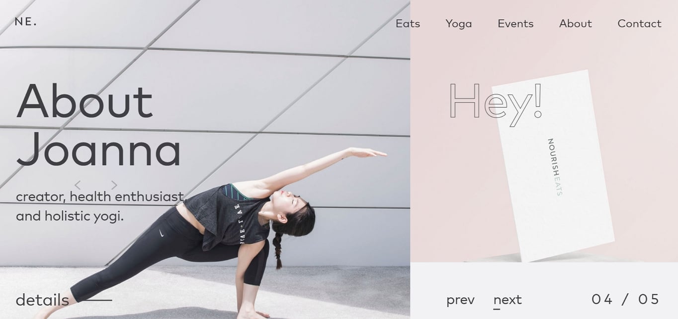
In many ways, the asymmetrical layout is an excellent choice. It is flexible, relatively easy to implement, and less commonly used than many alternatives. It is a convenient way to make your website look different without the headaches of some of the other choices.
11. Gallery Layout
When your visuals do most of the talking, a gallery layout steps back and lets them shine. These layouts use a grid of images with minimal text, putting photography, artwork, or design work front and center.
Gallery layouts are perfect for portfolios, photography sites, and any situation where you want users to browse a collection of visual work. The key is to give each image enough space to breathe while maintaining a consistent structure.
Sites like Dribbble and Unsplash are excellent examples of gallery layouts in action, giving each visual piece equal space in the grid and making it easy for users to browse and discover.
To make gallery layouts more engaging, consider adding hover effects that reveal additional information such as a title, description, or category. This keeps the grid clean while still providing context when users want it.
Like card-based layouts, galleries adapt well to different screen sizes, with the number of columns decreasing as the viewport narrows. The main drawback is that they rely heavily on strong visuals. If your images are inconsistent in quality or style, the layout can look disjointed.
12. Horizontal Strips Layout
This layout breaks up the long scroll of a webpage into full-width horizontal sections, or “strips.” Each strip functions as its own fold, creating a series of distinct visual experiences as the user scrolls down the page.
What makes this approach effective is the sense of anticipation it builds. Each strip can have a different background color, image, or content type, keeping the experience fresh and encouraging users to keep scrolling.
To make each strip stand out, try alternating between different elements: an image-heavy strip followed by a text-focused one, or alternating background colors from your brand palette. You can also add parallax scrolling effects to individual strips to create a sense of depth and motion.
This layout is particularly well suited for one-page websites and long-scroll landing pages. It provides a natural way to organize distinct sections of content (such as features, testimonials, pricing, and a contact form) into a single, cohesive page experience.
The main challenge is ensuring each strip has enough content to justify the space it takes. Strips that feel empty or repetitive can cause users to stop scrolling.
How to Pick a Layout
By reading this article, you have taken your first step in picking the right layout for your site. You have learned what kind of options are available to you.
Next, you need to get a sense of which options might be appropriate for your site. One way of doing this is to look at your competitors. However, I would advise not stopping there. The danger is that you will copy them, and that will always put you one step behind.
Instead, take a look at sites in other sectors that have related types of content to your own. If you have a brochureware website aimed at a B2B audience, have a look at other similar sites. Equally, if you have an eCommerce site, look at eCommerce in other sectors.
From there, work with your designer to experiment with some different approaches. Get them to wireframe some ideas based on different layouts and see what suits your content the best.
If you find yourself unable to make a decision or lack confidence in the right direction, try putting the options in front of some users and get their reactions. Don’t just ask them which they prefer, also ask them whether they spotted critical content or understood what the company was about.
Remember that accessibility should be a key consideration in your layout choice. According to WebAIM’s 2025 Million report, 94.8% of home pages have detectable WCAG conformance failures, so ensuring your chosen layout works for all users is both ethically important and increasingly legally required.
In truth, you will probably find yourself picking and choosing from different layout approaches for different parts of your website, and that is okay. Because when it comes to website layout, using the right one at the right time is critical.
How to Create a Website Layout Mockup
Once you have a sense of which layout types might work for your site, the next step is to create a mockup before committing to a full design. A wireframe is the simplest and most effective way to do this.
What Is a Wireframe?
A wireframe is a simplified visual map of your page. It is not the finished design – it shows the structure, placement, and hierarchy of elements without colors, fonts, or final images. Think of it as the blueprint of your layout.
How to Create a Simple Wireframe
- Define the user journey. Before sketching anything, think about what you want visitors to do on the page. What is the primary goal? Where should their attention go first?
- Start with mobile. Since the majority of web traffic comes from smaller screens, starting with a mobile wireframe forces you to prioritize content. You can then expand the layout for tablet and desktop.
- Sketch the basic framework. Place your header, navigation, main content area, and footer. Do not worry about details yet – focus on the big picture.
- Mark content areas. Indicate where headings, text blocks, images, and calls to action will go. If you know your content ahead of time, you can be more precise.
- Create multiple versions. Even if your first idea feels right, sketch two or three alternatives. The best ideas often emerge after a few iterations.
- Get feedback. Put your wireframes in front of potential users or colleagues. Ask whether they can find key information and whether the flow makes sense.
Tools for Wireframing
You do not need expensive software to create wireframes:
- Pen and paper: The fastest way to get ideas out of your head. No learning curve required.
- Figma: A popular free design tool with wireframe kits to help you get started quickly.
- Whimsical: A lightweight collaboration tool that works well for wireframes and getting team feedback. Has a free plan.
- Balsamiq: Designed specifically for wireframing with a deliberately rough, sketch-like style that keeps the focus on structure rather than visual polish.
Tips for Designing an Effective Layout
Regardless of which layout type you choose, keep these principles in mind:
- Create a clear visual hierarchy. Decide which elements are most important and make sure your layout draws attention to them first. Size, color, contrast, and placement all play a role.
- Use white space generously. The space between elements is just as important as the elements themselves. White space prevents clutter, improves readability, and gives your design room to breathe.
- Design for mobile first. With the majority of web traffic coming from phones, your layout needs to work on small screens before you worry about desktop.
- Keep navigation intuitive. Users should never have to think about how to get around your site. Place navigation where people expect to find it and keep it consistent across pages.
- Test with real users. Watch actual people use your layout. User testing reveals issues that are invisible from the designer’s perspective, such as missed calls to action or confusing content flow.
- Remember the fold. The area visible before scrolling is your first impression. Place your most important content and primary call to action above the fold.
Frequently Asked Questions
What is the most common website layout?
The single column layout and card-based layout are among the most widely used on the web today. Single column layouts dominate blogs and content-focused sites because of their simplicity and mobile friendliness. Card-based layouts are the standard for eCommerce product pages and any site where users need to browse a collection of items.
Can I use more than one layout on my website?
Absolutely. Most websites combine multiple layouts across different pages. For example, you might use a hero layout on your homepage, a content-focused layout for blog posts, and a card-based layout for your product listings. The key is choosing the layout that best serves each page’s content and purpose.
What are the main elements of a website layout?
Most website layouts consist of four core elements: a header (containing the logo and navigation), a main content area, optional sidebars for secondary information, and a footer with supplementary links and information. These elements are arranged differently depending on the layout type, but they provide the consistent structure visitors expect.
How do I make my website layout mobile-friendly?
Start by designing for mobile screens first, then expand the layout for larger devices. Choose layouts that adapt well to narrow screens, such as single column, card-based, or alternating layouts. Avoid layouts that rely on side-by-side elements that cannot easily stack on smaller screens. Test your design on real devices to ensure text is readable, buttons are tappable, and no content gets cut off.