
What is Tailwind CSS (and the v4 note)
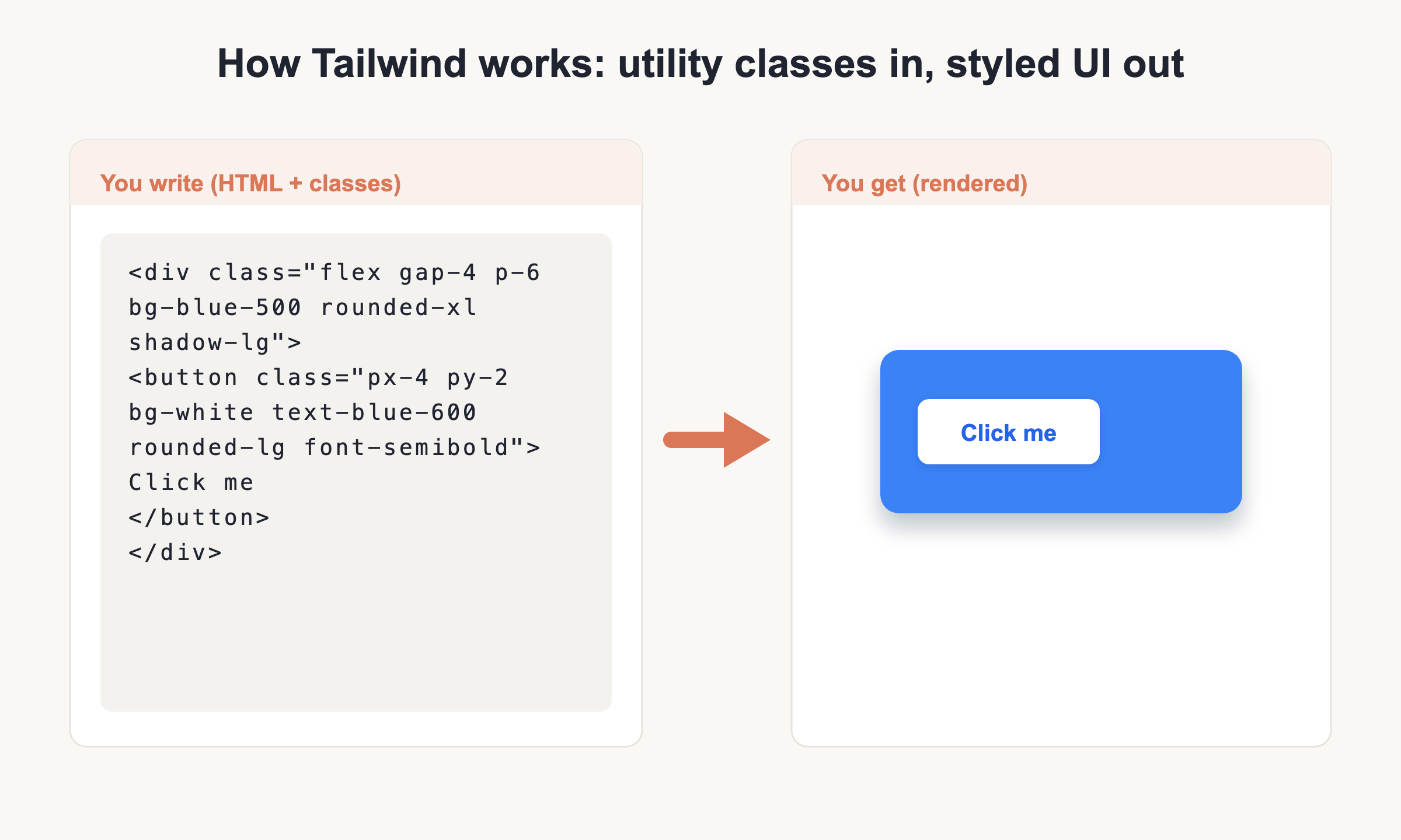
Tailwind CSS is a utility-first CSS framework. Instead of writing custom CSS rules in a separate file, you style elements by composing small, single-purpose classes right in your HTML. A class like p-4 adds padding, text-center centers text, and bg-blue-500 sets a background color. String a few together and the element is styled, no stylesheet switching required.
The current release is Tailwind v4 (v4.3.2 as of 2026). Version 4 changed how you set the framework up, so anything you copy from an old tutorial may not match. This cheat sheet sticks to v4 syntax throughout. New to CSS in general? Start with our CSS cheat sheet to learn the underlying properties, and keep the HTML cheat sheet handy for the markup you will be styling.
Install and set up Tailwind (v4)
Tailwind v4 has a smaller, faster setup than v3. Pick the path that fits your project. For anything you ship to real users, you need a build step: Vite or PostCSS. The browser build is for quick experiments only.
Vite plugin (recommended). Install the package and its Vite plugin, then register it:
npm install tailwindcss @tailwindcss/vite
// vite.config.js
import tailwindcss from '@tailwindcss/vite'

export default {
  plugins: [
    tailwindcss(),
  ],
}
PostCSS. If your toolchain uses PostCSS instead of Vite:
npm install tailwindcss @tailwindcss/postcss postcss
// postcss.config.mjs
export default {
  plugins: {
    "@tailwindcss/postcss": {},
  },
}
The CSS entry is now one line. In your main CSS file, add:
@import "tailwindcss";
That single import replaces the three v3 directives you may have seen: @tailwind base;, @tailwind components;, and @tailwind utilities;. Do not use those in v4.
Browser build (prototyping only). For a quick sketch with no build tools, drop in the script tag:
<script src="https://cdn.jsdelivr.net/npm/@tailwindcss/browser@4"></script>
The old v3 CDN at cdn.tailwindcss.com is deprecated. Use the jsDelivr browser build above for prototypes, and never in production.
Customizing. There is no tailwind.config.js by default anymore. You define design tokens in CSS with the @theme block:
@import "tailwindcss";

@theme {
  --color-brand: #1da1f2;
}
That one variable auto-generates matching utilities like bg-brand and text-brand. Configuration lives in your CSS now, not in a JavaScript file.
Layout
These classes control how an element sits on the page: whether it is a block or flex parent, and how it is positioned.
| What you want | Tailwind classes | Note |
|---|---|---|
| Centered fixed-width wrapper | container mx-auto |
Caps width at each breakpoint, centers it |
| Display type | block inline-block flex grid hidden |
hidden removes it from layout |
| Positioning | relative absolute fixed sticky |
Pair with top-0 left-0 etc. |
| Stacking order | z-10 |
Higher number sits on top |
Flexbox
Turn an element into a flex container, set the direction, then align and distribute its children along both axes.
| What you want | Tailwind classes | Note |
|---|---|---|
| Flex container and direction | flex flex-row flex-col flex-wrap |
flex alone defaults to a row |
| Justify (main axis) | justify-start justify-center justify-between justify-around |
Horizontal spacing in a row |
| Align (cross axis) | items-start items-center items-stretch |
Vertical alignment in a row |
| Gap between items | gap-4 gap-x-2 |
gap-x spaces columns only |
Grid
CSS Grid gives you rows and columns. Define the track count, then let items span or start at specific lines.
| What you want | Tailwind classes | Note |
|---|---|---|
| Grid container | grid |
Then add a column count |
| Column count | grid-cols-3 grid-cols-12 |
12 is handy for classic grid layouts |
| Span and start | col-span-2 col-start-1 |
An item can cover multiple columns |
| Rows and gaps | grid-rows-3 gap-4 |
gap works on grid too |
Spacing
Padding is inside the border, margin is outside. Tailwind uses one scale for both, and each step equals 0.25rem, so p-4 is 1rem.
| What you want | Tailwind classes | Note |
|---|---|---|
| Padding | p-4 px-6 py-2 pt-4 |
px = left+right, py = top+bottom |
| Margin | m-4 mx-auto -mt-2 |
Prefix with - for negative margin |
| Space between children | space-x-4 space-y-2 |
Adds gaps without touching each child |
Sizing
Set width and height with fractions, fixed steps, or viewport units. Use size-* when you want both dimensions equal.
| What you want | Tailwind classes | Note |
|---|---|---|
| Width | w-full w-1/2 w-64 w-screen |
Fractions, scale steps, or full viewport |
| Height | h-full h-screen |
h-screen is 100% of the viewport |
| Min and max | min-w-0 max-w-lg |
Constrain content width |
| Both at once | size-10 |
Sets width and height together |
Typography
Control size, weight, alignment, line height, and letter spacing, then set text color from the built-in palette.
| What you want | Tailwind classes | Note |
|---|---|---|
| Font size | text-sm … text-9xl |
Named steps, not raw pixels |
| Weight | font-normal font-medium font-semibold font-bold |
|
| Alignment | text-center text-left text-right |
|
| Line height and tracking | leading-tight leading-6 tracking-wide |
Line height and letter spacing |
| Color | text-gray-700 text-blue-500 |
Any hue and shade |
Backgrounds and gradients
Set solid backgrounds with bg-*. Gradients were renamed in v4: use bg-linear-to-r where v3 had bg-gradient-to-r.
| What you want | Tailwind classes | Note |
|---|---|---|
| Solid background | bg-white bg-blue-500 |
|
| Gradient direction | bg-linear-to-r bg-radial bg-conic |
v3 used bg-gradient-to-r |
| Gradient stops | from-blue-500 to-cyan-400 |
Add via-* for a midpoint |
Borders and radius
Add borders on all or selected sides, round corners, and draw dividers between stacked children.
| What you want | Tailwind classes | Note |
|---|---|---|
| Border width and side | border border-2 border-t |
border is 1px on all sides |
| Border color | border-gray-300 |
|
| Rounded corners | rounded rounded-lg rounded-full |
rounded-full makes pills and circles |
| Dividers | divide-y |
Lines between child elements |
Effects
Add depth and focus cues with shadows, opacity, rings, and blur.
| What you want | Tailwind classes | Note |
|---|---|---|
| Shadow | shadow shadow-md shadow-lg |
Bigger suffix = deeper shadow |
| Opacity | opacity-50 |
0 to 100 scale |
| Focus ring | ring-2 |
An outline that ignores box size |
| Blur | blur-sm |
Colors and the scale
Tailwind ships 22 built-in hues, such as slate, gray, red, and blue. Each hue has shades from 50 (lightest) through 900 and 950 (darkest). You apply them as {utility}-{color}-{shade}.
| What you want | Tailwind classes | Note |
|---|---|---|
| Background color | bg-blue-500 |
Mid shade of blue |
| Text color | text-gray-700 |
|
| Shade range | 50 100 200 ... 900 950 |
Low is light, high is dark |
Responsive breakpoints
Tailwind is mobile-first. An unprefixed class applies everywhere, and each breakpoint prefix is a min-width that kicks in on wider screens. So md:flex lg:grid-cols-4 becomes flex at 768px and a four-column grid at 1024px.
| What you want | Tailwind classes | Note |
|---|---|---|
| Small and up | sm: |
640px |
| Medium and up | md: |
768px |
| Large and up | lg: |
1024px |
| Extra large and up | xl: 2xl: |
1280px and 1536px |
State variants
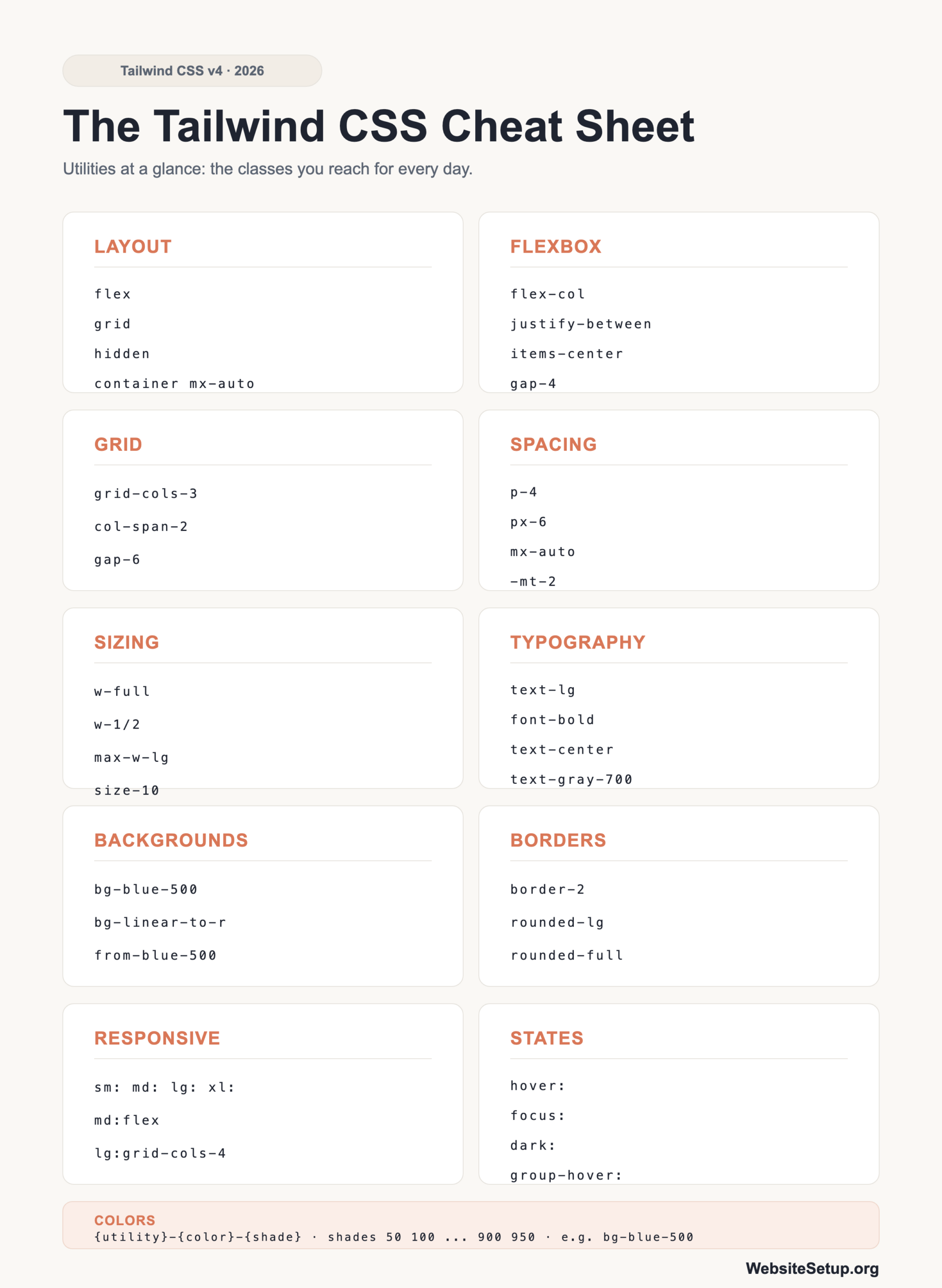
Prefix a class with a state and it only applies in that state. This covers interaction, form status, dark mode, and structural position.
| What you want | Tailwind classes | Note |
|---|---|---|
| Interaction | hover: focus: active: |
e.g. hover:bg-blue-600 |
| Form and accessibility | disabled: focus-visible: |
|
| Parent-driven and theme | group-hover: dark: |
group-hover reacts to a parent |
| Structural position | first: last: odd: |
Target items by their place in a list |
Transitions and transforms
Animate property changes smoothly, and move, scale, or rotate elements without leaving your HTML.
| What you want | Tailwind classes | Note |
|---|---|---|
| Transition | transition transition-all duration-300 ease-in-out |
Duration is in milliseconds |
| Scale and rotate | scale-110 rotate-45 |
Often paired with hover: |
| Translate | translate-x-2 -translate-y-1 |
Negative values move up or left |
| Built-in animation | animate-spin |
Good for loading spinners |
Arbitrary values
When no built-in utility gives you the exact value, use square brackets to pass one straight through. This works for lengths, colors, grid templates, and more.
| What you want | Tailwind classes | Note |
|---|---|---|
| Exact position | top-[117px] |
Any CSS length |
| Exact color | bg-[#1da1f2] |
One-off hex without a theme token |
| Custom grid | grid-cols-[1fr_500px] |
Use _ for spaces |
| Exact font size | text-[14px] |
Tailwind v4 vs v3 gotchas
If you learned Tailwind on v3, a handful of changes will trip you up. Here are the ones that matter most.
| What you want | Tailwind classes | Note |
|---|---|---|
| Configuration | @theme { ... } |
Moved from tailwind.config.js to CSS |
| Content detection | automatic | No content: [] array to maintain |
| Conflicting classes | p-2 p-4 |
Order in the generated stylesheet wins, not the class attribute |
| Force important | !p-4 |
The ! modifier adds !important |
Two more things to keep in mind. The browser build is for prototyping only; production needs a build step through Vite or PostCSS. And v4 targets modern browsers only, meaning Safari 16.4+, Chrome 111+, and Firefox 128+.
Download the Tailwind CSS Cheat Sheet (PDF)
Want this reference offline? Grab the printable PDF below and keep it next to your editor. It fits the whole v4 utility set on a few pages, so you can scan for the class you need without breaking flow.
Download the Tailwind CSS Cheat Sheet (PDF)
Related cheat sheets and FAQ
Building your first site from scratch? Our guide on how to create a website walks through the whole process. Pair Tailwind with the fundamentals and you will move faster.
Is Tailwind v4 different from v3? Yes. The big shifts: configuration is CSS-first through @theme instead of a JavaScript config file, setup is a single @import "tailwindcss"; line, and content detection is automatic so you no longer list your template files.
Do I need to write any CSS with Tailwind? Mostly no. You compose utility classes for the bulk of your styling. For custom design tokens or repeated patterns, you can reach for @theme and @apply, but most days you stay in the HTML.
Is Tailwind better than Bootstrap? They aim at different things. Tailwind is utility-first and unopinionated, so you assemble your own components. Bootstrap ships ready-made components like navbars and modals. If you prefer prebuilt pieces, see our Bootstrap cheat sheet.
Can I use Tailwind without a build step? Only the browser build, and only for prototyping. Anything you ship should run through Vite or PostCSS so unused classes are stripped and the output stays small.