When creating a website, there’s a lot of factors to consider. For example, it’s especially important to ensure your site is user-friendly for all people equally. This is where website accessibility practices come into action.
So what exactly is website accessibility?
It’s a practice of guaranteeing sites to be equally available to people with disabilities. Meaning, they will have similar access to the goods and services those sites provide. Website accessibility is an integral part of professional web design and development.
In this guide, we will cover 15 of the most common practices that improve website accessibility.
Why Should You Care About Accessibility?
There are many reasons why developers, designers, and their employers/clients should ensure that accessibility is an early and integral part of the process of web development:
- In many territories, such as the USA, EU, UK, Israel, and Japan, it’s a legal requirement not to discriminate against people due to their disability. In the USA, 2,235 new ADA Website lawsuits were filed in federal court in 2019. That’s one per hour.
- Accessible sites tend to be better coded, more robust, and rank well on search engines.
- Inaccessible sites are bad for business. In 2019, a UK survey found that more than 4 million people abandoned a retail website because of the accessibility barriers they found.
- It’s bad business to voluntarily turn away potential customers.
Most Common Errors on Top Million Home Pages
We’ve looked at the top barriers to eCommerce sites as reported by users with some form of impairment. Now let’s look at a much broader set of sites— the home pages for the top 1,000,000 websites, automatically analyzed by WebAIM in August 2019. 98% of the pages analyzed had at least one error.
The most common errors are
- Low contrast text (86.1%)
- Missing alternative text for images (67.9%)
- Empty links (58.9%)
- Missing form input labels (53.2%)
- Missing document language (30.5%)
We’ve dealt with low contrast, links, and form inputs above. Now let’s look at how we can avoid the other very common errors.
How to Improve Website Accessibility (15 Best Practices)
It’s a checklist of the most common errors that people with disabilities say are their main blockers, with practical suggestions to resolve the problems.
Firstly, note that none of the top 5 are technical issues — they’re a design or copywriting errors.
1) Too Much Content
It’s well-known that as the number of choices increases, so does the effort required to collect information and make good decisions. It’s the same with too much content—it soon becomes overwhelming.
So:
- Have only one <h1> on a page.
- Use sub-headings liberally; it breaks up a ‘slab’ of text for sighted users, while users of assistive technologies such as screen readers can use a short-cut key to jump between headings or obtain a mental map of the content from the heading structure.
- Don’t skip a level of headings. For example, if you use an <h3>, make sure it is preceded by an <h2>.
- Use bulleted lists marked up correctly in HTML as <ul>, <li>. Screen readers will announce “List of 10 items” (and allow the user to jump over them).
Use Plain English
Monzo Bank’s “Our tone of voice” guide explains the importance of plain language:
In 2010, US attorney Sean Flammer ran an experiment. He asked 800 circuit court judges to side with either a traditional ‘legalese’ argument or one in what he called ‘plain English’.
The judges overwhelmingly preferred the plain English version (66% to 34%), and that preference held no matter their age or background.
Flammer notes (PDF) of the plain English version:
It’s shorter by almost a page, so it obviously eliminates unnecessary sentences and words. Its sentences average 17.8 words, as opposed to 25.2 words.
So basically, if you want to please your reader, write in plain English.
2) ReCAPTCHA
ReCAPTCHA is a free service from Google that helps protect websites from spam. It should be easy for humans to solve but hard for bots and other malicious software to figure out.
However, the old reCAPTCHA version was something that many users were struggling with:
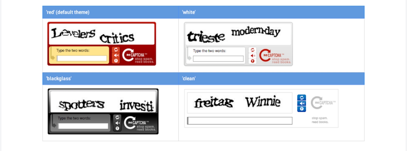
Luckily the style of the wobbly letters of reCAPTCHA is now deprecated.
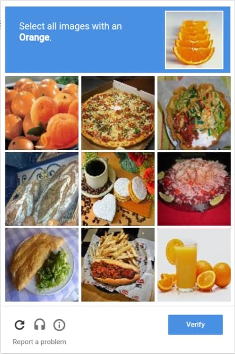
It’s much more common to see a newer incarnation called “No CAPTCHA reCAPTCHA” (also known as the “I’m not a robot” Checkbox) which requires the user to check a box confirming they’re not a robot. If they pass, no further interaction is required. However, if they fail, a further challenge will be displayed:
The most accessible form of reCAPTCHA is reCAPTCHA v3 which requires no user interaction, but needs you to do more work to deal with visits that fail the test:
It is a pure JavaScript API returning a score, giving you the ability to take action in the context of your site. For instance requiring additional factors of authentication, sending a post to moderation, or throttling bots that may be scraping content.
3) Poor Readability
Here are some of the best ways to make your text legible:
- Ensure adequate contrast. One of the most common access blockers on the web is the poor contrast between text and background. The W3C guidelines require a contrast ratio of at least 4.5:1, except for large-scale text and images of large-scale text which should have a contrast ratio of at least 3:1 (logos and ‘incidental’ text are exempt). There are many utilities that can measure contrast ratios for you; for example, Ada Rose Cannon’s contrast widget.
- Don’t have all-capital headings. There’s evidence that they are harder to read because capital letters are all the same height, so we can’t recognize the shape of common words. Additionally, some screen readers will spell out groups of capital letters as if they were abbreviations (like BBC, DOJ, etc). If you must have all capital headlines, write them in a normal case in your HTML and transform them with CSS
text-transform: uppercase. - Left-align text. (For pages in right-to-left languages like Arabic or Hebrew, right-align text.) Don’t justify it, as this makes it harder for people with dyslexia to read. The British Dyslexia Association’s style guide also suggests using sans serif fonts, like Arial and Comic Sans, as letters can appear less crowded. Alternatives include Verdana, Tahoma, Century Gothic, Trebuchet, Calibri, Open Sans.
4) Distracting Images and Graphics
The most basic level of WCAG requires “For any moving, blinking or scrolling information that (1) starts automatically, (2) lasts more than five seconds, and (3) is presented in parallel with other content, there is a mechanism for the user to pause, stop, or hide it unless the movement, blinking, or scrolling is part of an activity where it is essential”.
Distraction is an annoyance – especially for people with ADHD or other cognitive impairments. But movement and flashing can also cause seizures, so the WCAG guidelines require that content should not flash more than three times in any one-second period.
Respect User’s Choice for Animations
All major operating systems allow the user to express a preference for reduced motion on-screen—perhaps because they have motion-triggered vestibular spectrum disorder. Your website can detect whether the user has done this with the CSS prefers-reduced-motion media query.
Here, we only allow a button to animate if the user has expressed no preference:
/*
@media (prefers-reduced-motion: no-preference) {
button {
  /* `vibrate` keyframes are defined elsewhere */
  animation: vibrate 0.3s linear infinite both;
  }
}
If you’re looking to retrofit a site that has many animation rules, the following may stop all previously declared CSS animations:
/*
@media (prefers-reduced-motion: reduce) {
*,
*::before,
*::after {
  animation-duration: 0.001s !important;
  transition-duration: 0.001s !important;
  scroll-behavior: auto !important;
  }
}
The HTML picture element allows us to show a static image rather than an animated GIF to users who express the preference for reduced motion:
/*
<picture>
  <source srcset="no-motion.jpg" media="(prefers-reduced-motion: reduce)">
  <img srcset="animated.gif" alt="brick wall">
</picture>
On the subject of respecting the user’s operating system preferences, you may want to consider designing your website for dark mode.
5) Poor Link Information
One of the main causes of poor links is often poor copywriting. Most screen readers allow the user to quickly see a list of links on a page (in the most-used commercial screen reader, JAWS, the keyboard shortcut is Ins + F7; in the free NVDA screen reader, the same keyboard shortcut brings up an Elements List that lists page links, headings, and landmarks).
However, if every link has text saying “Click here” or “Read more”, with nothing else to distinguish them, this is useless.
The easiest way to solve this is simply to write unique link text, but if that isn’t possible, you can over-ride the link text for assistive technology by using a unique aria-label attribute on each link.
Here’s a good example from the Joomla website:
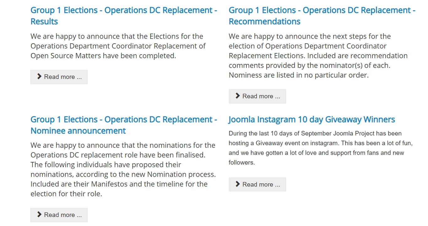
The visible link text is simply “read more”, but Joomla uses aria-label attributes to make each unique to assistive technology:
/*<a href="joomla-group-2-president-election-results.html" aria-label="Read more: Joomla Group 2 - President election results">Read more</a> <a href="forum-for-the-future-re-engage-re-ignite-stream.html" aria-label="Read more: Forum for the Future: Re-Engage & Re-Ignite Stream">Read more</a>
Because of the aria-label text will be used instead of the link text by assistive technologies, W3C recommends starting the text used in aria-label with the text used within the link as “this will allow consistent communication between users”.
Note: It’s not recommended to add explanatory text on links using the title attribute:
/*
<a href="results.html" title="click here to read more about the election results">Read more></a>
Don’t do this. The title isn’t exposed to most screen readers(developers used to stuff it with keywords for “SEO” purposes, so screen reader vendors disabled it by default), and browsers present title attributes as ‘tooltips’ which are only available to mouse users on hover.
Links Should Look Like Links
By default, browsers underline links. It’s best not to change this, but if you lose a fight in the car park with the designer about this, the link text must have a 3:1 contrast ratio from the surrounding non-link text and should give some ‘non-color designator” that they are a link when hovered or focussed, for example:
/*a:hover, a:focus {text-decoration: underline;}
The focus style causes the link to become underlined when a non-mouse user focuses on it from the keyboard, stylus, or voice input. Generally, whenever something on a page has a hover style, it should also be given a focus style.
The ‘non-color designator’ (in our case, an underline) ensures that visitors with low vision or color blindness will see the change on hover or focus. (Screen readers automatically announce “Link” before link text.)
Tell People If Link Opens a New Tab/ Page
It can be confusing to a visitor if activating a link opens a new tab or a new window, particularly if only some links on a page do this (for example, only external links open a new tab). If you must do this, you should alert the user either in the link text, or using the aria-label method above.
Tell People If Link Is to a File
If a link is to a file (for example, a PDF or a video), tell the user in the link text. Don’t hide it in aria-label, as this can be useful for many sighted users (some mobiles can’t open a .docx file, for example). If it is a large file, consider alerting the user of the approximate size; they may not wish to download a large video file over 3G. You can also use the download attribute, which causes the browser to open the operating system’s native file download dialogue. Putting this all together, the code will look like this:
/*<a href="big-report.pdf" download>Annual report (PDF, 240 MB)</a>
6) Another Design Error: Removing the Focus Ring
We’ve mentioned :focus styles before. They are an invaluable visual indicator for those people who can’t use a mouse for whatever reason: perhaps they have RSI, or Parkinson’s or Multiple Sclerosis. However, some people consider this aesthetically displeasing when they’re using a mouse and turn it off with CSS, thereby leaving the site inaccessible to keyboard users.
Enter a new standard, pioneered by Firefox, called :focus-visible. This will apply a focus ring to an element if it has been reached by a keyboard or a non-mouse pointing device but show nothing to mouse users. As it’s only supported in Firefox (at time of writing), Patrick Lauke suggests the following CSS to play nicely with all browsers:
/*
button:focus { /* some exciting button focus styles */ }
button:focus:not(:focus-visible) {
  /* undo all the above focused button styles
  if the button has focus but the browser wouldn't normally
  show default focus styles */
  }
button:focus-visible { /* some even *more* exciting button focus styles */ }
7) Form Filling
Given the vital importance of forms to eCommerce sites, it’s astonishing how many inaccessible forms there are. Often this is because old browsers didn’t allow much in the way of styling form elements, so developers faked them with other HTML elements. Modern browsers allow attractive checkboxes, radio buttons, custom select components and comboboxes, accessible autocomplete controls, and more.
Autofill Is Your Friend
Allowing browsers to auto-fill forms requires visitors to do less, so they’re more likely to complete a form and sign up/buy your product. Autofill on Browsers: A Deep Dive is a great article by eBay about this (and they should know).
Also, autocomplete is the only sufficient technique currently for achieving AA compliance with Success Criterion 1.3.5: Identify Input Purpose.
Make Form Fields Look Like Form Fields
By default, browsers display form input fields as boxes. By all means, style these with margins, padding, and borders, but keep them as boxes. Many designers followed Google’s pre-2017 Material Design pattern of using a single line for the user to input text:
However, Google found that the line under the old text fields was not clear to some users, often confused with a divider, and changed the design. In a usability test with 600 participants, they discovered that enclosed text fields with a box shape performed better than those with line affordance.
If you are considering adopting Google’s full Material Design UI library, read Stop using Material Design text fields! to see whether it meets your needs.
Label All Form Fields
All form fields (text inputs, checkboxes, radio buttons, sliders, etc) need to be labeled. The best way to do this is to use an HTML <label>
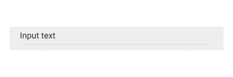
Here’s a demo of an unlabelled form field vs a labeled form field. They look identical, but the top one doesn’t have a proper label, whereas the second one does. Click into the text label of the bottom one, and you’ll see that it focuses on the associated input.

This makes focusing an input much easier for someone with motor control difficulties – or maybe for you, trying to check a tiny checkbox on a small screen on a bumpy train.
It’s also vital for screen reader users who will tab through fields in a form (by default, only links and form fields are focusable by tabbing); when they tab into an input field, the screen reader will announce the contents of the associated label.
The code for this is simple. The input field is given a unique ID, and the label is associated with it using the for attribute:
/*
<label for="colour">What's your favourite colour?</label>
<input id="colour">
Hiding Labels
Occasionally, you might not want a visible label. Or the designer doesn’t, and you don’t want another fight in the car park. Anyway, here’s an example when a label saying “Search” preceding the input feels like overkill.
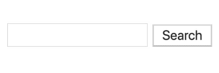
We can associate the input field with the text “Search”, which is the contents of the submit button using aria-labelledby:
/*
<input type="text" aria-labelledby="searchbutton">
<button id="searchbutton" type="submit">Search</button>
We could have used aria-label (which we met earlier when talking about links):
/*
<input type="text" aria-label="Search">
But it’s always better to prefer visible text on a page because that will be translated if the page is run through a translation tool, whereas text “hidden” in HTML attributes won’t be. (Hat-tip to Adrian Roselli for this tip, from his article My Priority of Methods for Labeling a Control.)
8) Provide Text Alternatives for All Images, Video, and Audio
Every <img> must have alternative text (“alt text”) which can be communicated to visitors with visual impairments or those with low bandwidth/expensive data plans who have turned images off in their browsers. This includes images of text.
Here are the basic rules:
- If the image is purely decorative, it must have empty alt text:
alt="". (But purely decorative images should probably be in CSS, anyway.) - If an image is described in body text it should have empty alt text (
alt=""), to avoid repetition. But be careful if it’s<img>in a<figure>– see How do you figure? for more. - If an image is the only content of a link (for example, your organization’s logo can be clicked to go to the homepage) the alternate text should describe the destination of the link. For example,
alt="home page". - Don’t use icon fonts; they can be really bad for dyslexic people. If you do use them, convert them to SVG.
Video and Audio Alternate Text
Don’t forget that audio content needs alternative text for people with hearing impairments. That means transcripts of podcasts, subtitles on videos, and (if appropriate to your media) Audio Description: narration used to provide information surrounding key visual elements in media work.
And, again: don’t autoplay media.
9) Add Proper Document Language
Approximately 30% of home pages don’t declare the language they’re written in, which can make them confusing for screen reader users. This is important because the word “six” is pronounced very differently if the sentence is in English or French, for example.
It’s easy to solve this by adding a lang attribute to your HTML element:
/*<html lang="en">
The “en” tells a screen reader (or translation software) that this page is in English. “es” is Spanish, “fr” is French, and so on. For most languages, the language tag is pretty easy to determine. The W3C has a guide to Choosing a Language Tag.
If the page contains content in a language other than its main declared one, add a language attribute to an element surrounding that content. For example, in a page declared to be English:
/*If you'd like to chat a <span lang="es">matador</span>, in some cool <span lang="es">cabana</span>
And meet <span lang="es">senoritas</span> by the score, <span lang="es">Espana por favor</span>
10) Help a Visitor Get Around Your Content
When a sighted visitor comes to your page, they can easily visually scan it to understand where the navigation is, and where the main content begins. A screen reader user can’t do this.
However, HTML5 gives us some new tags to mark these areas, and assistive technologies have shortcuts that can skip to (or skip over) landmarks like header, footer, navigation and the like.
Here’s what you can do:
- Wrap your main content, that is, stuff that isn’t header, primary navigation or footer, in a
<main>element. In almost all cases, there should only be one<main>per page. All browsers (IE9+) allow you to style it, and assistive technologies know what to do with it. - Wrap your header (brand logo, strapline, the heading of the page) in a
<header>element. - Wrap your footer (legal stuff, contact details, copyright notice, etc) in a
<footer> - Mark up your primary navigation using
<ul>wrapped in a<nav>element. This can be nested inside the<header>if that fits the visual design of the page. - Advertising and non-essential content should be wrapped in an
<aside> - If you have more than one product/video/news item/blog post on a page, wrap each of them in an
<article>element.
In its survey of screen reader users, WebAIM found that 26% of screen reader users frequently or always use these landmarks when navigating a page.
Additionally, wrapping discrete pieces of content in <article> helps Apple’s WatchOS display content optimally.
11) Use HTML Properly
A common theme in this article has been using the correct HTML elements.
For example, label has a built-in browser behavior that focuses its associated input field; <main> is preferable to <div class="main"> because it allows screen reader users to jump straight to the important content while being entirely unobtrusive to those who don’t use a screen reader.
Another example is using a <button> for buttons, instead of faking them with loads of nested <div>. <button> can be styled to look more or less as you want. But the killer feature is that, by default, a real button is focusable with the keyboard, and can be activated with a space bar or enter key. A fake button must replicate those built-in behaviors, making your code more brittle and less maintainable.
12) Complex Interactions
Sometimes you might be asked to code complex widgets that don’t have native HTML equivalents.
First, you should consider whether they can be simplified into native HTML interactions. If not, you’ll need to enter the murky world of JavaScript and ARIA. Luckily, the WAI-ARIA Authoring Practices is full of examples of accessible Tree Views, multi-thumb sliders, and more.
Don’t reinvent the wheel; use these. However, not all the examples are good; despite what the guidance says, don’t use ARIA menu roes for site nav, and don’t use ARIA grid unless you’re trying to recreate Excel.
13) Frameworks
Increasingly, frameworks such as React and Vue are used to create web pages. There is nothing inherent in such frameworks that prohibits accessibility, but often the components that developers choose are not written using correct HTML tags, nor tested with assistive technology.
It doesn’t need to be this way. Marcus Herrmann writes “I got the impression that more and more React component systems built with accessibility in mind are emerging.”
For React, these look promising:
- Design System of Australian Government
- Reakit “strictly follows WAI-ARIA 1.1 standards. All components come with proper attributes and keyboard interactions out of the box”
- Reach UI “is tested with Safari + VoiceOver, Firefox + NVDA, and Edge + JAWS. As the project matures we’ll get it audited by WebAIM to ensure that if you pick Reach UI, your app has a solid, accessible foundation.”
For Vue:
- Vuetensils “Follows WAI-ARIA authoring practices for accessibility baked in; semantics, ARIA attributes, roles, etc.”
- Tournant UI and Vue a11y are small but growing.
ING bank open-sourced its internal component library, a project called Lion, which can be used with any (or no) framework.
Lion is a white-label, open-source, framework-agnostic component library, and can be the foundation for your codified in-house Design System. It’s built from the ground up to allow for accessibility and extendability as we learned that these things are almost impossible to change/achieve at a later point in development.
Please note you should always conduct your own review of third-party software: just because a library or utility is popular doesn’t mean it’s accessible—for example, Typeform is still inaccessible.
Adrian Roselli wrote an invaluable Basic Custom Control Requirements which you can use to evaluate any component library you are considering adopting.
14) Content Management Systems and Site Builders
The major open-source CMSs, WordPress, Joomla, and Drupal, all have the potential to produce accessible sites, although the quality is very dependant on the site creator choosing accessible themes and plugins.
Of the hosted Site Builders, avoid Weebly since it’s not accessible. Both Squarespace and Wix are capable of creating accessible sites. However, you have to be looking to do so, since it’s not going to happen by default.
15) PDF
Strictly speaking, PDF is not a web technology, although PDF documents are often delivered from web pages.
According to Adobe, many features found in formats like HTML, such as alternative text for images, headings for tabular data, labels for form controls, and many more are fully supported by the PDF specification. Users of popular assistive technologies are able to use their tool of choice and access information contained in PDF files.
You can make tagged accessible PDFs from HTML and CSS with a library called Prince—it’s free for non-commercial use.
Keep Testing Website Accessibility
As with any other development, you should always test your pages before making them live. A simple test plan might look like this:
- Validate your HTML.
- Test the color contrast.
- Can you navigate around the page, using only the keyboard, and see where your focus is throughout?
- Can you fill in and submit forms using only the keyboard?
- Link to Heydon Pickering’s revenge.css which puts pink error boxes (with messages in comic sans) everywhere you write bad HTML. (Don’t worry, you won’t forget to remove it before you make the page live.)
The BBC has open-sourced its BBC Accessibility Standards Checker. Google Lighthouse (now available as a Firefox extension) and Tenon.io are also very good.
No automated tool can be completely reliable, as the article Building the most inaccessible site possible with a perfect Lighthouse score demonstrates.
The best way to test the accessibility of your site is to test with real people with a range of disabilities. Peter van Grieken wrote a useful list of things to consider when doing usability testing with disabled people.
Additional Documentation
- The single source of truth is Web Content Accessibility Guidelines (WCAG) 2.1 from W3C.
- UK’s Government Digital Service has a good readable Understanding WCAG 2.1 guide.
- For advanced applications requiring ARIA, I find W3C’s Using ARIA is invaluable.
- A magnificent book on developing accessible forms is Form Design Patterns by Adam Silver.
- A superb book on developing inclusive user interfaces is Inclusive Components by Heydon Pickering.
- Finally, Moritz Gießmann has a nice single-page Accessibility Cheatsheet that you can keep on your noticeboard.
To all the people whose articles and research referenced or linked to: thank you for the work you do for the web community and disabled community, and thank you for so generously sharing it to make the world a better, more equal place.