In 2021, there were globally at least 2.2 billion people who had a near or distance vision impairment.
Why is it important to create websites for visually impaired people?
In the past, to read a newsletter, magazine, or another type of content, visually impaired people had to either find an audio version, use the braille system, or have someone read it out loud. Today, thanks to the internet, people with disabilities have easier options.
For example, blind people can use screen reader software, people with motor disabilities can use assistive devices, and deaf or hearing-impaired people can use multimedia captions and transcripts to access content on the web.
Despite this, web accessibility often gets put on the backburner when creating a website when it should be a priority. As a result, the internet’s potential remains largely unavailable to people with disabilities.
Table of Contents:
- The Importance of Web Accessibility and Web Design for Those With Disabilities
- 3 Tools the Visually Impaired Use to Surf the Web
- Common Issues Visually Impaired People Experience When Navigating the Web
- How To Make Your Website Accessible for Blind and Partially Sighted People
- Wrapping Up: Creating a Website That Is Accessible to All
- Additional Blind Web Accessibility Resources
The Importance of Web Accessibility and Web Design for Those With Disabilities
Before going into how to make your website accessible for visually impaired people, we’ll explain the importance of web accessibility as a whole, along with its many benefits.
Designing your website with web accessibility in mind is not only a legal obligation and the right thing to do, but it’s also good for website and business performance. Here are the most important reasons why you should make your website accessible:
Ethical Reasons
The first reason comes down to ethics. As a business, it’s your responsibility to provide equal access to your website to people with disabilities. An accessible website helps people with impairments participate actively in society.
The internet has become a fundamental part of modern life, and to gain full access to information and resources, one needs to be able to access the internet. But not all people have equal abilities to access the web. In addition to that, for some people with disabilities, it’s easier to communicate and do business online rather than in person.
Legal Compliance
Web accessibility is a legal requirement in many countries. In the U.S., the Workforce Rehabilitation Act of 1973 requires that information and communications technology provided by federal agencies is accessible to people with disabilities.
If users with impairments are unable to access important information because your website isn’t accessible, they can sue your company for digital discrimination. In 2018, approximately 2,250 lawsuits were filed in federal court in the U.S. alone.
Enhanced Brand Reputation
Making your website accessible will make your brand come through as socially responsible and show that your company cares for others. This will improve your brand image among your entire audience, ultimately resulting in more sales.
Research has found that 62% of consumers prefer to buy from companies that stand for issues that reflect their values — and walk away from those that don’t. Ensure your website and company are socially responsible by prioritizing website accessibility.
Access to a Large Market
It’s reported that one in four U.S. adults has a disability. Even if people with disabilities are not your primary customers, they’re most likely part of your audience.
Do you think these consumers would buy from a website that is not accessible and difficult to use? More than 80% of people with disabilities don’t trust a service provider because of problems, mainly caused by unsatisfactory web accessibility. A survey study in the U.K. found that, in 2019, 4 million people abandoned a retail website because of accessibility difficulties — resulting in a loss of £17.1 billion (almost $24 billion).
Also, keep in mind that internet users using assistive devices have huge purchasing power (more than $350 billion in the U.S. alone). By targeting this market effectively, you are putting your business in front of an audience that is often willing to pay more for a premium service.
Improved SEO and User Experience
Web accessibility best practices coincide with those for SEO, mobile web design (e.g., speed), and usability (ensuring your website is easy to use).
For example, adding alt text to images and transcripts to videos are best practices for both web accessibility and SEO.
Web accessibility also requires you to have your website extremely well organized in terms of navigation structure, titles and headings, content, and more. This will improve not only your SEO efforts but also the overall user experience and usability of your site.
Finally, a web accessibility best practice is having clean code. This will result in an overall better website, with fewer bugs and a faster load time.
While in this guide we focus on how to build a website for the visually impaired, keep in mind that web accessibility must include elements that target all types of disabilities, as well as people without disabilities that have other impediments. The main categories of disability are:
- Auditory (including deafness and hard-of-hearing)
- Cognitive (including learning disabilities, distractibility, and inability to remember large amounts of information)
- Visual (including blindness, low vision, and color‑blindness)
- Motor (including Inability to use a mouse, slow response time, and limited fine motor control)
- Neurological
- Physical
- Speech
An accessible website should also be designed for the elderly, people with temporary disabilities or situational limitations, people with slow internet connections, and people using different devices, like mobile phones or tablets.
3 Tools the Visually Impaired Use to Surf the Web
The process of making your website accessible will be more concrete if you understand how visually impaired people navigate your site. Here are the most common tools the visually impaired use to surf the web:
1. Screen Readers
Screen readers are software programs that convert text and other content on a website into synthesized speech and allow users to access content in different ways. Users can let this device read everything from top to bottom, one line at a time, heading by heading, link by link, and more.
Some of the most common screen readers are JAWS, NVDA, and VoiceOver. These devices can also be used by those who are both deaf and blind using a Braille system device that converts text into Braille. Smartphones and tablets have built-in screen readers used with touch or swipe gestures.
2. Special Browsers
Special browsers, such as WebbIE, EIA, and PnC Net are designed specifically for visually impaired users. These can detect the structure of a web page and pass the information to the user accordingly.
The downside of special browsers is that they’re not as developed as popular browsers (like Google Chrome or Safari), so they may not support some new features, like integrations with apps and extensions, and availability on all types of devices.
3. Screen Magnifiers
Not all visually impaired people need a speech device to access the internet. Some of them — for example, those with low vision — will either use screen magnifiers or built-in device features to improve readability.
There is a downside to these: without a webpage structure that is designed for this use, the relationships between items on a page can be lost and users will only see part of the screen at a time.
Common Issues Visually Impaired People Experience When Navigating the Web
To understand the issues that visually impaired people face online, it’s important you know who visually impaired people are. Visual disabilities fall into three main categories:
- Some people have irreversible visual disabilities — total lack of vision is the extreme end of the blindness scale. Most “legally blind” people (with a visual field of 20 degrees) do have some vision.
- eople with low vision (which is most common among the elderly) are those whose vision cannot be corrected to near 20/20.
- People with a color-blindness disability (also known as color vision deficiency) are unable to see colors in a normal way.
WebAIM conducted an accessibility evaluation of 1,000,000 homepages and found that 97.4% of them had detectable Web Content Accessibility Guidelines (WCAG) 2.0 failures (in particular, in order of prevalence, these were low contrast text, missing alt text for images, empty links, missing form input label, empty buttons, and missing document language).
These are some of the most common issues that visually impaired people face on a website:
Areas Not Accessible Via The Screen Reader
Some types of content, like visuals, tables, and graphics, are not easily accessible by screen readers. Take data tables as an example. Without using specific HTML tags, a screen reader can’t understand the relationship between elements on rows and columns.
The same goes for images. While screen readers are very powerful tools for visually impaired people, they cannot analyze images to extract meaning. To understand visual content, these devices need alternative text.
Similarly, interactive elements (like menus, mouseover information, collapsable text, and media players) need to be properly marked using the appropriate HTML element.
Page Content Not Structured With Headings
While a user without visual disabilities can scan a web page and understand how the page is organized based on layout, proximity, or visual design, a screen reader can’t. Only through proper structure with relevant headings and code associations can visually impaired people have a comparable web experience.
Headings Not Following a Structure
A logical and semantic sequence in headings is fundamental for screen reader users.
In order to find relevant information, visually impaired users will use screen readers to look for the sections they’re interested in. To do that with a screen reader, they use a function that lists out headings. This is why it’s important not only that you use headings, but that you use them in a logical and ordered sequence.
Links and Buttons Without Accessible Description
Some screen reader users use a function that lists out all links on a page. For example, this is the case when users are looking for specific resources.
In this case, having general anchor text on links and buttons (like “click here”) won’t be of much use and can be very frustrating for a visually impaired user. Even worse cases are empty links and buttons and invalid URLs. Having broken links on your website will confuse readers and their overall experience will be bad. Similarly, make sure all your CTA buttons are clickable and link to the right landing pages.
Inputs Without Associated Labels
Labels are important to help users understand the required input on a form control, which is a user interface control that works as a link between the user and the server (like list boxes, option buttons, and command buttons).
For example, trying to complete a form with boxes can be impossible for a visually impaired user if you don’t add proper and logical labels (for example, Name, Last Name, Email Address, etc., with “Submit” at the end is a logical structure for a form).
Content Not Accessible by Keyboards
Most screen reader users use a keyboard as the primary tool to access the web. Web features that only work when using a mouse or touchscreen (like clicking on a link) are useless in this case.
This is an important issue not only for visually impaired users but also for those who use a keyboard due to motor disabilities.
Missing Language Information
Screen readers assume that all content on a website is in the user’s default language. This can create issues when the software reads the content in a foreign language using the rules of English pronunciation. Text can be a mix of multiple languages (for example, “He looked at her and just said ‘C’est la vie,’ before leaving.”) In cases like this, users can get confused if the screen reader is not programmed for the pronunciation rules it should use.
How to Make Your Website Accessible for Blind and Partially Sighted People
There are some key factors when it comes to web accessibility for the visually impaired. To be accessible to blind people, a website must be:
- Perceivable: First, people must be able to understand the information on your site. As obvious as this might sound, this principle is often ignored in web development. For example, blind people cannot perceive visual information like graphics and layout.
- Operable: The interface of a website cannot require users to take any action they can’t perform. Some visually impaired people use adaptive devices that emulate keyboards in terms of functionality, so your website shouldn’t require users to use a mouse. It’s important to make web content keyboard-accessible.
- Understandable: Content must be easy to follow and understand for all users. It needs to be as simple and clear as possible. Keep in mind your users might not be able to understand complex sentences due to learning or cognitive disabilities.
- Robust: Finally, content must be compatible with assistive technologies and devices that visually impaired people use.
While some websites choose to create a separate version of their website that is screen-reader friendly and designed for blind people, this is generally not a good idea unless it will be updated on a regular basis.
We suggest creating a separate version only if the other ways to make your website accessible for visually impaired people seem not to work, if you’re able to update the second website regularly, or if you’re specifically trying to target people with visual disabilities and provide the best user experience possible.
In most cases, you can use the following best practices to make your website accessible for blind and partially sighted people.
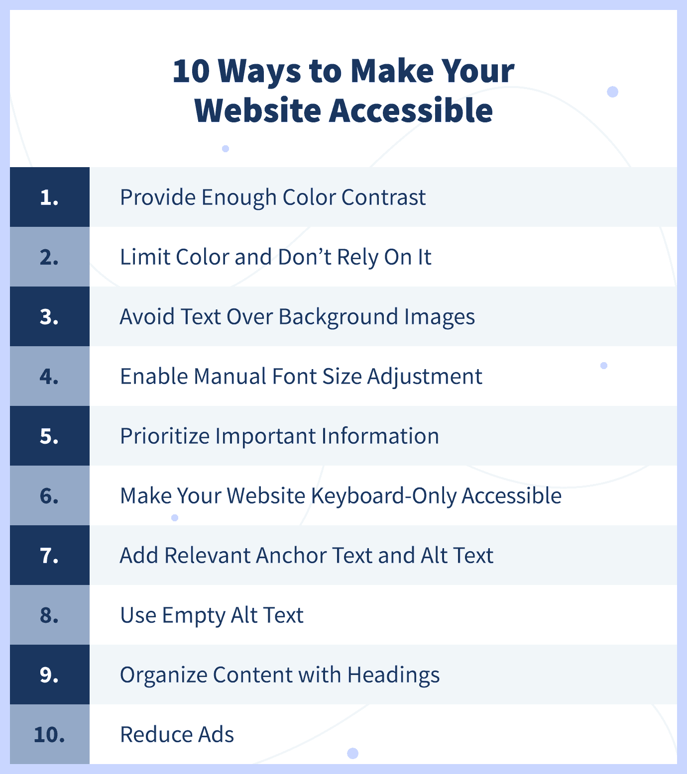
Provide Enough Color Contrast
Use high contrast between background color and text. This is especially important for color-blind users. At a minimum, you should meet WCAG 2.0 AA requirements, which require a contrast ratio of 4.5:1 for normal text and 3.1 for large text. Large text is considered a 14- or 18-point font or bold text.
You can use a tool like Colorzilla to check the value of any element. Also, most color contrast checkers check for compliance with this standard.
Since many partially sighted users highlight text as a trick to increase contrast, avoid using JavaScript or CSS techniques that prevent users from highlighting. As a final tip, don’t use crowded or watermarked background patterns that could be difficult to read or distracting for some users.
Limit Color and Don’t Rely On It
Using too many colors can be distracting and confusing. It can also make it difficult for users to identify important items, so try and limit the number of colors you use.
For color blind people, it’s especially important that you don’t rely on color alone to convey information (e.g., “click on the red button”). To do that, stick to a few colors, and try to not use green on red or red on the green to avoid confusion for color-blind users.
Avoid Text Over Background Images
Adding text over background images often results in a problem, as the image might not have enough contrast with the text color. Unless you make sure there is enough contrast by using online tools to test this, avoid using text over background images altogether.
If you choose to use text over background images, make sure that you use the right colors and ensure there’s enough contrast so the text is easy to read even for color-blind users.
Enable Manual Font Size Adjustment
Font size is one of the most common issues with web accessibility for partially sighted people.
Since there’s no best font size, you should have adaptive pages where users can manually adjust font size. With that said, make the default font size big enough (at least 10 points) so that most users won’t have to manually adjust it.
If most of your visitors are seniors or partially sighted people, make the default font size larger, and consider adding a button that loads a larger font size. Finally, make sure your website’s content layout doesn’t break when the text-only zoom is enabled. That could cause text to overlap with adjacent content and become illegible.
Prioritize Important Information
Having the most important content at the top of the page is good for all users, and for search engines too. But it’s particularly useful for people using assistive technology, who can quickly decide if a page will include the information they’re looking for.
Whether it’s a blog post or a product page, make sure you briefly describe the content and include the most important information at the very beginning.
Make Your Website Keyboard-Only Accessible
Since some users with visual disabilities rely on keyboards alone to navigate the web, allow keyboard shortcuts and commands to make it easier to navigate your site. In general, don’t make devices like a mouse a requirement.
For example, users who use a keyboard will use the tab button to advance fields when filling in a contact form. To provide a good experience, you should use the “tabindex” attribute to indicate the correct order of fields to follow.
Limit the Number of Links
You should limit the number of links on your pages even without web accessibility in mind since that can be frustrating for users (and having too many outgoing links is bad for SEO).
But limiting links on a page becomes especially important when designing a website for visually impaired people. With some screen readers, the first thing users hear when landing on a page is the number of links, which can be overwhelming if there are many.
Add Relevant Anchor Text
Some screen readers have a navigation mode that makes the tool read all links on a page if the user is looking for specific resources. In this case, having anchor text like “Click here” will be useless and annoying.
When it comes to choosing the words where you’ll insert your links, make sure to add text that describes what the linked page is (e.g., “learn about the best website builders available”).
Provide Alternative Content
For visually impaired people using technology to access content, it becomes important to provide alternatives for some types of content.
Remember that screen readers can only read text and code, so users can’t get information that’s present on visual assets. If an image doesn’t have alt text, the screen reader will skip it. If it does have alt text, it will describe the type of content (e.g., “image”) and read the alt text.
Include alt text for images, alternative attributes for graphics, and an alternative content for all other media (for example, transcripts or descriptions for video content or moving images). Make sure these are brief and get to the point quickly, and include them only if the information is important.
Use Empty Alt Text
For visual assets that are not necessary, it might be better to have screen readers skip them altogether. Since screen readers read code and not just text, some elements can be annoying for vision-impaired users when trying to access the content.
For example, if you have decorative images that don’t really add value or information for visually impaired people, use empty alt text to tell screen readers to skip this code.
Organize Content With a Descriptive Title and Headings
Screen readers read the title as the first thing when users land on a page, and then users have the option to jump from heading to heading. Make your title as descriptive as possible, and include a table with “<th>” elements at the top to help users identify headings.
Use correct CSS for layout and HTML for structure. For example “<p>” for paragraphs, “<h1>,” ”<h2>,” etc., for headings, and “<ul>,” “<ol>,” and “<li>” for lists. This will help screen readers understand the structure of your content and communicate it effectively.
Reduce the Number of Ads on Your Page
Having too many ads on your website can create a bad user experience, especially for screen reader users who can’t easily distinguish this type of content from other content on your page.
For visual advertisements, keep in mind the same considerations as you would for other types of visual content (e.g., adding alt text), but also consider placing the word “advertisement” at the beginning of the alt text. This way, visually impaired people will know what type of content this is and can decide whether they want to consume it or not.
Add Language Information
Adding language information is especially important if your website has an international audience and content written in multiple languages.
Specify the language using a “lang” attribute so that assistive devices can figure it out and use proper pronunciation rules. This way, a screen reader will know when it encounters content that is in a foreign language, and you will avoid causing confusion for visually impaired users.
Use the Right Tools
Fortunately, there are many free online tools that web designers and developers can use to ensure a website meets accessibility standards. Here are some of the most useful tools:
- Color Safe provides AA & AAA compliant color suggestions based on your website’s existing elements.
- Colour Contrast Analyser finds text elements that aren’t compliant in terms of color contrast.
- NVDA helps you see a website from the perspective of a visually impaired person.
- WebAIM’s Wave finds errors in terms of accessibility to your website.
Wrapping Up: Creating a Website That Is Accessible to All
In a web-savvy world with visually impaired people a large part of internet users, applying these best practices to make your website accessible is fundamental. Considering that one in four adults in the United States has a disability, having a website that is accessible to all is not only socially responsible but also beneficial for your business.
Aside from the legal complications, it can save you, a website that is accessible to all will enhance your brand reputation, improve SEO, and elevate user experience.
When creating a website for the visually impaired, remember, at a high level, to make it perceivable, operable, understandable, and robust. Not only should visually impaired people be able to access your content, but it’s also important that they can do so as easily as possible, without distractions and complications.
Additional Blind Web Accessibility Resources
Find additional web accessibility resources for web developers, web designers, and visually impaired users below.
For Web Developers
- Web Content Accessibility Guidelines (WCAG) 2.1 — Detailed guidelines to create an accessible website.
- WebAIM — Web accessibility services and training.
For Web Designers
- 14 Best Web Design Software — A guide to choosing the right web design software.
- The Colour Laboratory— Select a color and see what it looks like next to another one, with different background combinations (in simulated color blindness scenarios).
- Vischeck — Upload an image to check the visibility of graphics and text and to see what it looks like to people with color blindness and other visual disabilities.
- Safe Web Colors — Information and design tools to understand which colors can be confused and how to avoid losing color cues.
For Visually Impaired Users:
- American Foundation for The Blind — Resources for Americans with vision loss.
- National Federation of The Blind — Network of blind Americans.
- Royal National Institute of Blind People — UK’s largest community of blind and partially sighted people.