Web design is one of the main factors that determines whether a user will stay on your website. In fact, 94% of first imp
ressions are related to your website’s design.
A good website design should be simple, functional, and consistent with your company’s branding. More specifically, the best-designed websites use a grid-based layout (you should adapt your layout to the type of content you share) to keep content aligned, optimize load time, are mobile-friendly, and use compelling copy.
Since many elements of web design will vary depending on your industry and the type of content you share, we created a collection of the best-designed websites in the world, so you can find inspiration for your website design.
1. Avoriaz 1800 – Visite Virtuelle
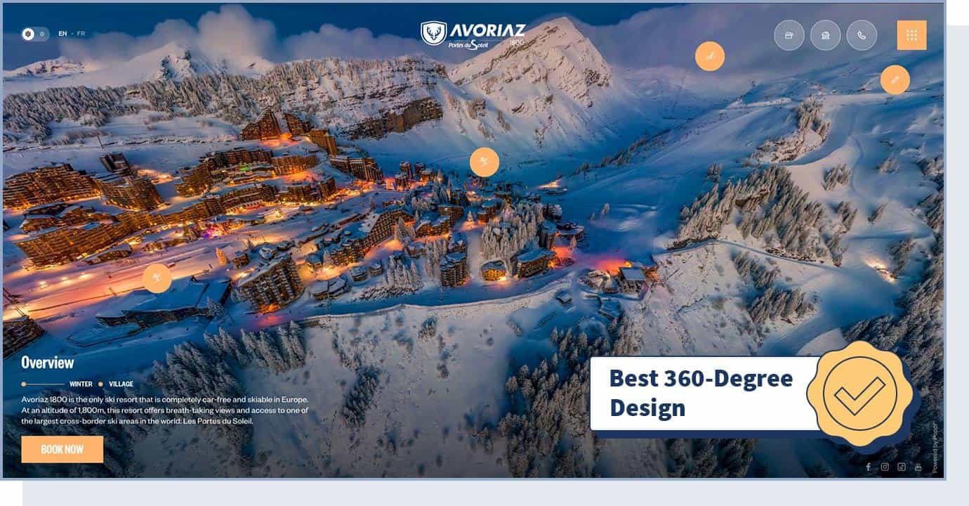
Avoriaz 1800 is a ski resort in Morzine, France, that offers breathtaking views.
On the website, users can choose between a winter tour and a summer tour to explore the village’s apartments and ski areas through a 360-degree panoramic virtual tour. What makes this website one of the best-designed websites in the world is the 360-degree views it offers, which allow users to feel like they’re part of the experience.
Consider investing to create something similar if you’re in the travel and hospitality industry. Offering a virtual tour that allows users to experience a destination before booking can cause reservations to increase between 16% and 67%.
- Website Type: Hospitality
- Design Characteristics: Animation, 360-degree, Storytelling, Photo and Video
- Technologies Used: CSS3, HTML5, Apache
- Colors Used: Blue
2. Playbook
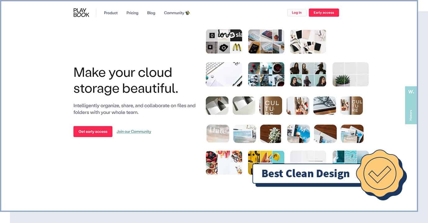
Playbook is a cloud storage platform for designers. When looking at this website you’ll see that what captures the user’s attention is how clean the design is. Not only does this follow an important aspect of web design, but it also matches the company’s product: a way to manage files and folders in a visually organized way.
For a technology company targeting designers, having a clean design will show users what you’re capable of and why they should trust your product or service. The website also incorporates elements of interactivity, which creates a more personalized and engaging experience for the users.
- Website Type: Startup, Technology
- Design Characteristics: Clean, Photography, Gallery, UI design
- Technologies Used: Ruby, GraphQL, React
- Colors Used: Red
3. Animus Studios
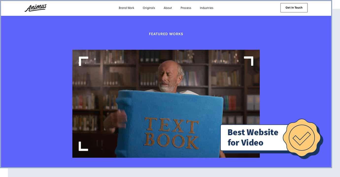
Animus Studios is a video agency committed to making the work with their clients fun and organized. They do so by creating original video content that is focused on storytelling.
What makes this website stand out is the colorful animation it offers. Not only is animation a great way to stand out from other websites, but here, it’s also a way to indirectly show the company’s capabilities in terms of video making.
- Website Type: Business, Agency
- Design Characteristics: Animation, Colorful, Video
- Technologies Used: Craft CMS
- Colors Used: Blue, Red, Yellow
4. PUBLIC DOMAIN
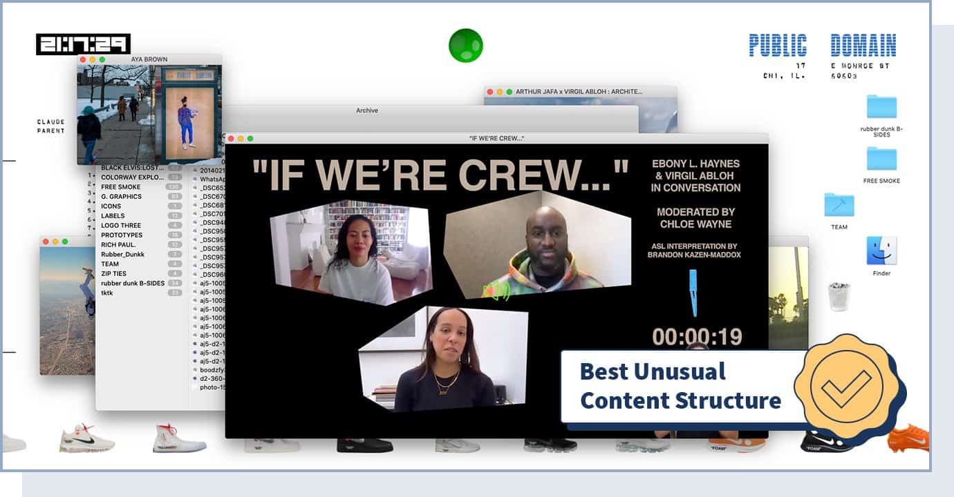
PUBLIC DOMAIN is an innovative, interactive, and experimental website founded by Virgil Abloh to show his collections (in particular, Off-White x Nike Collaborations) and to tease upcoming product launches. More than a catalog, his website is designed to look like Virgil’s own desktop.
What makes this website different from any other web design we’ve seen is the unusual content structure — the way the information is presented and organized on a site, and in particular the hierarchy of different pages. PUBLIC DOMAIN doesn’t have different pages and the content is organized in a very interactive way.
- Website Type: Fashion
- Design Characteristics: Big Background Images, Gallery, Horizontal Menu, Content Architecture
- Technologies Used: JavaScript, HTML5
- Colors Used: Black, Silver, White
5. Globalance World
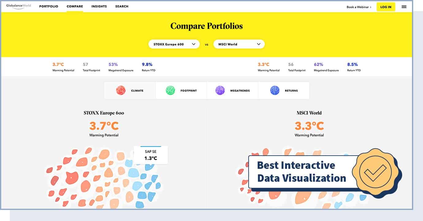
Globalance World is an interactive investment platform that enables users to make investment decisions based on economic, societal, and environmental factors like climate, footprint, megatrends, and returns. This site offers one of the most simple and best designed interactive experiences on the web; it also has a very responsive design, meaning content and design are adapted to work well for all devices. In addition to interactivity, this website uses the right color scheme (in particular, the color yellow) to convey a fun aspect.
For example, users can choose a real portfolio or market index and visualize various types of data through different views (like globe, city, or map), or they can opt to compare two market indices (like S&P 500 and Nasdaq 100). The goal of these interactive elements is to provide investors with a fun way of making good long-term decisions.
In a competitive industry like business or finance, having interactive experiences on your website allows you to stand out from the crowd and keep your users engaged.
- Website Type: Business, Finance
- Design Characteristics: Interactive, Responsive, Data Visualization, 3D
- Technologies Used: next.js, CSS3, Three.js, React, D3, GraphQL
- Colors Used: Black, Grey, Yellow
6. UXPERT
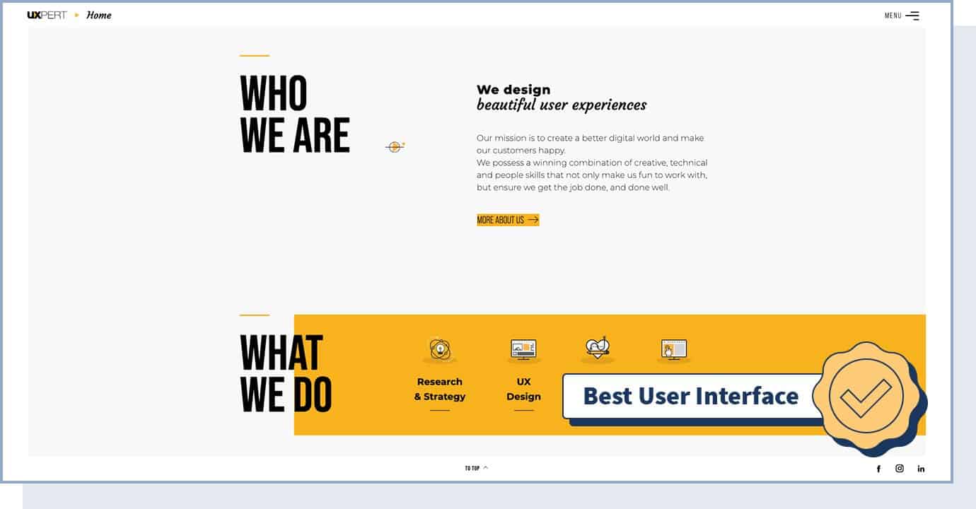
UXPERT is a digital agency that focuses on designing beautiful user experiences. Given the type of service this agency offers, it’s not a surprise that this website boasts an innovative user interface, with an unparalleled user experience.
The user interface is fairly simple: on the homepage, users can play a short showreel to learn about the brand. They can then scroll down to learn more about the services, works, and awards. Did you know that 71% of B2B marketers use video marketing? Using a short showreel can help you improve your user experience, especially if you’re targeting busy users.
- Type: Business, Agency
- Design Characteristics: Animation, Clean, Graphic design, Innovative UI
- Technologies Used: WordPress, CSS3, HTML5
- Colors Used: Black, White, Yellow
7. MAD
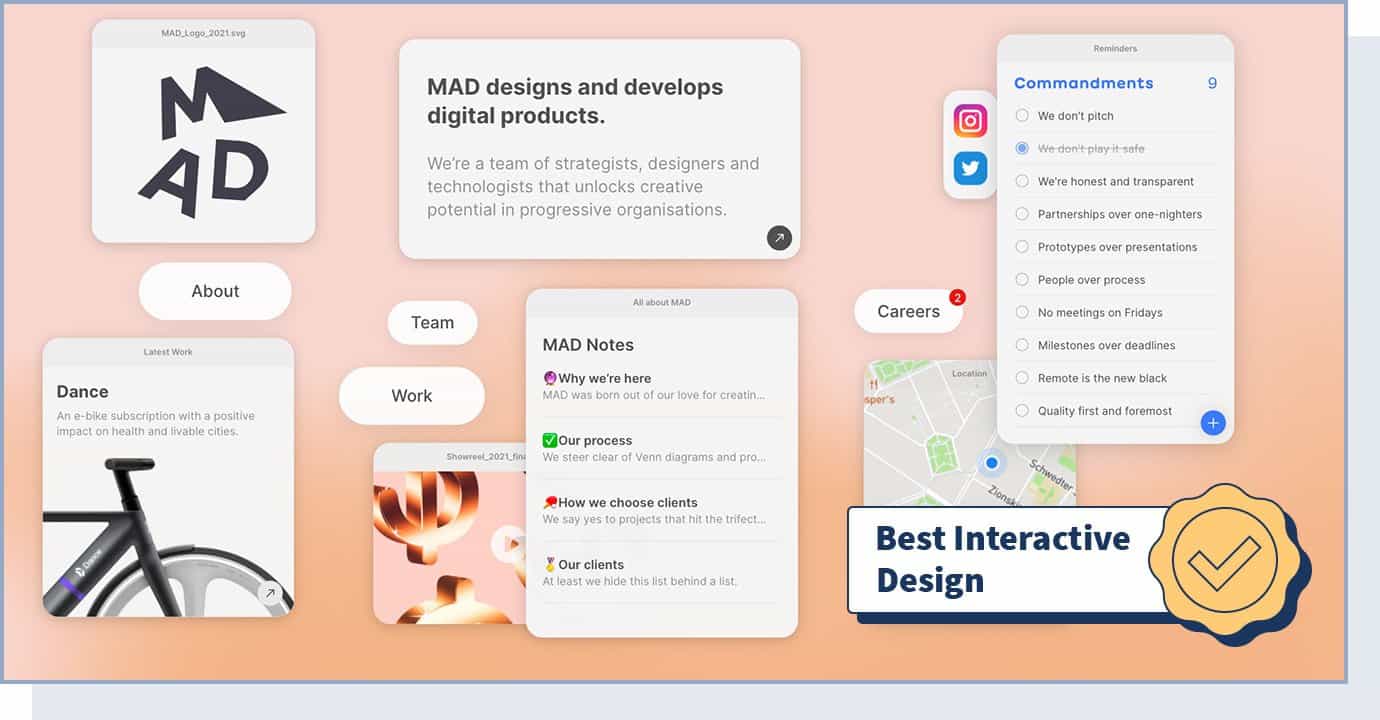
MAD is a creative digital design agency. This website takes a creative approach to interactivity to create an unusual design that helps capture the users’ attention. Users can play with the MAD logo, move objects around, and more. As a result, they stay longer on the site, see it as a leading-edge company they can trust for creative work, and are more likely to connect with it for business.
By using these unexpected interactive effects, MAD manages to juice up the user experience and create interest and curiosity.
- Website Type: Business, Agency
- Design Characteristics, Experimental, Unusual Design, Transitions, Filters and Effects, Innovative UI Design, Microinteractions
- Technologies Used: CSS3, HTML5, WebGL, Nginx, React
- Colors Used: Black, Orange, White
8. Glob
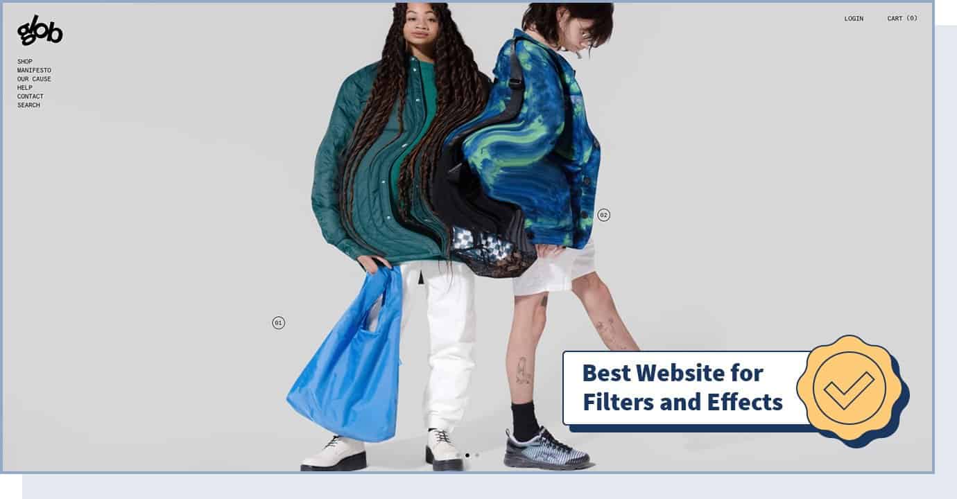
Glob is an eCommerce site selling reusable bags for a plastic-free lifestyle.
This website makes creative use of filters and effects to grab the users’ attention by making the design more entertaining. In particular, users can use their mouse to interact with designs through a liquify effect while scrolling through the website. This makes the shopping experience on Glob more appealing compared to a traditional web design.
- Website Type: eCommerce, Fashion
- Design Characteristics: Interactive, Big Background Images, Animation, Filters and Effects
- Technologies Used: WebGL
- Colors Used: Black, Orange
9. Gucci Beauty Foundation
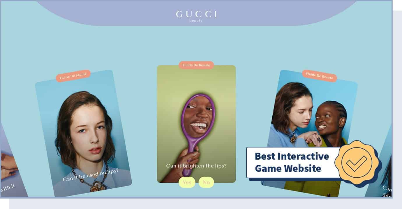
The Gucci Beauty Foundation is a subdomain of Gucci’s website dedicated to their popular foundation product. The page offers a quiz game, interactive shades palettes, and short video tutorials to discover its uses in an entertaining way.
Just like Gucci, you can consider dedicating a subdomain or subfolder of your website to present a specific product in an interactive way, to create a buzz in your industry, and keep your audience engaged.
- Website Type: Promotional, Fashion
- Design Characteristics: Clean, Colorful, Single Page, Gestures, Interactive
- Technologies Used: CSS3, HTML5, React, Anime.js
- Colors Used: Green, Pink, Yellow
10. Mario Russo Archive
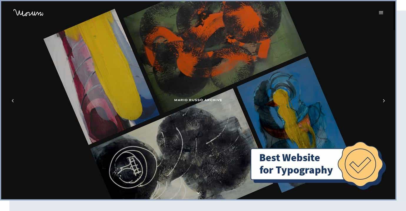
If you’re looking for web design inspiration for your art portfolio, artist Mario Russo’s Archive presents a simple and innovative way of showing your work.
This website has a responsive design and makes use of simple and beautiful typography to tell a story. Typography (which includes font style, appearance, and structure) is one of the most important factors that impact user experience. One study found that 46% of consumers base their decisions about a website’s credibility on its visual appeal and aesthetics (which are, for about 90% of users, based on typography alone).
- Website Type: Portfolio, Art
- Design Characteristics: Responsive Design, Appealing Typography, Storytelling
- Technologies Used: CSS3, HTML5, jQuery, Typekit
- Colors Used: Black, Silver
11. Yusuke Fukunaga
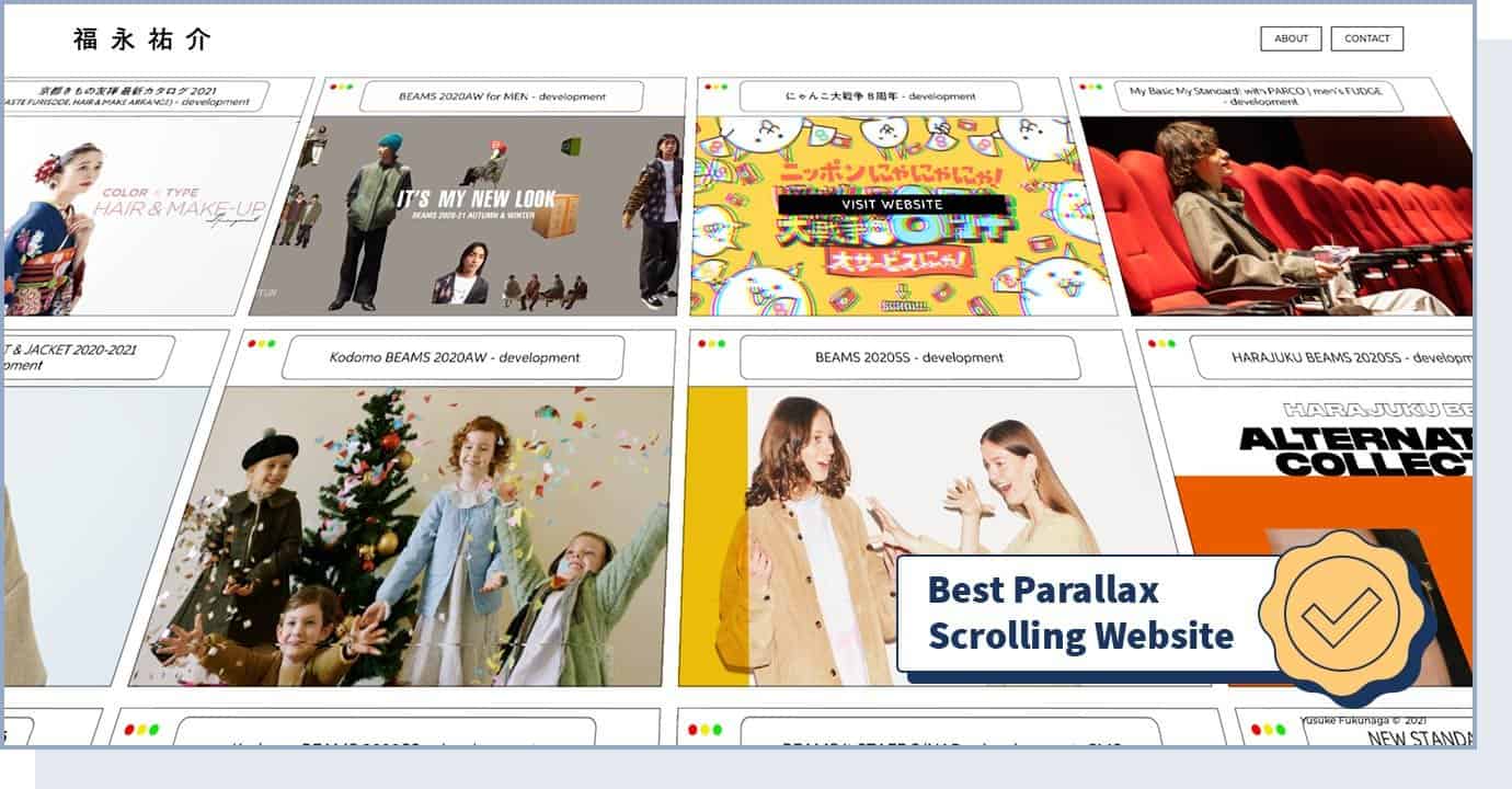
Yusuke Fukunaga’s portfolio is worth looking at if you’re looking for web design inspiration for a dynamic content portfolio, such as a developer portfolio.
Using parallax effect — where the position of an object appears different when viewed from different angles — and infinite scroll technology, this freelancer front-end developer based in Tokyo shows his portfolio of websites.
While the website design is simple (one main page, with about and contact sections) this is, at the same time, one of the most innovative website designs on this list.
- Website Type: Portfolio, Developer
- Design Characteristics: Infinite Scroll, Parallax, Scrolling, Filters and Effects
- Technologies Used: WebGL, GSAP Animation, Three.js
- Colors Used: Black
12. IdeaRocket
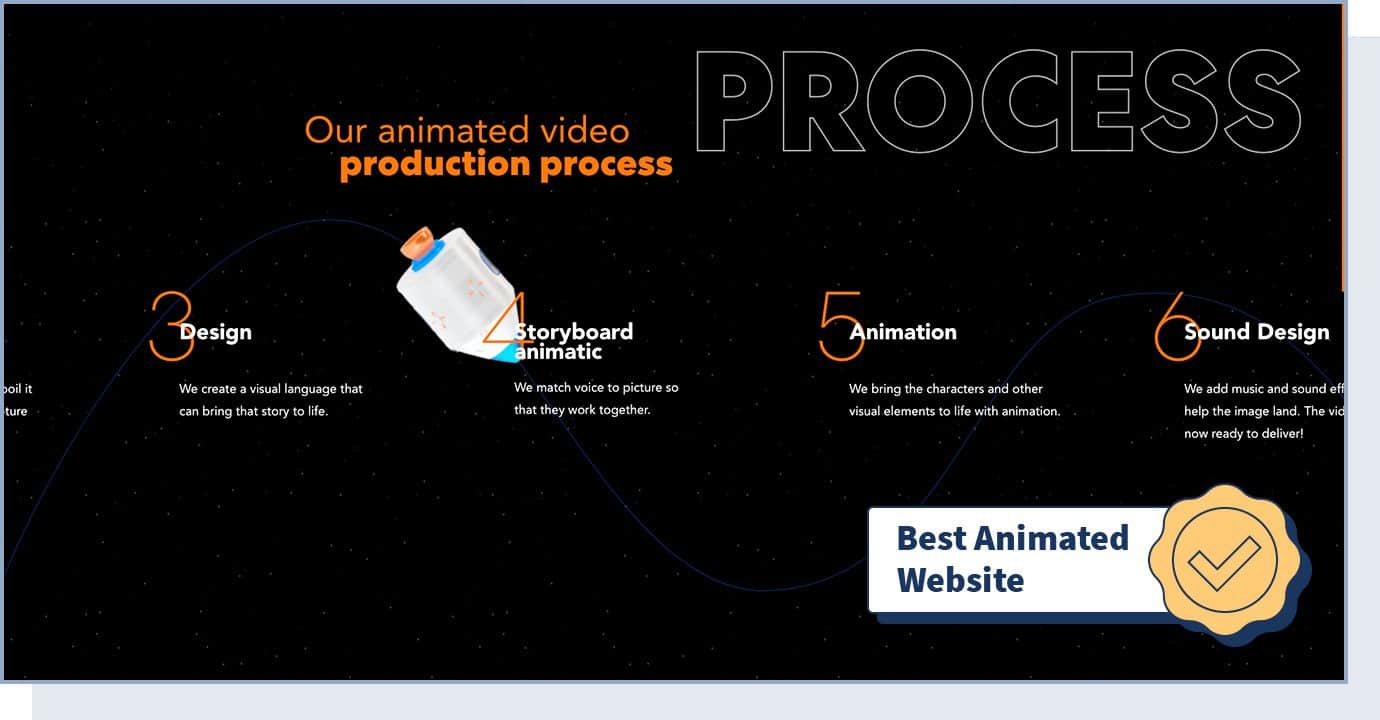
IdeaRocket is an animation studio based in New York City. What makes their website one of the best designed websites is the exceptional user experience and the way examples of work are presented.
In the “works” section, users can choose a category (like 2D animation, 3D animation, etc.) and click on a project to open a high-quality video. If you want to add videos to your website, you should take a look at the way IdeaRocket does this.
- Website Type: Business, Agency
- Design Characteristics: Animation, Video, Scrolling, Illustration, Storytelling
- Technologies Used: WordPress, CSS3, HTML5. GSAP Animation
- Colors Used: Black, Blue, Orange
13. Low Five Brewing
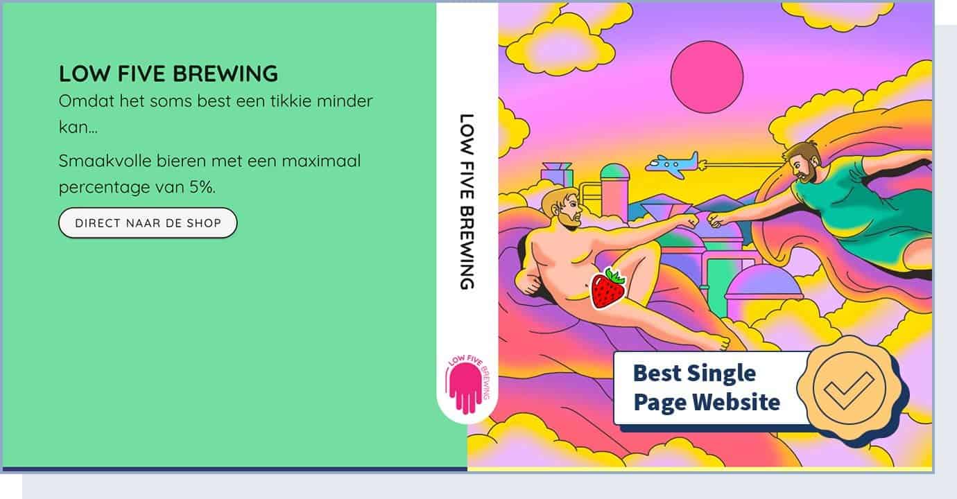
With a simple (yet interesting and innovative) design, Low Five Brewing is one of our favorite single-page websites. This type of website features all content on one page, without using a menu. This makes navigation easy, improves website load time, and makes the website more responsive.
Users can learn about this Amsterdam-based brewery just by scrolling through the web page. At the bottom, users can find a link to the webshop, which brings them to another site — also extremely simple and minimalistic — where they can purchase beer.
If you’re in the eCommerce space (especially if you only sell a few items), we suggest you get inspiration from this website design, since single pages can increase conversions by 37.5%.
- Website Type: eCommerce, Food & Beverage
- Design Characteristics: Single page, Unusual Navigation, Responsive
- Technologies Used: Vue.js, Nuxt.js
- Colors Used: Green, Pink, Yellow
14. Swissdent
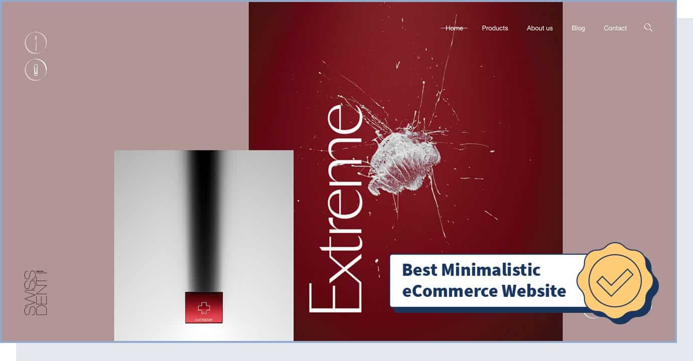
Premium dental products brand Swissdent created a website that uses outstanding photography to tell a story. The minimalistic and impressively clean web design gives users an outstanding shopping experience. Focusing on a few items and on a minimalistic design is important for eCommerce sites, where avoiding too many options and limiting distractions often result in more sales.
- Website Type: eCommerce
- Design Characteristics: Photography, Animation, Clean, Minimalistic, Parallax, Transitions
- Technologies Used: WordPress, CSS3, HTML5, GSAP Animation, PHP
- Colors Used: Black, Red, White
15. Goodfight
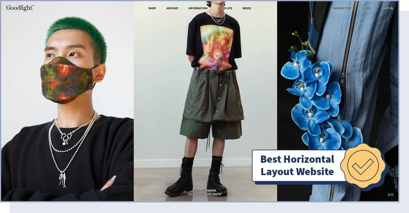
Goodfight is a creative fashion label based in Los Angeles. With infinite scrolling technology on a horizontal menu and layout, this website manages to create an engaging experience for users who want to learn more about the brand. Considering 72.9% of all eCommerce sales will happen on mobile devices, adding a simple layout, such as infinite scrolling, can contribute to your website’s conversion rate.
- Website Type: eCommerce, Fashion
- Design Characteristics: Horizontal Menu, Horizontal Layout, Responsive Design, Transitions, Filters and Effects
- Colors Used: Black, Silver, White
16. Hanwag – 100 Years
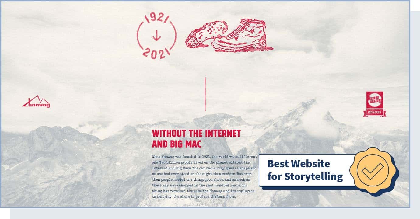
Hanwag is a German footwear company. When it comes to using web design for storytelling, the Hanwag – 100 Years subdomain was our top choice.
It consists of a single page, detailing the history of the Hanwag brand from the very first shoemaker’s shop in 1921 to the 500,000 pairs of shoes expected to be manufactured in 2022. Storytelling allows you to humanize your brand and increases the chance of potential customers remembering your company.
- Website Type: eCommerce, Fashion
- Design Characteristics: Experimental, Retro, Scrolling, Illustration
- Colors Used: Red, White, Blue
17. Fabulatorij
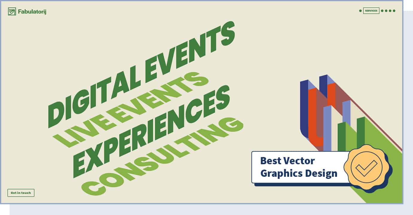
If you’re a fan of vector graphics — which use geometric shapes to create images — we suggest you scroll through this event agency’s website to find some ideas for your site design.
With hard lines and a fresh style, Fabulatorij managed to create a modern and edgy-looking website that focuses on the company’s services and work samples (that are presented through videos).
- Website Type: Business, Events
- Design Characteristics: Animation, Colorful, Vector, Illustration, Responsive, Filters and Effects
- Technologies Used: GSAP Animation, VideoJS, Vue.js, Nuxt.js, Netlify
- Colors Used: Green, Pink, Yellow
18. BURGER & SAUCE
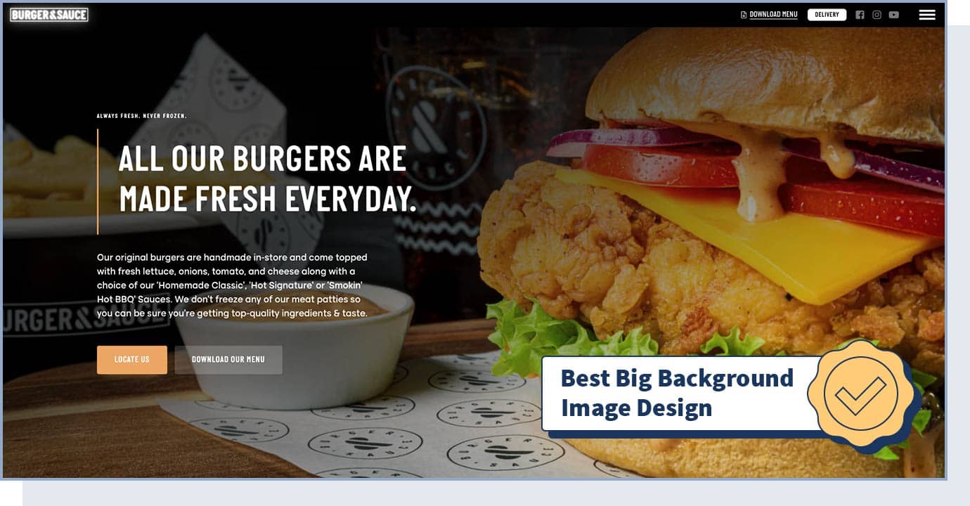
The BURGER & SAUCE website uses stunning big background images to share its handmade burgers, offering an impressive and memorable experience for users
Did you know that 82% of people buy meals just because of how they look in a picture? If you’re looking for web design ideas for a restaurant, you can’t miss out on seeing how BURGER & SAUCE lets high-quality photos tell a story that generates user interest.
- Website Type: Business, Restaurant
- Design Characteristics: Big Background Images, Vector, Responsive
- Technologies Used: WordPress, SVG, Cloudflare
- Colors Used: Black, White, Yellow
19. Westbound Mag – Stories And Places
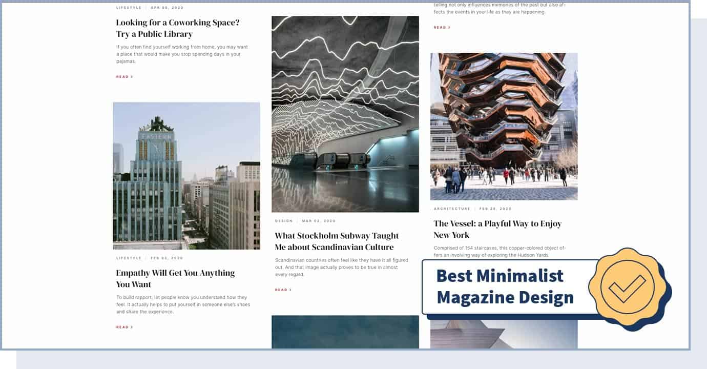
The Westbound Mag is our top pick when it comes to web design for a blog or magazine. When creating this site, the developer created a minimalist style that captures the readers’ attention.
This online magazine is characterized by a coconut white background color and high-quality images to create an enjoyable reading experience. When you’re designing an online magazine, it’s important you make the reader experience as enjoyable as possible by selecting the right font, colors, and visual assets.
- Website Type: Blog
- Design Characteristics: Photography, Clean, Minimal, Typography, Responsive, Storytelling
- Technologies Used: WordPress, Bootstrap, WooCommerce
- Colors Used: Red, Black, White, Silver
20. April Group
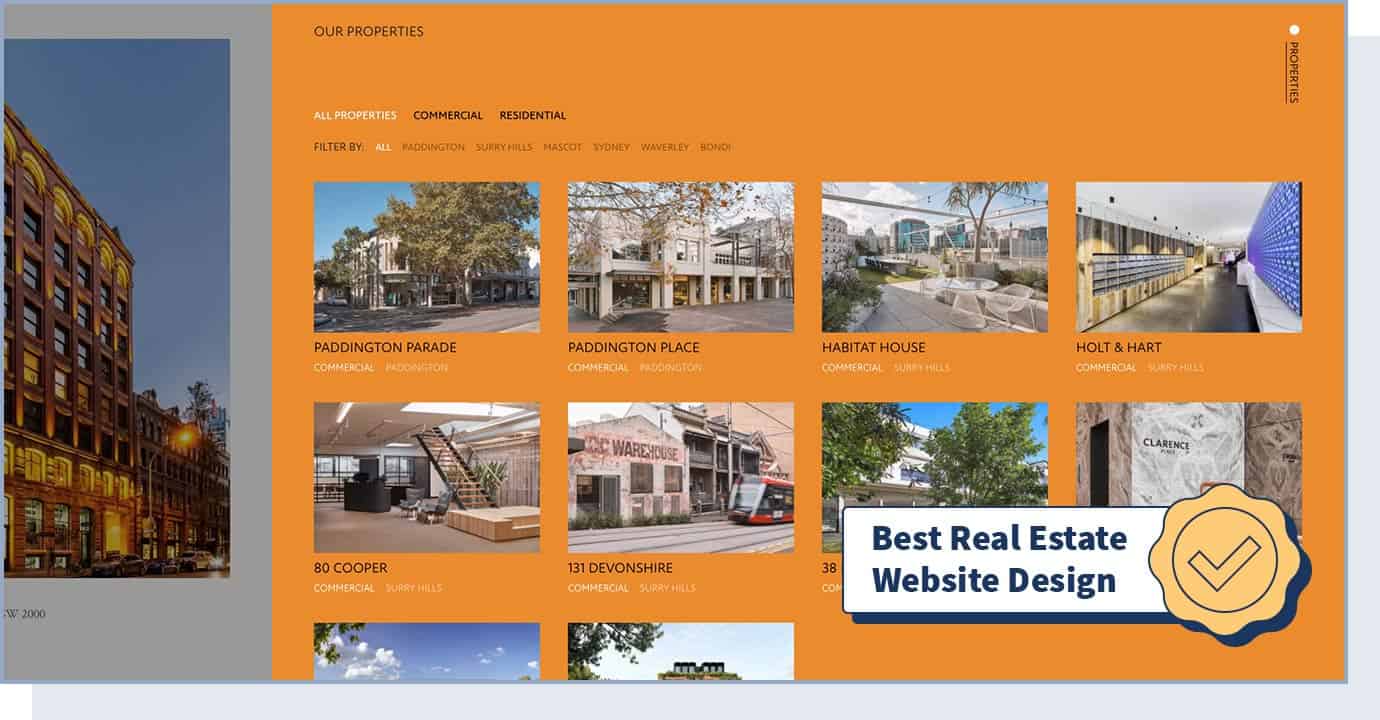
Real estate investment company April Group created one of the best designed websites in the real estate industry.
The web design is extremely professional and makes remarkable use of photos and videos to show the properties in a simple and organized way. Considering that homes with high-quality and professional photos sell 32% faster and sell at or above list price 44% of the time, make photography the focus of your website design if you’re in the real estate industry.
- Website Type: Business (Real Estate)
- Design Characteristics: Big Background Images, Clean, Minimalistic, Vertical Menu
- Colors Used: Black
21. USAF ECHO
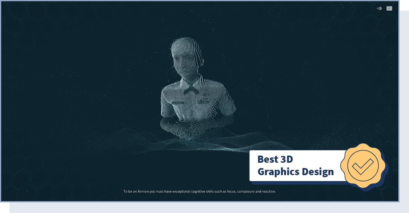
The U.S. Air Force created a cinematic website called USAF ECHO where users face challenges in order to test skills like focus, composure, and reaction.
The Enhanced Cognitive Human Ops website uses a WebGL (Web Graphics Library) API to create an engaging and interactive user experience through the use of high-performance 3D graphics. To engage your website’s visitors, consider using 3D graphics — you don’t need to have a game to offer as you can use this to show your products or services, or to tell a story about your brand.
- Website Type: Games & Entertainment
- Design Characteristics: Clean, Transitions, 3D, Filters and Effects, Microinteractions
- Technologies Used: WebGL
- Colors Used: Black, Blue, Silver
22. Wax Poetics
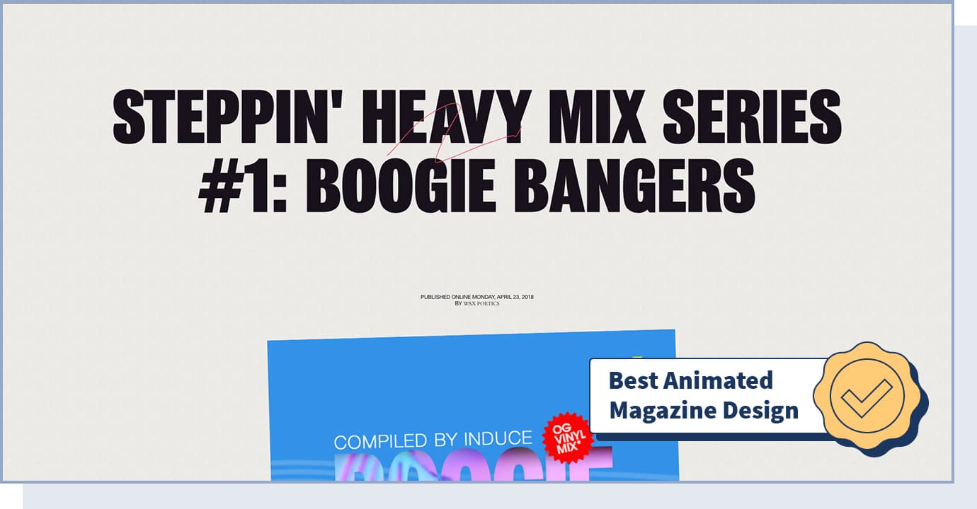
Through the use of animation and interactive elements, the Wax Poetics music journal community created a highly engaging online magazine for music enthusiasts.
If you have a blog, online magazine, or any type of website with a lot of posts, we suggest you explore this website to find inspiration from the innovative way articles are presented to keep users engaged.
- Website Type: Magazine, Music
- Design Characteristics: Animation, Colorful, Interactive Design, Microinteractions
- Colors Used: Black, Green, Red
23. The Atlas of Moons
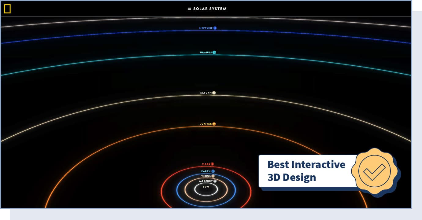
The Atlas of Moons website by National Geographic was the Webby Awards 2020 winner for best use of animation or motion graphics — which goes to websites that integrate animation to enhance the user experience.
On this award-winning website, users can virtually fly through the moons and learn everything about them in an unparalleled interactive setting.
- Website Type: Learning
- Design Characteristics: 3D, Interactive, Animation, Scrolling Navigation
- Technologies Used: WebGL, JavaScript, GSAP, React, three.js, Python
- Colors Used: Black
24. The Body Issue – Every Body Has a Story
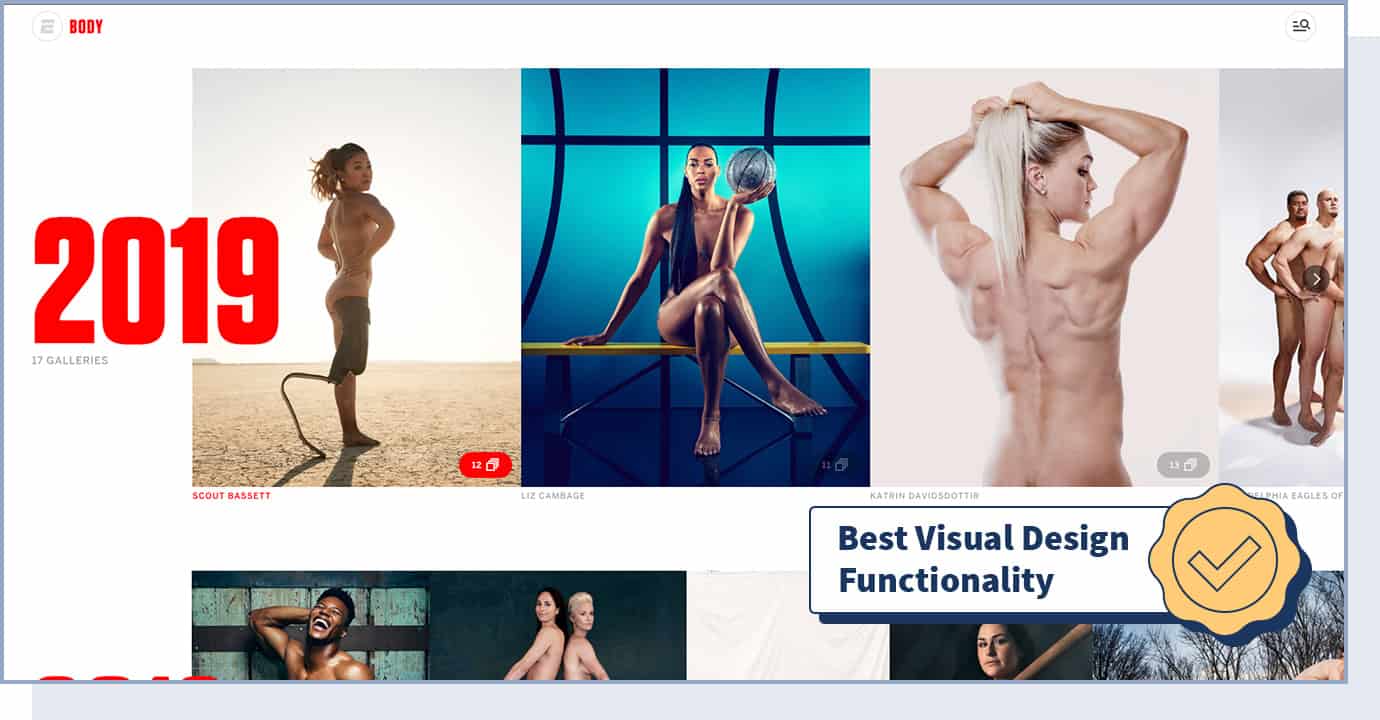
The “Every Body Has a Story” website by ESPN won the Webby Awards 2020 best visual design functionality award, which goes to sites that rely on visual design elements to create a seamless user experience.
This website shows the world’s best athletes using an interactive interface and stunning photography. Considering that while only 10% of people remember what they hear, 80% of people remember what they see and do. As a result, focusing on high-quality images is the best way to tell a story on your website.
- Website Type: Media, Sports
- Design Characteristics: Interactive, Photography, Transitions, Filters and Effects
- Technologies Used: GSAP (Greensock), Hammer.JS
- Colors Used: Black, Red, White
25. Ending FGM – A Piece of Me
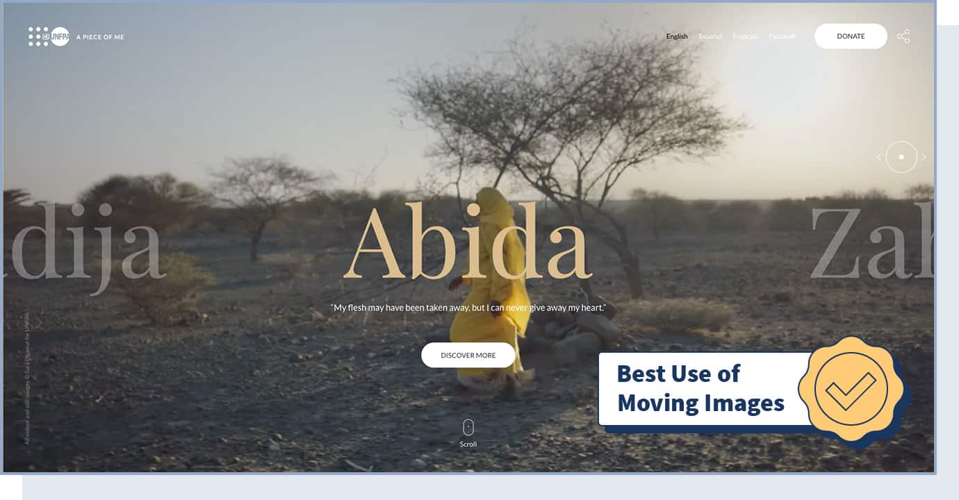
The UNFPA created the “Ending FGM – A piece of me” website, winner of the 2020 Webby Awards for the best use of video or moving image.
Through the use of animation and astonishing photos and videos, this website tells an impactful story focused on the mission to deliver a world where every pregnancy is wanted.
- Website Type: Health Agency
- Design Characteristics: Responsive Design, Video, Moving Images
- Colors Used: Yellow, Orange, Pink
26. LeBron James’ Los Angeles
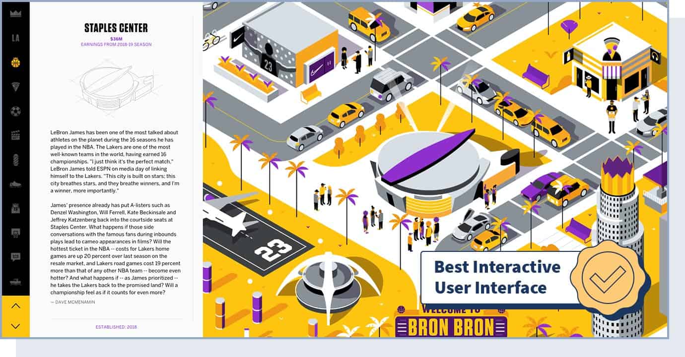
Created by sports powerhouse ESPN, the “Welcome to Bron Bron Land” website was awarded by Webby Awards the title of the best user interface in 2020.
The interactive website is an educational journey of how LeBron’s roots set the foundation for his growing empire. Creating a great user interface will facilitate the interactions between you and your website’s visitors and, ultimately, increase conversions. For example, a study performed by Forrester Research found that a good interface can improve conversion rates by up to 200%.
- Website Type: Media, Sports
- Design Characteristics: Interactive, Transitions, Filters and Effects, Innovative UI
- Colors Used: Purple, Gold, White, Black
27. Lusion
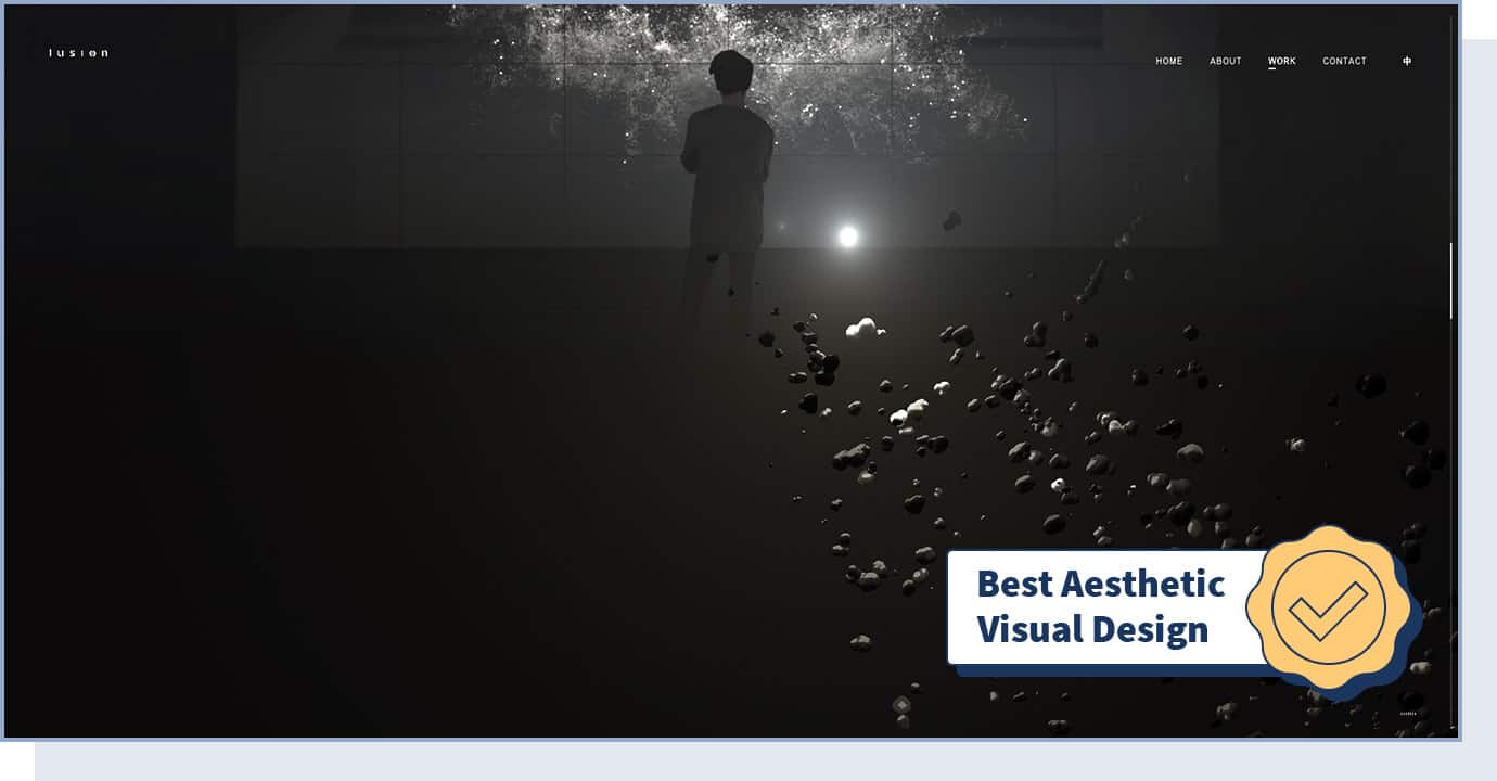
The Lusion website by creative studio Lusion Ltd is the Webby Awards 2020 winner of the best aesthetic visual design, awarded to sites that are aesthetically emotional and beautiful. The site features stunning graphics and effects that attract users’ attention. Consider using similar animations to make your website stand out.
- Website Type: Business, Agency
- Design Characteristics: Interactive, Animation, 3D
- Technologies Used: WebGL, Three.js
- Colors Used: Black, White
28. 2019: The Year In Pictures
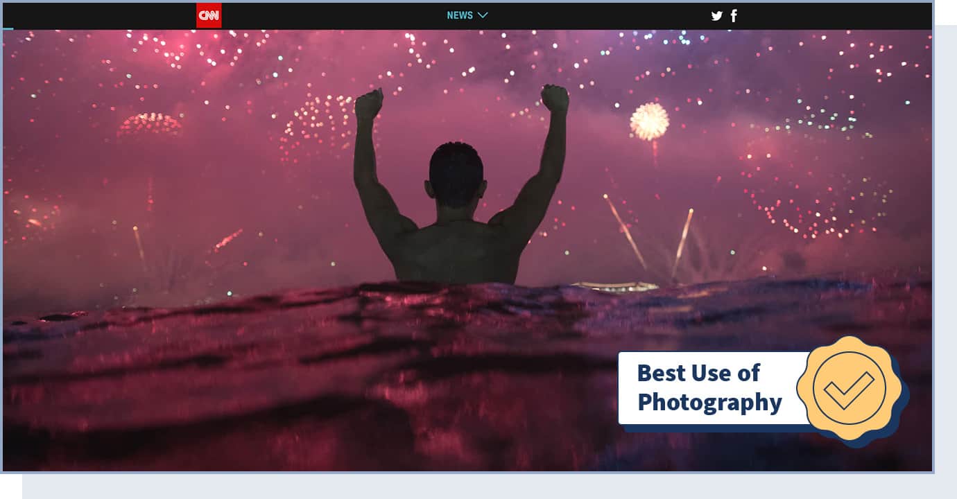
Summarizing the news, entertainment, and sports that characterized 2019 through photos, the “2019: The Year In Pictures” website by CNN won the 2020 Webby Award for the best use of photography, granted to websites that rely on photographic imagery to enhance user experience. If you have an information website, photography is one of the elements you should focus on to increase exposure.
- Website Type: Information (News, Entertainment, Sports)
- Design Characteristics: Photography, Big Background Images, Single-page
- Colors Used: Black, Blue, Green, Red
29. Human Interaction Company
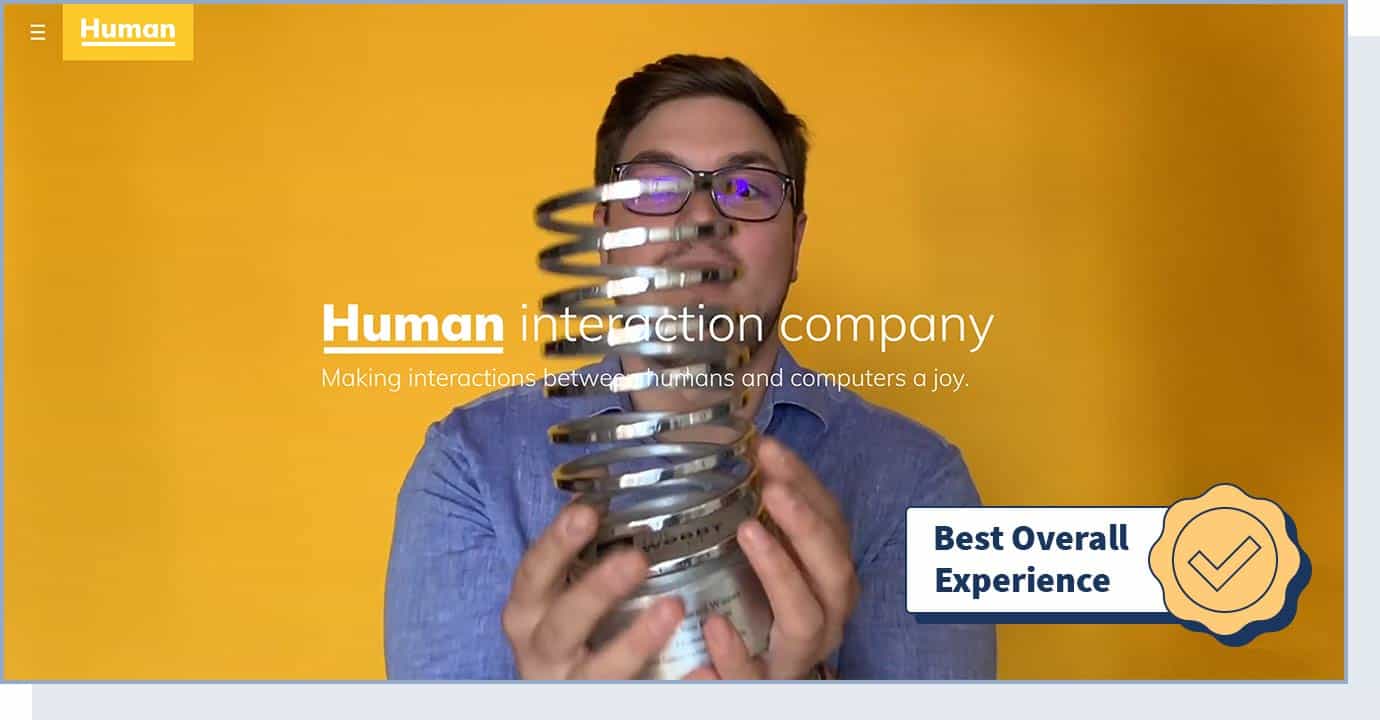
The Human Interaction Company is dedicated to making interactions between humans and computers more joyful.
This company’s website is the Webby Awards 2020 winner for the best practices award — which is given to websites with the most innovative and advanced website designs. In particular, the best practices refer to content, structure, navigation, visual design, interactivity, functionality, and overall experience. Use this website as a model for technical design inspiration, especially if you’re in the business space.
- Website Type: Business, Agency
- Design Characteristics: Interactive, Content architecture, Copy design, Photo & Video, UI design
- Technologies Used: CSS Framework, React
- Colors Used: Red, Yellow
30. Drone VR
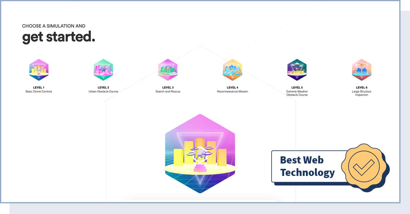
The Drone VR website by Very Big Things is the Webby Awards 2020 winner for technical achievement. It managed to set new industry standards in user experience through innovative web technology. With this website, Very Big Things achieved its goal of making the pilot certification process more enjoyable.
Using 3D video graphics is an uncommon way to stand out and come through as a creative website. If you’re a software company, adding 3D video graphics to your website will make you appear up-to-date and original.
- Website Type: Business, Software
- Design Characteristics: 3D, Interactive
- Technologies Used: WebGL, Three.js, React
- Colors Used: Green, Red, Yellow
31. Codex Atlanticus
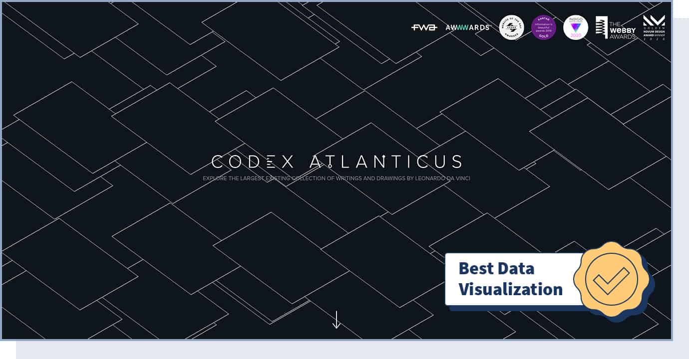
Codex Atlanticus by The Visual Agency (in collaboration with the Biblioteca Ambrosiana) is the Webby Awards 2020 winner of the best data visualization award. On this website, users can explore a collection of Leonardo da Vinci’s writings and drawings. The Codex Atlanticus is the leading website when it comes to illustrating complex datasets in an innovative, visually appealing, and easily comprehensible way.
- Website Type: Data
- Design Characteristics: Illustration, Interactive, Data Visualization, Storytelling, Content Architecture
- Technologies Used: Vue.js
- Colors Used: Black, Green
32. Spotify: Your 2019 Wrapped
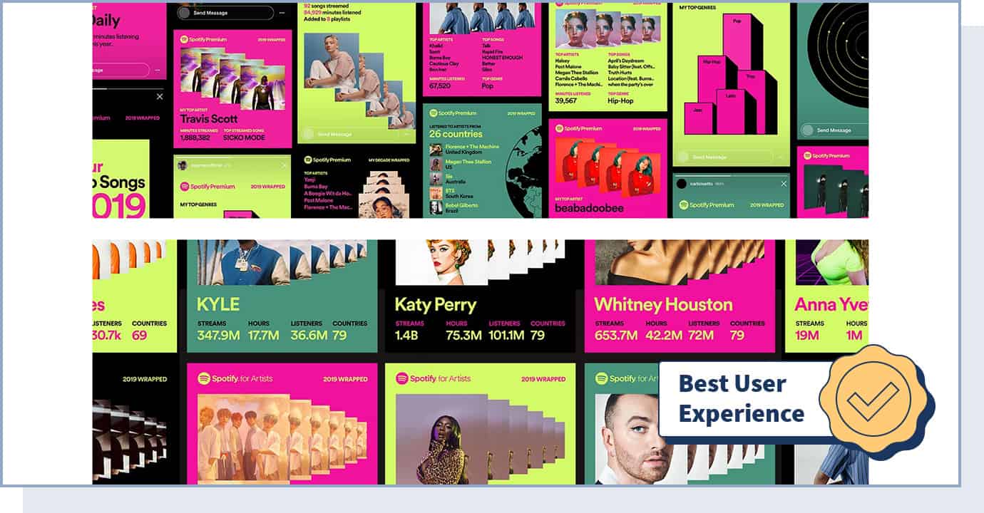
Your 2019 Wrapped by Spotify won three Webby Awards in 2020: best data visualization, best user experience, and best website in the music industry.
To create this website, Spotify used complex datasets and turned them into visually appealing representations that are easy to understand and navigate through. If you have data that your users would benefit from seeing, you can use a similar, interactive data visualization web design.
- Website Type: Music
- Design Characteristics: Interactive, Animation, Transitions, Data Visualization, Responsive
- Technologies Used: WebGL
- Colors Used: Black, Green, Pink
33. Climate Science, Risk & Solutions
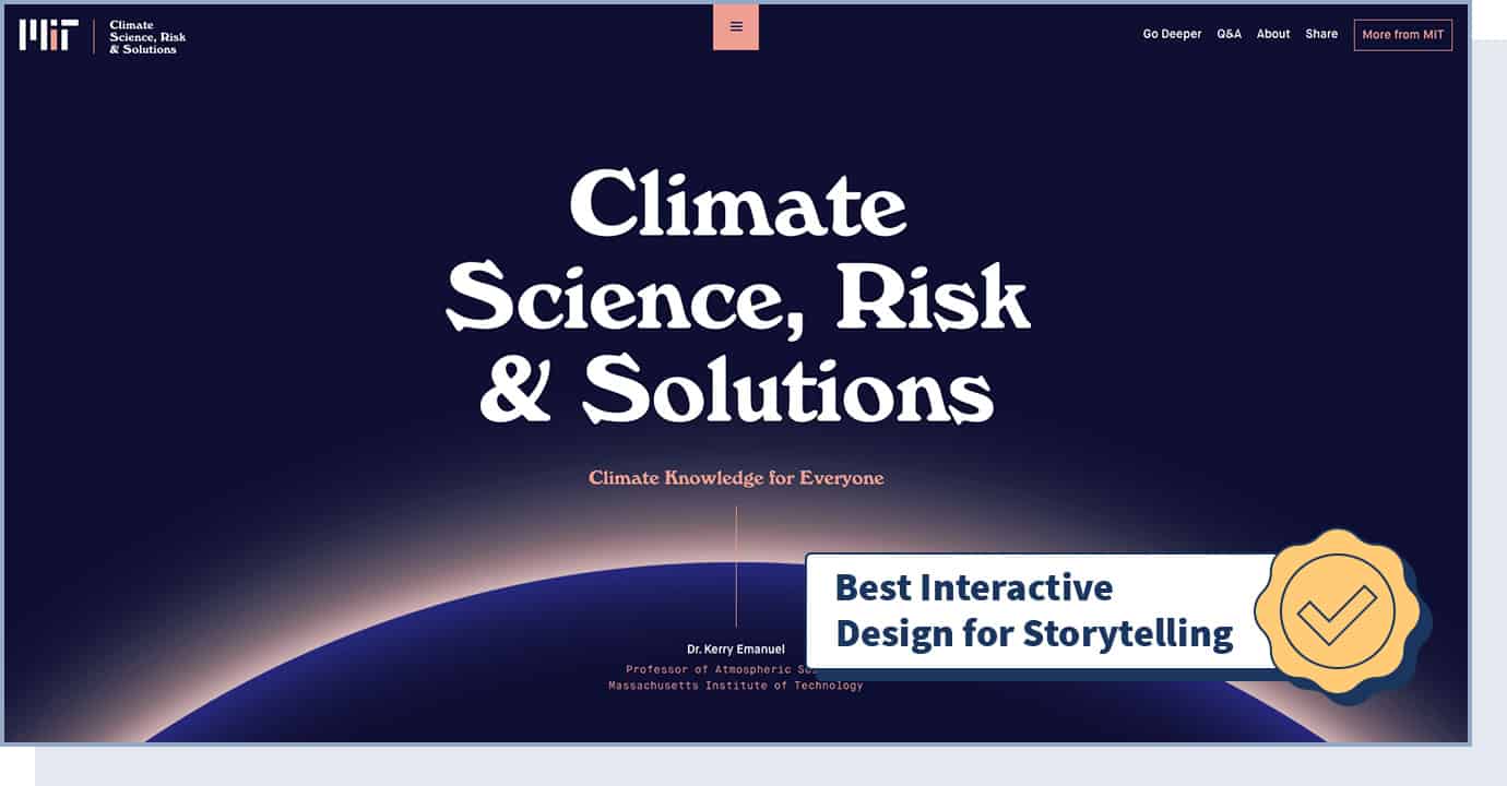
The Climate Science, Risk & Solutions website by the Massachusetts Institute of Technology won the best individual editorial feature 2020 Webby Award for websites that use innovative interaction design and multimedia storytelling components. The goal of this website is to make climate information accessible to everyone. For better storytelling, you can use an interactive design similar to this one by MIT.
- Website Type: Organization
- Design Characteristics: Interactive Design, Storytelling
- Technologies Used: Elasticsearch, Vue.js
- Colors Used: Blue
34. Pattern Radio: Whale Songs
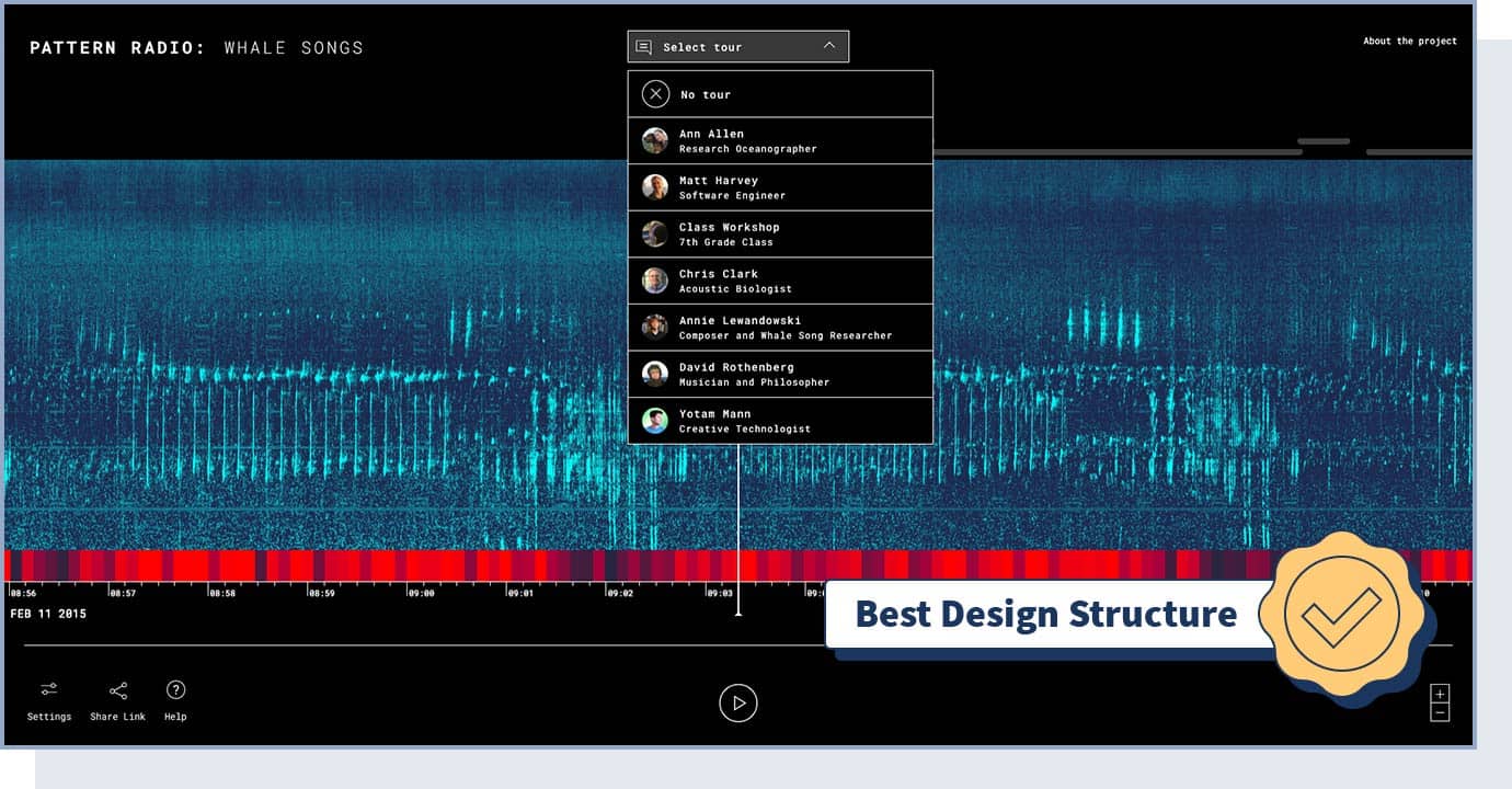
Developed by Google Creative Lab — in collaboration with research oceanographer Ann Allen at National Oceanic and Atmospheric Administration (NOAA) Pacific Islands Fisheries Science Center (PIFSC) — the Pattern Radio website won the 2020 best navigation/structure Webby Award for websites that offer innovative content architecture to enhance the user experience.
The website uses Artificial Intelligence and allows users to easily explore thousands of hours of hunchback whale songs — to make anyone part of this interesting phenomenon.
- Website Type: Government, AI
- Design Characteristics: Navigation, Site Structure, Heat Maps
- Technologies Used: WebGL, Pixi.js, ResNet-50
- Colors Used: Black
35. Buero112
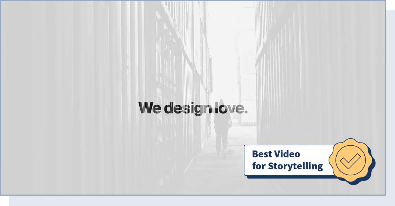
Digital design and branding agency Buero112 created a website that is characterized by extraordinary storytelling through the use of video and image animation. This is extremely powerful, given that users retain 95% of a message when they watch it in a video compared to 10% when reading it.
When landing on this website, a video immediately plays, showing the company’s work through eye-catching moving images. This way, users don’t have to click, scroll, or take any other action. No matter what industry you’re in, you can take advantage of similar features to help users easily consume information on your site.
- Website Type: Business, Agency
- Design Characteristics: Video, Moving Images, Animation, Responsive, Single-page
- Technologies Used: jQuery
- Colors Used: White
36. NexBank
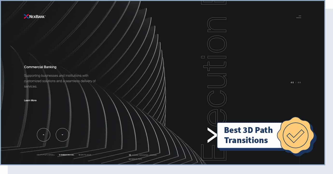
Top-performing U.S. Bank NexBank’s website features Institutional, Commercial, and Mortgage Banking services. This website offers an engaging experience thanks to 3D path transitions and the use of animation. Adding 3D graphics to a business-related industry will make your website more entertaining and visually appealing.
- Website Type: Business, Banking
- Design Characteristics: Animation, Clean, Parallax, 3D Path Transitions, Overlay Menu,
- Technologies Used: CSS3, HTML5, jQuery, SVG
- Colors Used: Black, White
37. Cantamañanas International Urban Art Festival
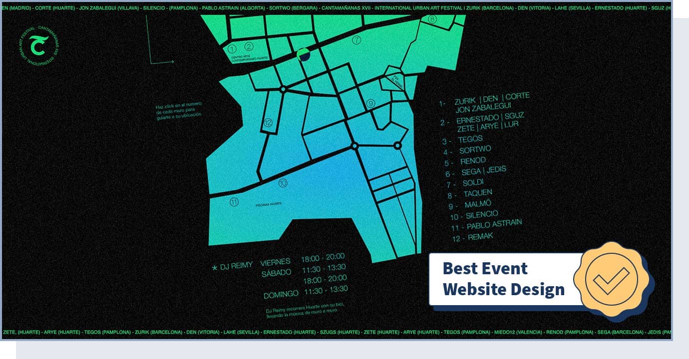
Cantamañanas is an international urban art festival. On the website, users can learn about upcoming events in an interactive, 360-degree view. This website takes a bold approach to present information for an event. A user can use their mouse to explore the location, upcoming events, artists, and more.
- Website Type: Event
- Design Characteristics: Experimental, 360, Graphic design, Typography, Unusual Navigation
- Colors Used: Black, Green
38. Pennsylvania Academy of Fine Arts
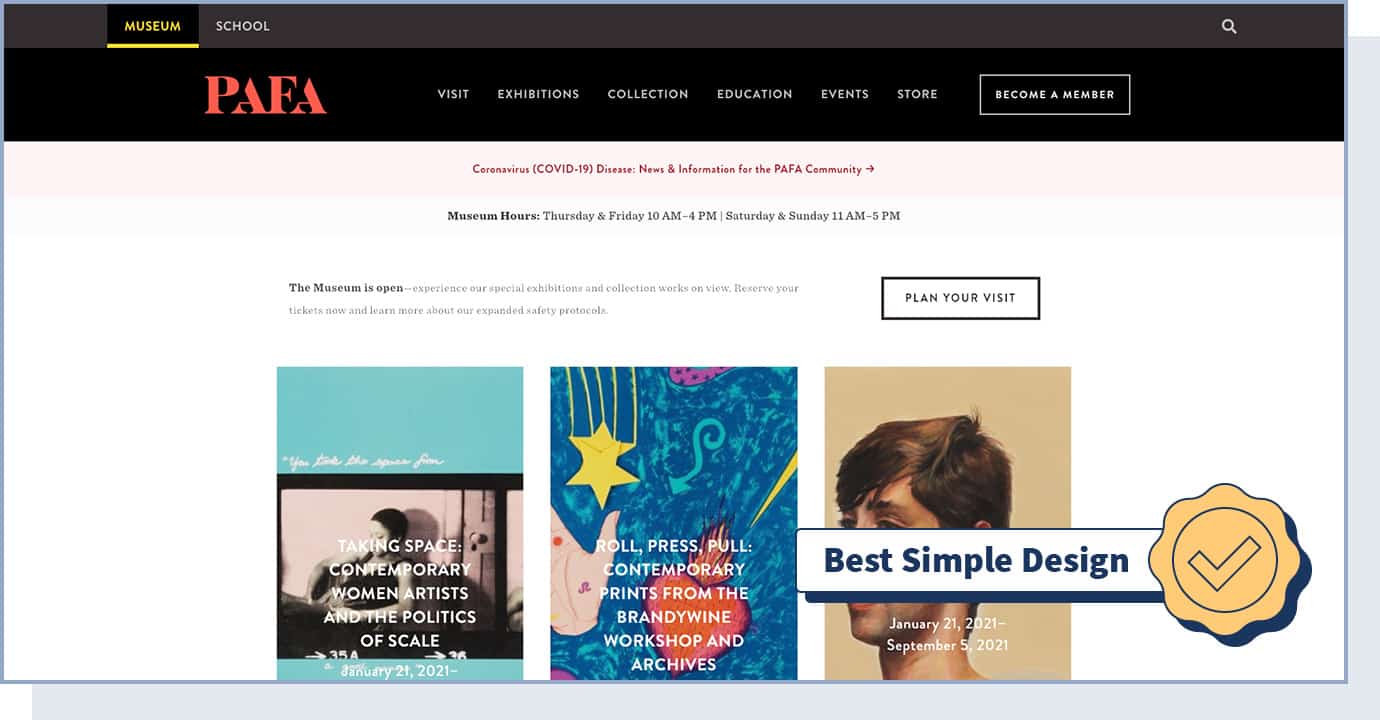
Celebrating the museum’s best art collections and exhibitions, the Pennsylvania Academy of Fine Arts website is the Webby Awards winner of the best school website in 2020. This website is all about minimal design and clear navigation. If you want to simply share useful information without too many distractions or fancy animations, a simple and clean web design like this is the best choice for you.
- Website Type: Education, Culture
- Design Characteristics: Colorful, Responsive, Simple
- Colors Used: Black
39. Bugaboo
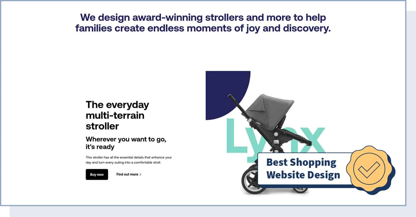
Iconic stroller brand Bugaboo is the Webby Awards 2020 Winner of the best shopping website. With the use of interaction and a clean and simple design, the Bugaboo website is all about offering a seamless online shopping experience.
Users can quickly compare different products and explore each through high-quality video and photos. The “customize” option is an example of how you can make your eCommerce website more interactive for visitors.
- Website Type: eCommerce
- Design Characteristics: Interactive, Big Background Images, Clean, Graphic Design, Interactive 3D models
- Technologies Used: Dept SFRA, PWA
- Colors Used: Black, Silver, White
40. BASIC® Culture Manual
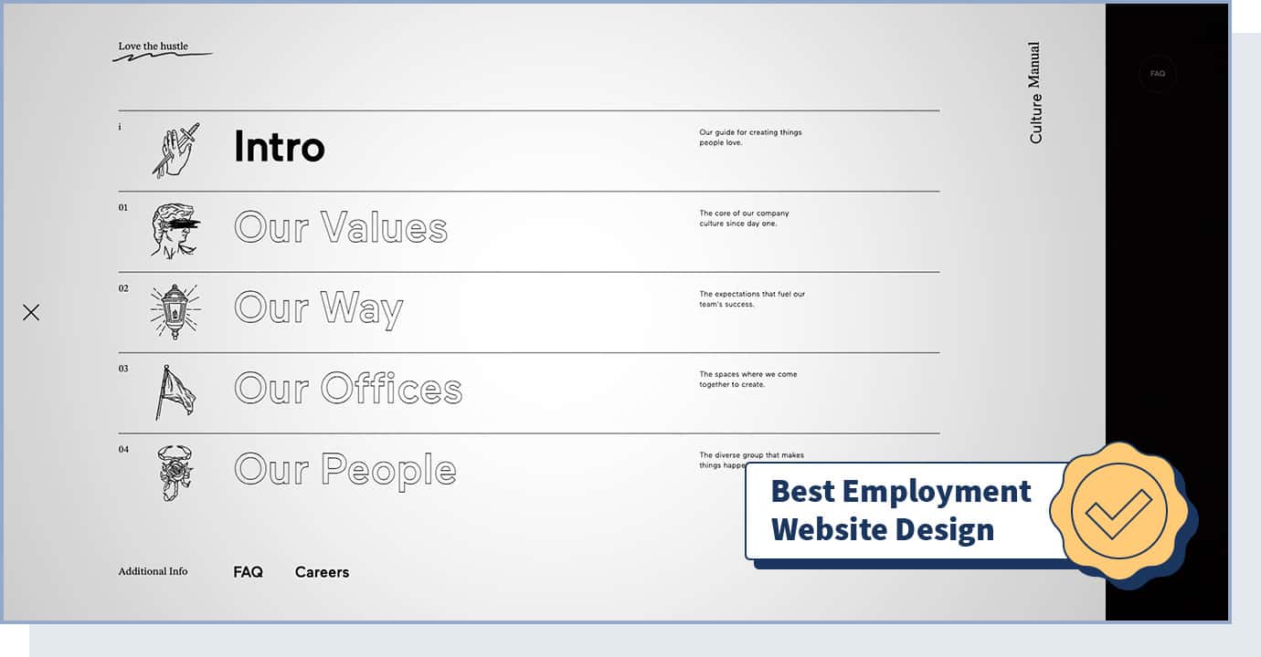
BASIC® is a branding and experience design agency. The BASIC® Culture Manual website was the Webby Awards 2020 winner of the employment award, given to websites that feature job and employment listings, services, or information.
The Culture Manual website serves both as a guide to understand the brand and as a tool for recruiting and onboarding new employees.
- Website Type: Agency, Design, Culture
- Design Characteristics: Interactive, Experimental, Flashing images loading animation, Overlay menu flag effect animation
- Technologies Used: WebGL, GSAP (Greensock), Nginx, Hammer.JS
- Colors Used: Black, Silver, White
41. Nike Purpose Website
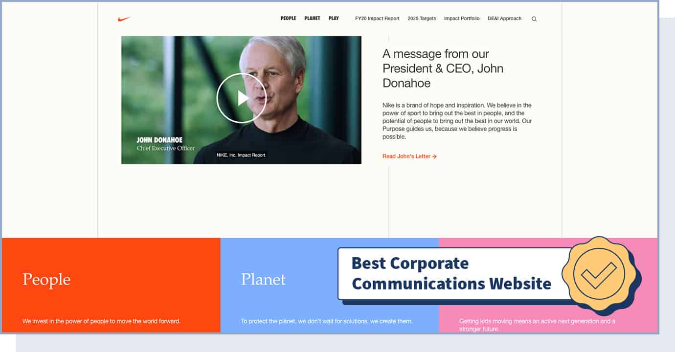
Created by Owen Jones and Partners, the Nike Purpose website is the Webby Awards 2020 corporate communications website winner.
The goal of corporate communication websites is to create a favorable point of view among the company’s — in this case, Nike’s — stakeholders (employees, media, customers, etc.) by sharing the core mission and values.
This website is characterized by a simple and colorful design and uses videos and animations to invite users to learn more about the brand.
- Website Type: Fashion, Communication
- Design Characteristics: Colorful, Simple, Animation, Engaging
- Technologies Used: WordPress, React, Redux, Docker, Express server, Webpack, Atom
- Colors Used: Black, White, Red, Blue, Pink