Bootstrap is a front-end framework that helps you build mobile responsive websites more quickly and easily. Originally developed by Twitter, it now powers everything from web applications to WordPress themes. Notable users include Spotify and LinkedIn, among others. The framework is completely free, versatile, and intuitive.
With Bootstrap, you can build complex web pages from standard HTML and customize them to your needs. It also comes with additional functionality such as carousels, buttons, modals, and more.
Last, but not least, Bootstrap gives you a lot of shortcuts for creating web pages that will save you time and energy. All you need is a basic understanding of HTML and CSS to create web pages that are responsive, mobile-first, and compatible with all modern browsers.
P.S. While Bootstrap is awesome, it’s not a perfect option for complete beginners. If you have absolutely no experience using markup, alternatively, you can use a website builder or WordPress to create a website.
- What is Bootstrap?
- Step 1: Setup and overview
- Step 2: Design your landing page
- Add a navigation bar
- Include custom CSS
- Create a page content container
- Add background image and custom JavaScript
- Add an Overlay
- Include a page title and body text
- Create a CTA button
- Set up a three-column section
- Add a contact form
- Include a team section
- Create a two-column footer
- Add media queries
- Create additional pages
- Bonus: Create a modal
- Get your website live
- FAQ
Total time to create a website using Bootstrap: 3-4 hours. Skill level: Beginner to Intermediate
What Is Bootstrap?
Bootstrap is an open-source front-end framework created to help developers build responsive, mobile-first websites faster. Instead of writing all your CSS and JavaScript from scratch, Bootstrap gives you a library of pre-built components and utility classes you can drop into your HTML.
Here’s what makes it so useful:
- 12-column grid system – Makes it easy to create layouts that adapt to any screen size, from phones to wide desktop monitors.
- Pre-designed components – Buttons, navigation bars, cards, modals, forms, and more are ready to use out of the box.
- Responsive by default – Everything is built mobile-first, so your site looks good on all devices without extra work.
- Customizable – You can override Bootstrap’s default styles with your own CSS or use Sass variables for deeper customization.
- JavaScript plugins – Interactive features like dropdowns, tooltips, carousels, and modals are included and work without additional libraries.
The current major version is Bootstrap 5.3.8, which was a significant update from Bootstrap 4. If you’ve seen older Bootstrap tutorials that mention jQuery as a requirement, that’s no longer the case – Bootstrap 5 uses plain JavaScript instead.
Bootstrap Tutorial Step 1: Setup and Overview
In order to use Bootstrap, you first need to integrate it into your development environment, aka web page. For that, you have two different possibilities: load it remotely or download and use Bootstrap locally. However, for both, you first need something to load it into.
A Note on Bootstrap 5 vs. Bootstrap 4
This tutorial uses Bootstrap 5, the current stable version of the framework. If you’ve followed older Bootstrap tutorials, here are the key differences you should know about:
- No more jQuery – Bootstrap 5 dropped jQuery as a dependency. All JavaScript functionality now runs on vanilla JavaScript.
- Updated data attributes – Data attributes now use a
bsnamespace. For example,data-togglebecamedata-bs-toggle, anddata-targetbecamedata-bs-target. - New utility classes – Bootstrap 5 added a utility API, new spacing and layout helpers, and RTL (right-to-left) support.
- Dropped Internet Explorer support – If you need to support IE, you’ll need to stick with Bootstrap 4. For everyone else, Bootstrap 5 is the way to go.
- Popper.js is bundled – If you use
bootstrap.bundle.min.js(recommended), Popper.js is included automatically. No need to load it separately.
With that context out of the way, let’s get started.
1. Create an HTML Page
As a first step in this tutorial, we will create a simple HTML template as a base where we will use Bootstrap. For that, the first thing you want to do is create a folder on your computer or server for the project files. In this case, we will simply call it bootstrap. Here, create a new text file and call it index.html. Open it with a text editor of your choice (e.g. Notepad++) and then paste the code below into it.
<!DOCTYPE html>

<html lang="en">

    <head>

        <title>Bootstrap Tutorial Sample Page</title>

        <meta charset="utf-8">

        <meta name="viewport" content="width=device-width, initial-scale=1">


	</head>


	<body>

	</body>


</html>
Don’t forget to save your file before moving on.
2a. Load Bootstrap via CDN
Bootstrap consists mainly of style sheets and scripts. As such, they can be loaded in the header and footer of your web page like other assets such as custom fonts. The framework offers a CDN (content delivery network) access path for that. You can find it on the Bootstrap download page.
To get Bootstrap’s CSS into your page, simply paste the code below into the <head> section of your template.
<link href="https://cdn.jsdelivr.net/npm/bootstrap@5.3.8/dist/css/bootstrap.min.css" rel="stylesheet" integrity="sha384-sRIl4kxILFvY47J16cr9ZwB07vP4J8+LH7qKQnuqkuIAvNWLzeN8tE5YBujZqJLB" crossorigin="anonymous">
Be sure to take the actual link from the official download page in order to make sure you are using the latest version of Bootstrap.
When you now save the file, any browser that opens it will automatically load the Bootstrap assets.
Using the remote method is a good idea as many users will already have the file in the cache of their browser from loading other Bootstrap-based websites. If that is the case, they won’t have to reload it when coming to your site, leading to faster page loading time. As a consequence, this is the recommended method for live sites.
However, for experimenting and development, or if you want to be independent of an Internet connection, you can also get your own copy of the files. This is what we’re doing for this Bootstrap tutorial because it also results in less code we need to post.
2b. Host Bootstrap Locally
An alternative way to set up Bootstrap is to download it to your hard drive and use the files locally. You find download options in the same place as the links to the remote version. Be sure to get the compiled CSS and JS files. You don’t need the source files.
Once you have finished downloading it, unzip the file and copy its contents into the same directory as index.html. After that, you can load the Bootstrap CSS into your project like this:
<link rel="stylesheet" href="bootstrap/css/bootstrap.min.css">
You will notice that this includes the file path at which to find the Bootstrap file. In your case, make sure your path corresponds to your actual setup. For example, the names of the directories might differ if you downloaded a different version of Bootstrap.
3. Load Bootstrap JavaScript
To get the full functionality of Bootstrap, you also need to load the Bootstrap JavaScript bundle. This single file includes both Bootstrap’s JS and Popper.js (needed for tooltips, popovers, and dropdowns), so you only need one script tag.
Important: Unlike Bootstrap 4, Bootstrap 5 does not require jQuery. You only need the Bootstrap bundle file.
Place the following <script> tag right before the closing </body> tag. You can call it remotely like this:
<script src="https://cdn.jsdelivr.net/npm/bootstrap@5.3.8/dist/js/bootstrap.bundle.min.js" integrity="sha384-FKyoEForCGlyvwx9Hj09JcYn3nv7wiPVlz7YYwJrWVcXK/BmnVDxM+D2scQbITxI" crossorigin="anonymous"></script>
Or locally like so:
<script src="bootstrap/js/bootstrap.bundle.min.js"></script>
We recommend using bootstrap.bundle.min.js rather than bootstrap.min.js because the bundle includes Popper.js. Without Popper, components like dropdowns, tooltips, and popovers won’t work properly.
4. Put it All Together
If you have followed the steps above correctly, you should end up with a file that looks like this for the remote solution:
<!DOCTYPE html>

<html lang="en">

    <head>

        <title>Bootstrap Tutorial Sample Page</title>

        <meta charset="utf-8">

        <meta name="viewport" content="width=device-width, initial-scale=1">

        <link href="https://cdn.jsdelivr.net/npm/bootstrap@5.3.8/dist/css/bootstrap.min.css" rel="stylesheet" integrity="sha384-sRIl4kxILFvY47J16cr9ZwB07vP4J8+LH7qKQnuqkuIAvNWLzeN8tE5YBujZqJLB" crossorigin="anonymous">

    </head>

    <body>


        <script src="https://cdn.jsdelivr.net/npm/bootstrap@5.3.8/dist/js/bootstrap.bundle.min.js" integrity="sha384-FKyoEForCGlyvwx9Hj09JcYn3nv7wiPVlz7YYwJrWVcXK/BmnVDxM+D2scQbITxI" crossorigin="anonymous"></script>

    </body>


</html>
And here is what you should have for the version that loads all assets locally:
<!DOCTYPE html>

<html lang="en">

    <head>

        <title>Bootstrap Tutorial Sample Page</title>

        <meta charset="utf-8">

        <meta name="viewport" content="width=device-width, initial-scale=1">

        <link rel="stylesheet" href="bootstrap/css/bootstrap.min.css">

    </head>

    <body>


        <script src="bootstrap/js/bootstrap.bundle.min.js"></script>

    </body>


</html>
Notice how much simpler this is compared to Bootstrap 4 – no jQuery, no separate Popper.js file. Just one CSS link and one JavaScript file.
If that looks like what’s in your file and you saved your work, you are now ready to move on to the next step.
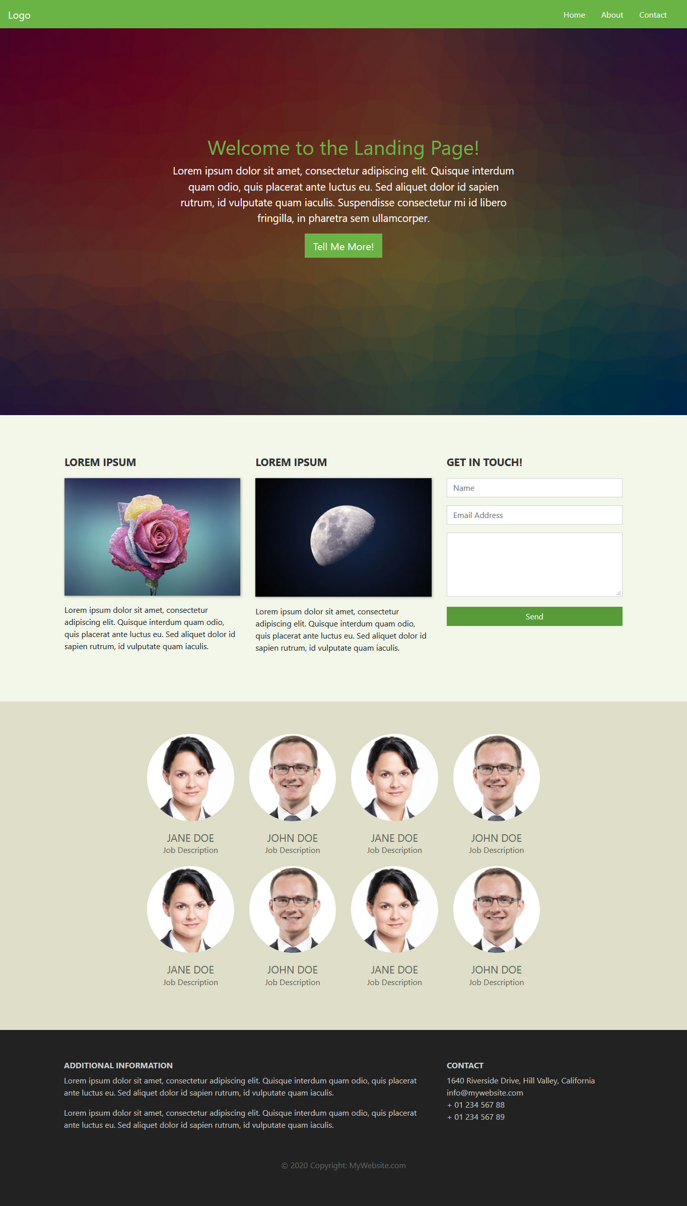
Bootstrap Tutorial Step 2: Design Your Landing Page
Alright, that was, admittedly, a lot of preparation work. However, it wasn’t very hard, was it? Plus, now the fun begins.
At the moment, when you open your sample site in a browser, you should simply see a blank page. Time to change that. In order to teach you Bootstrap, in this tutorial we will build a landing page with different elements so we can show you many use cases of the front-end framework.
1. Add a Navigation Bar
The first thing we want to do is add a navigation bar to the top of the page. Doing so allows your visitors to get around your site and discover the rest of your pages.
For that, we will use the navbar class. This is one of the default elements of Bootstrap, which you will see a lot of in the course of this tutorial. It creates a navigation bar that is responsive by default and will automatically collapse on smaller screens. It also offers built-in support for adding branding, color schemes, spacing, and other components.
You can start by posting this just after the <body> tag:
<nav class="navbar navbar-expand-md">

	<div class="container-fluid">

		<a class="navbar-brand" href="#">Logo</a>

		<button class="navbar-toggler" type="button" data-bs-toggle="collapse" data-bs-target="#main-navigation">

			<span class="navbar-toggler-icon"></span>

		</button>

		<div class="collapse navbar-collapse" id="main-navigation">

			<ul class="navbar-nav">

				<li class="nav-item">

					<a class="nav-link" href="#">Home</a>

				</li>

				<li class="nav-item">

					<a class="nav-link" href="#">About</a>

				</li>

				<li class="nav-item">

					<a class="nav-link" href="#">Contact</a>

				</li>

			</ul>

		</div>

	</div>

</nav>
Some Explanation of the Code
The markup above is probably full of unknown CSS classes. Here is what they mean:
navbar-expand-md– This denotes at which point the navigation bar expands from vertical or hamburger icon to a full-size horizontal bar. In this case, we have set it to medium screens, which, in Bootstrap, is anything greater than 768px.container-fluid– In Bootstrap 5, it’s recommended to wrap your navbar content inside a container. We usecontainer-fluidhere so it spans the full width.navbar-brand– This is used for your website branding. You can also include a logo image file here.navbar-toggler– Denotes the toggle button for the collapsed menu. The piecedata-bs-toggle="collapse"defines that this will turn to a hamburger menu. It’s important that you define adata-bs-targetwith a CSS id (defined by the#) and wrap a<div>with the same name around the actualnavbarelement. Note thebsnamespace in these attributes – this is new in Bootstrap 5.navbar-toggler-icon– As you can probably guess, this creates the icon users click on to open the menu on smaller screens.navbar-nav– The class for the<ul>list element that holds the menu items. The latter are denoted withnav-itemandnav-link.
Why are we explaining this so much?
Because that is the point of Bootstrap. It comes with all of these standards that allow you to quickly create elements with some HTML and CSS. You also don’t have to worry about layout, as everything is already set up within Bootstrap. Plus, it’s all mobile responsive out of the box! Are you beginning to see how helpful this is?
The above is enough to add a navigation bar to your site. However, at the moment, it still looks like very little.

That’s because it doesn’t have a lot of styling attached to it. While you are able to add default colors (for example, by giving the navbar a class like bg-dark and adding data-bs-theme="dark"), we instead want to add our own.
2. Include Custom CSS
Fortunately, if you want to change the default styling, you don’t have to wade through a large library of style sheets and make the changes by hand. Instead, just like with a WordPress child theme, you are able to add your own CSS files which you can use to overwrite existing styling.
For that, simply create a blank file with your text editor and call it main.css. Save it, then add it to the head section of your Bootstrap site like this:
<link rel="stylesheet" type="text/css" href="main.css">
This is the code for a style sheet that resides in the main directory. If you decide to place yours inside the css folder, be sure to include the correct path in the link. Make sure this line comes after the Bootstrap CSS link so your styles can override Bootstrap’s defaults.
From here, you are able to add custom CSS to your site. For example, to style the page background as well as the navigation bar and its elements, you could use markup like this:
body {

    padding: 0;

    margin: 0;

    background: #f2f6e9;

}

.navbar {

    background:#6ab446;

}

.nav-link,

.navbar-brand {

    color: #fff;

    cursor: pointer;

}

.nav-link {

    margin-right: 1em !important;

}

.nav-link:hover {

    color: #000;

}

.navbar-collapse {

    justify-content: flex-end;

}
And here is the result:
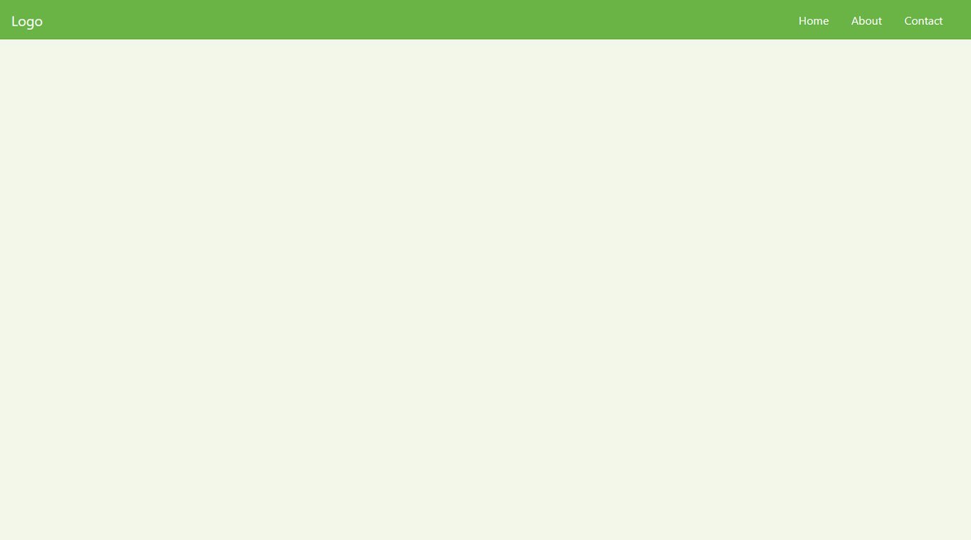
Looks better than before, doesn’t it?
3. Create a Page Content Container
After the navigation bar, the next thing you want is a container for the page content. This is really easy in Bootstrap as all you need for it is this underneath the navbar tag:
<header class="page-header header container-fluid">

</header>
Notice the container-fluid class. This is another one of those default Bootstrap classes. Applying it to the div element automatically applies a bunch of CSS to it.
The -fluid part makes sure the container stretches across the entire width of the screen. There’s also just container, which is a class that has fixed widths applied to it, so there will always be space on both sides of the screen.
However, if you now reload the page, you still won’t see anything (unless you use the developer tools). That’s because you only created an empty HTML element. This will start changing now.
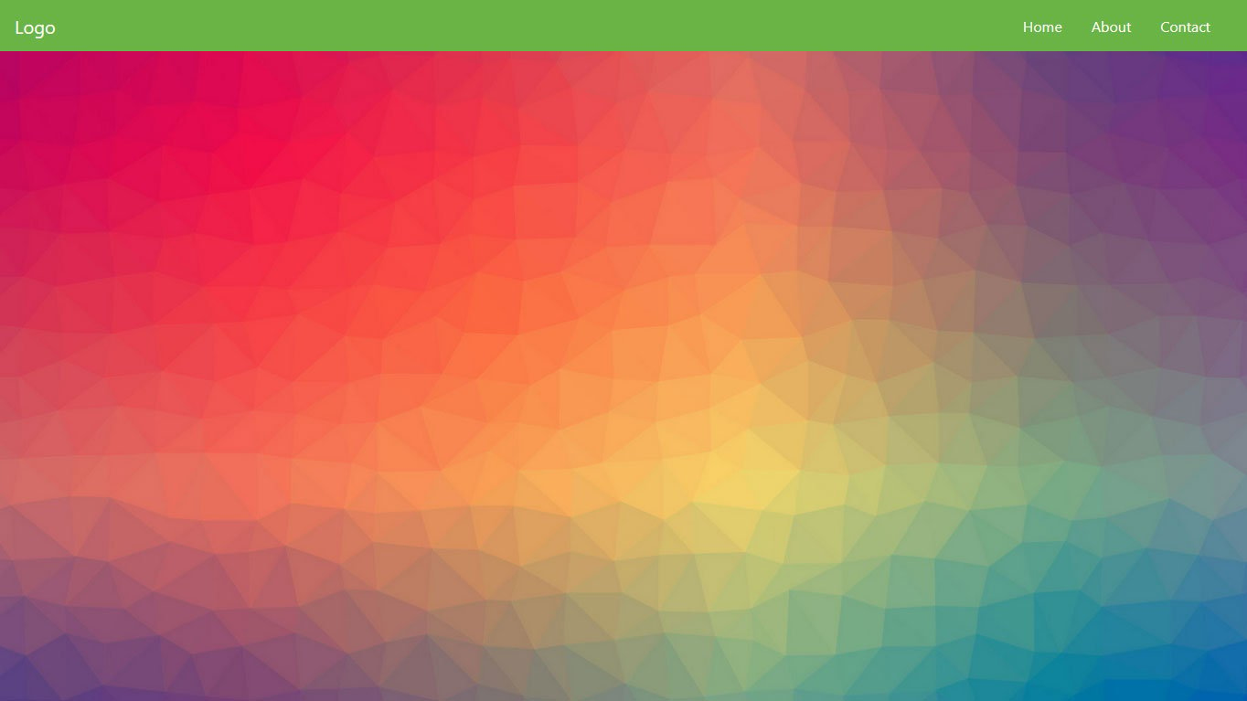
4. Add a Background Image and Custom JavaScript
As the next step in this Bootstrap tutorial, we want to include a full-screen background image for our landing page header. To that end, we will use some JavaScript to make the image stretch all the way across the screen.
First, create a text file named main.js and place it inside your site folder. Then, call it before the closing </body> tag inside index.html (after the Bootstrap bundle script).
<script src="main.js"></script>
After that, paste this piece of JavaScript code to make the <header> element stretch across the entire screen height:
var ready = (callback) => {

    if (document.readyState != "loading") callback();

    else document.addEventListener("DOMContentLoaded", callback);

}

ready(() => {

    document.querySelector(".header").style.height = window.innerHeight + "px";

})
Since Bootstrap 5 doesn’t use jQuery, we’re using plain JavaScript here. This is a good practice that keeps your site lightweight and future-proof.
Tip: You can also achieve a full-viewport header purely with CSS using height: 100vh; on the header element, which avoids needing JavaScript entirely. Either approach works.
Then, the only thing that’s left is to set a background image. You can do this like so inside main.css:
.header {

    background-image: url('images/header-background.jpg');

    background-size: cover;

    background-position: center;

    position: relative;

}
If you place an image of sufficient size at the location specified by the path above, you will achieve a result similar to this:
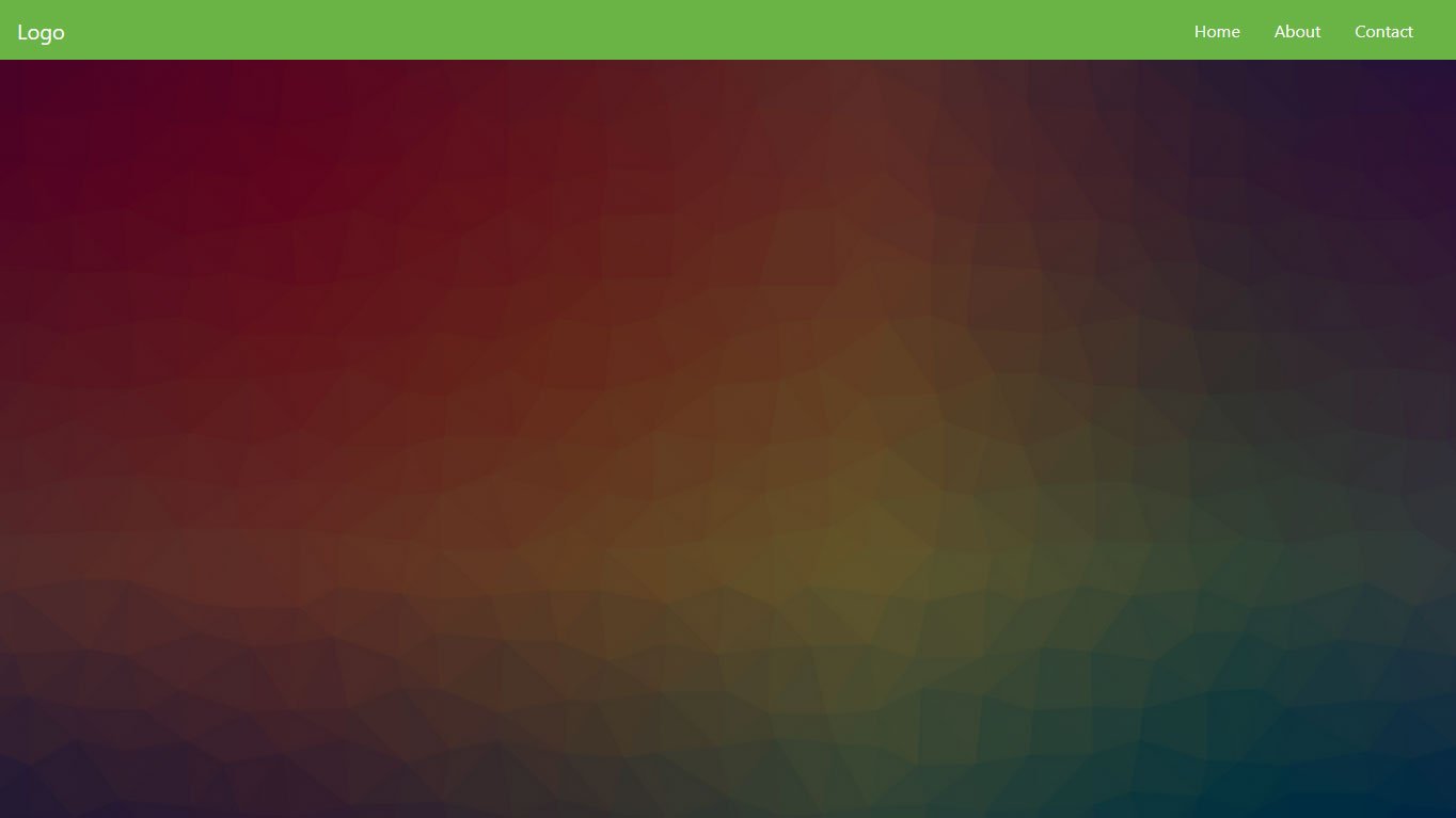
5. Add an Overlay
To make the background image extra stylish, we will also add an overlay. For that, create another div inside the <header> element you just created earlier.
<div class="overlay"></div>
Then, you can add the following in your custom CSS file:
.overlay {

    position: absolute;

    min-height: 100%;

    min-width: 100%;

    left: 0;

    top: 0;

    background: rgba(0, 0, 0, 0.6);

}
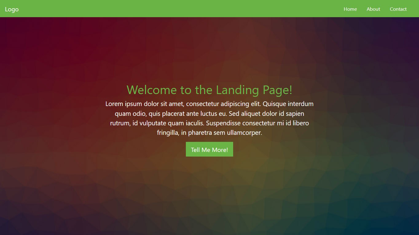
This will create this nice overlay for the image you input earlier:
6. Include a Page Title and Body Text
As a next step, you probably want to add a page title in the form of a heading plus some body text. That way, your visitors will know immediately which site they are on and what they can expect from it.
To create those, simply add this snippet inside the container you set up in the last step, below the overlay:
<div class="description">

	<h1>Welcome to the Landing Page!</h1>

	<p>Lorem ipsum dolor sit amet, consectetur adipiscing elit. Quisque interdum quam odio, quis placerat ante luctus eu. Sed aliquet dolor id sapien rutrum, id vulputate quam iaculis. Suspendisse consectetur mi id libero fringilla, in pharetra sem ullamcorper.</p>

</div>
After that, add the following markup to main.css.
.description {

	left: 50%;

	position: absolute;

	top: 45%;

	transform: translate(-50%, -55%);

	text-align: center;

}

.description h1 {

	color: #6ab446;

}

.description p {

	color: #fff;

	font-size: 1.3rem;

	line-height: 1.5;

}
When you do, the landing page now looks like this:
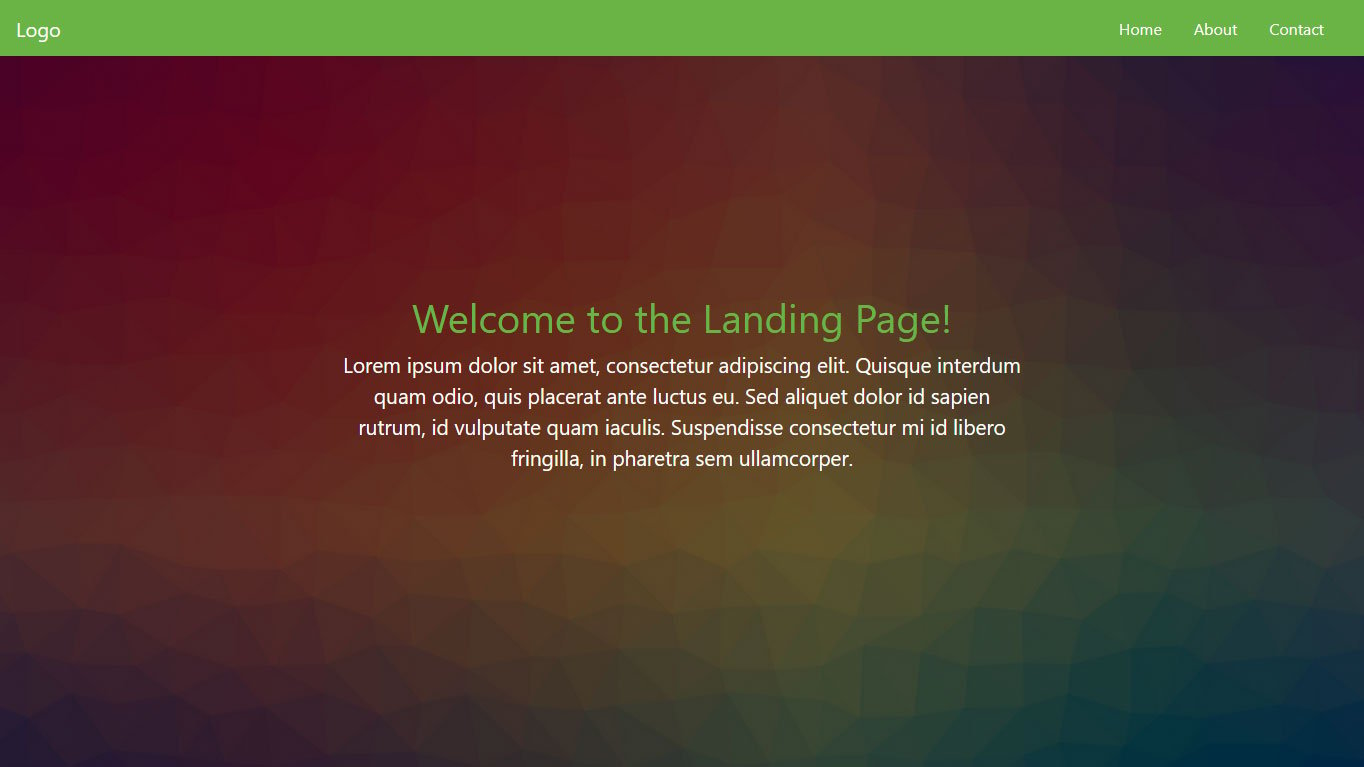
It’s really starting to come together, isn’t it?
7. Create a CTA Button
No landing page is complete without a call to action, most often in the form of a button. For that reason, we would be remiss not to include how to create one in this Bootstrap tutorial.
Luckily, the framework offers plenty of tools to create buttons quickly and easily. You can find a lot of examples here. In our case, we add the following markup right below the page content inside the <description> container:
<button class="btn btn-outline-secondary btn-lg">Tell Me More!</button>
In addition to that, we add this CSS to main.css:
.description button {

    border:1px solid #6ab446;

    background:#6ab446;

    border-radius: 0;

    color:#fff;

}

.description button:hover {

	border:1px solid #fff;

    background:#fff;

    color:#000;

}
After saving and reloading, it looks like this:
8. Set Up a Three-Column Section
We can already be quite satisfied with how things are shaping up. However, we are not done with the page yet. Next up, we want to create three columns below the main content for additional information. This is a specialty of Bootstrap since it plays to its strength, creating a grid, and no tutorial is complete without it. Here’s how to do that in this case:
<div class="container features">

    <div class="row">

        <div class="col-lg-4 col-md-4 col-sm-12">

            <h3 class="feature-title">Lorem ipsum</h3>

            <img src="images/column-1.jpg" class="img-fluid">

            <p>Lorem ipsum dolor sit amet, consectetur adipiscing elit. Quisque interdum quam odio, quis placerat ante luctus eu. Sed aliquet dolor id sapien rutrum, id vulputate quam iaculis.</p>

        </div>


        <div class="col-lg-4 col-md-4 col-sm-12">

            <h3 class="feature-title">Lorem ipsum</h3>

            <img src="images/column-2.jpg" class="img-fluid">

            <p>Lorem ipsum dolor sit amet, consectetur adipiscing elit. Quisque interdum quam odio, quis placerat ante luctus eu. Sed aliquet dolor id sapien rutrum, id vulputate quam iaculis.</p>

        </div>


        <div class="col-lg-4 col-md-4 col-sm-12">


        </div>

    </div>

</div>
The first thing you will notice is the row element. You need this whenever creating columns to act as a container for the grid.
As for the columns, they all have several classes: col-lg-4, col-md-4, and col-sm-12. These denote that we are dealing with columns and the size they will take on on different screens.
To understand this, you need to know that in a Bootstrap grid, all columns in one row always add up to the number twelve. So, giving them the classes above means that they will take up one-third of the screen on large and medium screens (12/4=3) but the entire screen on small devices (twelve out of twelve columns).
It makes sense, doesn’t it?
You will also notice that we included images and added the .img-fluid class to them. This is to make them responsive so that they scale along with the screen that the page is viewed on.
In addition to that, you can include the following styling in the usual place:
.features {

	margin: 4em auto;

	padding: 1em;

	position: relative;

}

.feature-title {

	color: #333;

	font-size: 1.3rem;

	font-weight: 700;

	margin-bottom: 20px;

	text-transform: uppercase;

}

.features img {

	-webkit-box-shadow: 1px 1px 4px rgba(0, 0, 0, 0.4);

	-moz-box-shadow: 1px 1px 4px rgba(0, 0, 0, 0.4);

	box-shadow: 1px 1px 4px rgba(0, 0, 0, 0.4);

	margin-bottom: 16px;

}
When added below the main content and saved, it looks like this:
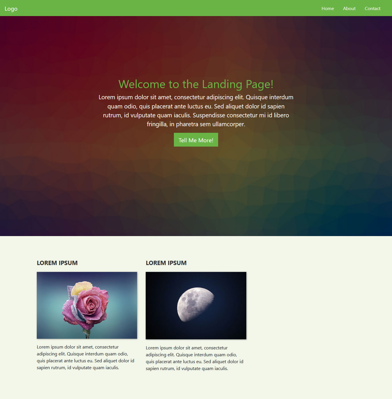
By the way, if you don’t want to manually set the box shadow on your elements via CSS, you can also assign Bootstrap’s pre-set classes for that. These are .shadow-sm, .shadow, and .shadow-lg. More information here.
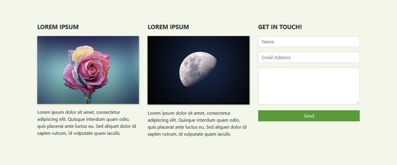
9. Add a Contact Form
You will notice that one of the new fields is still empty. This was on purpose because we want to add a contact form to it. This is a very normal practice for landing pages to allow visitors to get in touch.
Creating a contact form in Bootstrap is quite easy:
<h3 class="feature-title">Get in Touch!</h3>

<div class="mb-3">

	<input type="text" class="form-control" placeholder="Name" name="">

</div>

<div class="mb-3">

    <input type="email" class="form-control" placeholder="Email Address" name="email">

</div>

<div class="mb-3">

    <textarea class="form-control" rows="4"></textarea>

</div>

<input type="submit" class="btn btn-secondary btn-block" value="Send" name="">
Pay attention to these CSS classes:
mb-3– In Bootstrap 5, theform-groupclass has been dropped. Instead, you use spacing utilities likemb-3(margin-bottom) to add space between form fields.form-control– Denotes form fields such as inputs, text areas, etc. This class still works the same way in Bootstrap 5.
There is a lot more you can do with forms, which you can find out in the documentation. However, for demonstration purposes, the above is enough. Place it inside the remaining empty column and then add this styling in main.css:
.features .form-control,

.features input {

	border-radius: 0;

}

.features .btn {

    background-color: #589b37;

    border: 1px solid #589b37;

    color: #fff;

    margin-top: 20px;

}

.features .btn:hover {

    background-color: #333;

    border: 1px solid #333;

}
When you do, you get a form like this:
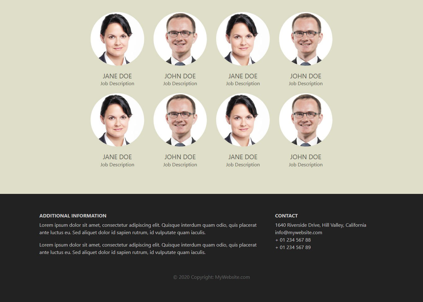
10. Include a Team Section
Card layouts are another thing Bootstrap excels at. Its custom CSS classes make creating a Pinterest-like layout a cinch. In the following, we will use this to set up a team section, where we display team members and their positions in the company.
However, we want to make this section a different color. For that reason, we first include another <div> element as its background. Inside, there is another container with a custom class for more customizability, followed by a row.
<div class="background">

    <div class="container team">

        <div class="row">


        </div>

    </div>

</div>
Creating cards is easy, simply give an element the class card. You can also use grid classes for sizing it and determining how many cards appear in one row. Plus, since we want all the content in the card to be centered, we will also add the Bootstrap class text-center to it.
<div class="card col-lg-3 col-md-3 col-sm-4 text-center">

</div>
Cards can contain different elements. In our case, we want an image at the top, followed by a title (the name of the person) and a description that says what they do. As is probably no surprise, Bootstrap offers custom classes for all of that.
For images, we will use the card-img-top class to position an image at the roof of the card. We will also give it the rounded-circle class to make the image round.
After that, we create a new element with the class card-body that contains a heading and paragraph with card-title and card-text classes respectively. Here’s what it looks like all together:
<div class="card col-lg-3 col-md-3 col-sm-4 text-center">

    <img class="card-img-top rounded-circle" src="images/team-image-1.png" alt="Card image">

    <div class="card-body">

        <h4 class="card-title">Jane Doe</h4>

        <p class="card-text">Job Description</p>

    </div>

</div>
When we now place it inside the row element, replicate it eight times, and place image files in the respective locations, we get this result.
Of course, to make it look like this, we also included some custom CSS. Here is the markup you can add to your style sheet:
.background {

	background: #dedec8;

	padding: 4em 0;

}

.team {

	color: #5e5e55;

	padding: 0 180px;

}

.team .card-columns {

	-webkit-column-count: 4;

	-moz-column-count: 4;

	column-count: 4;

}

.team .card {

	background:none;

	border: none;

}

.team .card-title {

	font-size: 1.3rem;

	margin-bottom: 0;

	text-transform: uppercase;

}
Note: The .card-columns class was removed in Bootstrap 5. If you want a Masonry-style card layout, Bootstrap 5 recommends using CSS Grid or the Masonry plugin. For our simple grid layout above, the standard row and column classes work just fine.
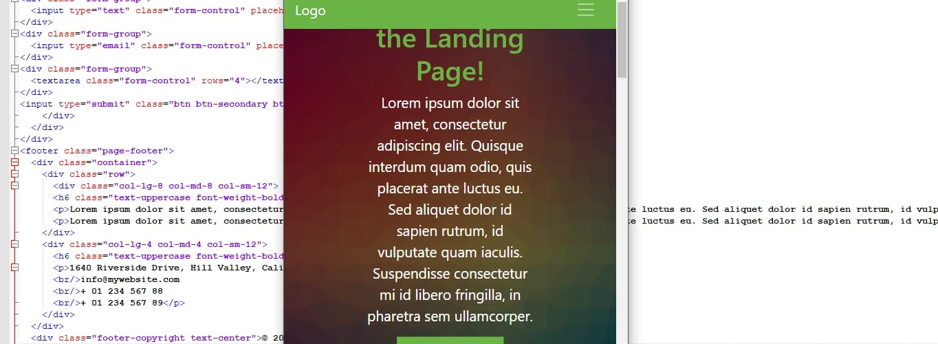
11. Create a Two-Column Footer
Alright, we are now getting towards the end of the Bootstrap tutorial. The last thing we want to add to our landing page is a footer section with two columns. By now, this shouldn’t pose much of a problem for you anymore.
<footer class="page-footer">
<div class="container">
<div class="row">
<div class="col-lg-8 col-md-8 col-sm-12">
<h6 class="text-uppercase font-weight-bold">Additional Information</h6>
<p>Lorem ipsum dolor sit amet, consectetur adipiscing elit. Quisque interdum quam odio, quis placerat ante luctus eu. Sed aliquet dolor id sapien rutrum, id vulputate quam iaculis.</p>
<p>Lorem ipsum dolor sit amet, consectetur adipiscing elit. Quisque interdum quam odio, quis placerat ante luctus eu. Sed aliquet dolor id sapien rutrum, id vulputate quam iaculis.</p>
</div>
<div class="col-lg-4 col-md-4 col-sm-12">
<h6 class="text-uppercase font-weight-bold">Contact</h6>
<p>1640 Riverside Drive, Hill Valley, California
<br/>info@mywebsite.com
<br/>+ 01 234 567 88
<br/>+ 01 234 567 89</p>
</div>
<div>
<div class="footer-copyright text-center">© 2025 Copyright: MyWebsite.com</div>
</footer>
Besides the usual grid markup, this section highlights a few possibilities to modify typography with Bootstrap:
text-uppercasefont-weight-bold(in Bootstrap 5, you can also usefw-bold)text-center
It should be pretty clear from the names of the classes what they do. You can find more information about Bootstrap and typography here.
In addition to the above, you can use styling like this:
.page-footer {

    background-color: #222;

    color: #ccc;

    padding: 60px 0 30px;

}

.footer-copyright {

    color: #666;

    padding: 40px 0;

}
This results in a beautiful footer that looks like so:
12. Add Media Queries
The page is basically ready by now. It is also fully responsive. However, in the mobile view of the browser, some sections don’t come out quite right yet. For example, here’s what the header image looks like on mobile devices:
However, no worries, you can correct that quite easily with a simple media query. Unless you are using SASS for compiling your Bootstrap site, these work the same way as in other instances. You just need to keep in mind the preset breakpoints included in Bootstrap.
Bootstrap 5 uses the following default breakpoints:
- Extra small (xs): <576px
- Small (sm): ≥576px
- Medium (md): ≥768px
- Large (lg): ≥992px
- Extra large (xl): ≥1200px
- Extra extra large (xxl): ≥1400px (new in Bootstrap 5)
As a consequence, to correct the above problem, you can simply include a piece of code like this:
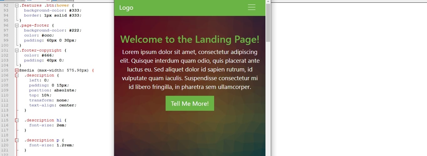
@media (max-width: 575.98px) {

    .description {

        left: 0;

        padding: 0 15px;

        position: absolute;

        top: 10%;

        transform: none;

        text-align: center;

    }


    .description h1 {

        font-size: 2em;

    }


    .description p {

        font-size: 1.2rem;

    }


    .features {

        margin: 0;

    }

}
After that, everything is as it should be:
If you download the files below, you will also see some other markup in the media query section to style some of the other parts of the landing page on smaller screens.
13. Create Additional Pages
So far, we have built only a single page for our Bootstrap website. However, you might remember that, when setting up the navigation menu, we included several menu items. Yet, currently, these links don’t lead anywhere when you click them.
If you want to change that and add additional pages to your Bootstrap website, there’s nothing easier than that. The most straightforward way is to simply make a copy of index.html and give it a different name, typically that of the other page you want to create.
So, for example, we could name the copy about.html. However, why copy it and not start from scratch? Because with a copy you can use those parts of the page that stay the same (e.g. the navigation menu) and only delete or modify what you want to change. For instance, here’s what the About page might look like:
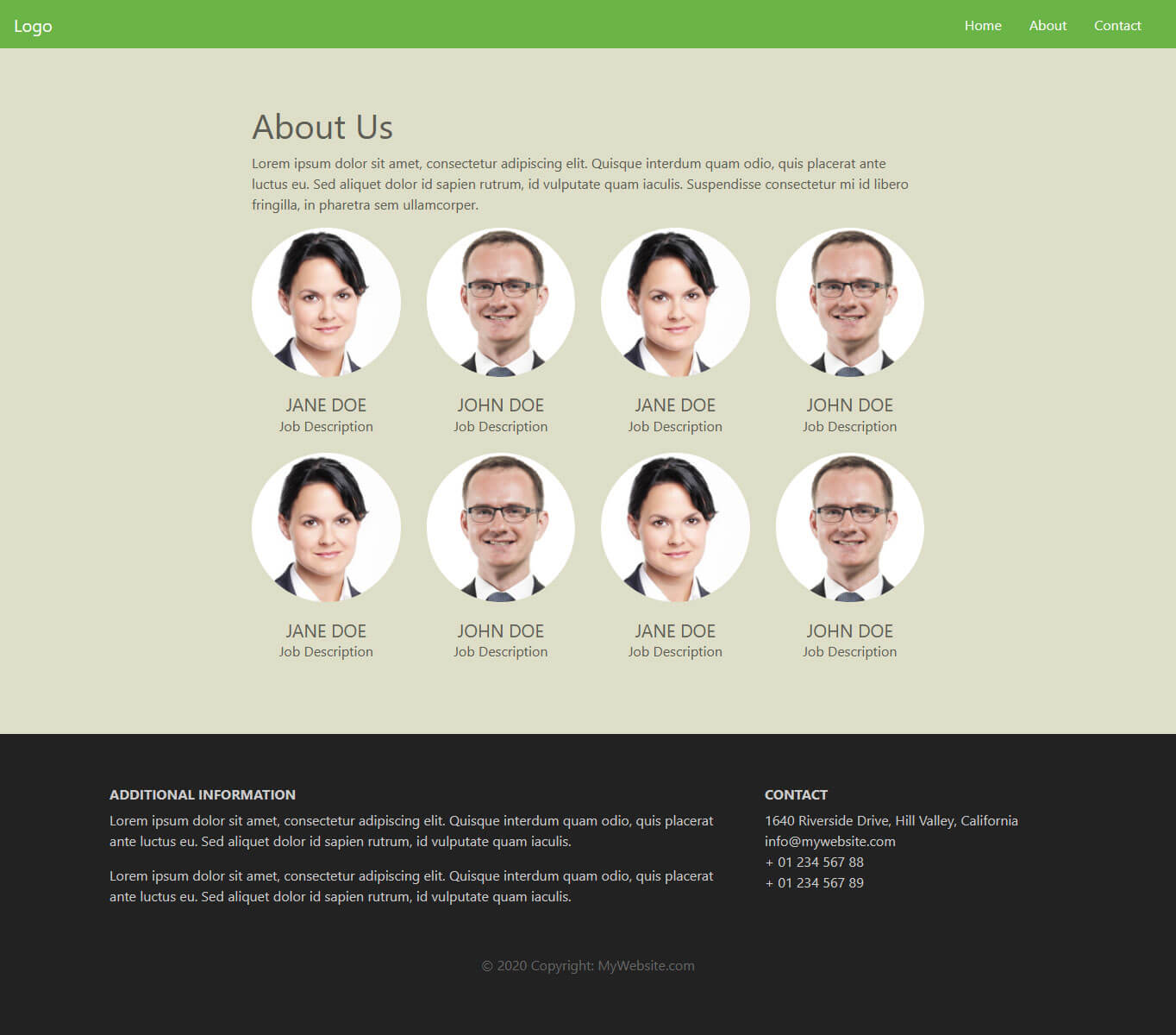
When you have the second file, all that’s left to do is make sure the link in the navigation menu actually points to it like so:
<a class="nav-link" href="about.html">About</a>
Quick note: For this to work, about.html has to be in the same directory as index.html. If it’s, say, in a subfolder called html, you would link to it like so:
<a class="nav-link" href="html/about.html">About</a>
That’s it, now you have a second page on your Bootstrap site that can be accessed from the navigation menu! Just be sure that, whenever you change the navigation links or add more pages to your site, you always have to update the links in all other files as well.
14. Bonus: Create a Modal
As a bonus, we will also create a modal for our test website. This isn’t strictly necessary but it’s a great opportunity to show off some more of Bootstrap’s capabilities and round off this tutorial.
In case you are not familiar with the term, a modal means an element like a popup that appears on top of a website. You can use it for all sorts of purposes. In our case, we want to create a prompt to subscribe to a newsletter.
Set up the Modal Trigger
As usual, Bootstrap offers its own markup to achieve this. However, before building the modal, we first want to create the trigger for it to show up on the page. Otherwise, we won’t see what we are doing.
Since Bootstrap 5 uses vanilla JavaScript (no jQuery), add this piece of code to your main.js file:
document.addEventListener("DOMContentLoaded", function() {

    setTimeout(function() {

        var demoModal = new bootstrap.Modal(document.getElementById('demo-modal'));

        demoModal.show();

    }, 500);

});
This triggers the modal to show up after a defined time as set by the number at the end. For the demo, we have timed it to 500 milliseconds, since we want to see the modal quickly after reload while working on it. On a live page, you would naturally set it to a longer interval so that your visitors see the popup after being on your page for a while.
Notice how we’re using new bootstrap.Modal() – this is the Bootstrap 5 JavaScript API for modals. You create an instance of the modal object and then call .show() on it.
Create the Modal
Alright, let’s start with the actual modal. It all begins with three nested elements that have the classes modal, modal-dialog, and modal-content assigned to them respectively.
<div id="demo-modal" class="modal fade">

    <div class="modal-dialog modal-lg modal-dialog-centered">

        <div class="modal-content">

        </div>

    </div>

</div>
These create the modal on top of your site and set up the modal window that you can fill with content.
We have also given the modal element an id of #demo-modal to make CSS targeting easier and also so that it works with the JavaScript trigger. The fade class makes sure its appearance and disappearance isn’t abrupt. At the same time, modal-lg determines the size of the modal window and modal-dialog-centered centers it vertically on screen.
However, where to place this code? That’s a very good question. Modal markup belongs right before the closing </body> tag and below the calls for any JavaScript files.
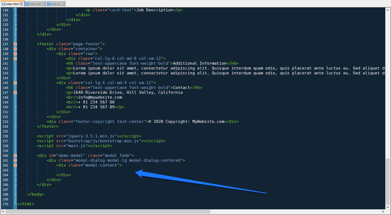
Yet, even though it’s in the page markup, because of the modal class, it will not show up on the page unless triggered.
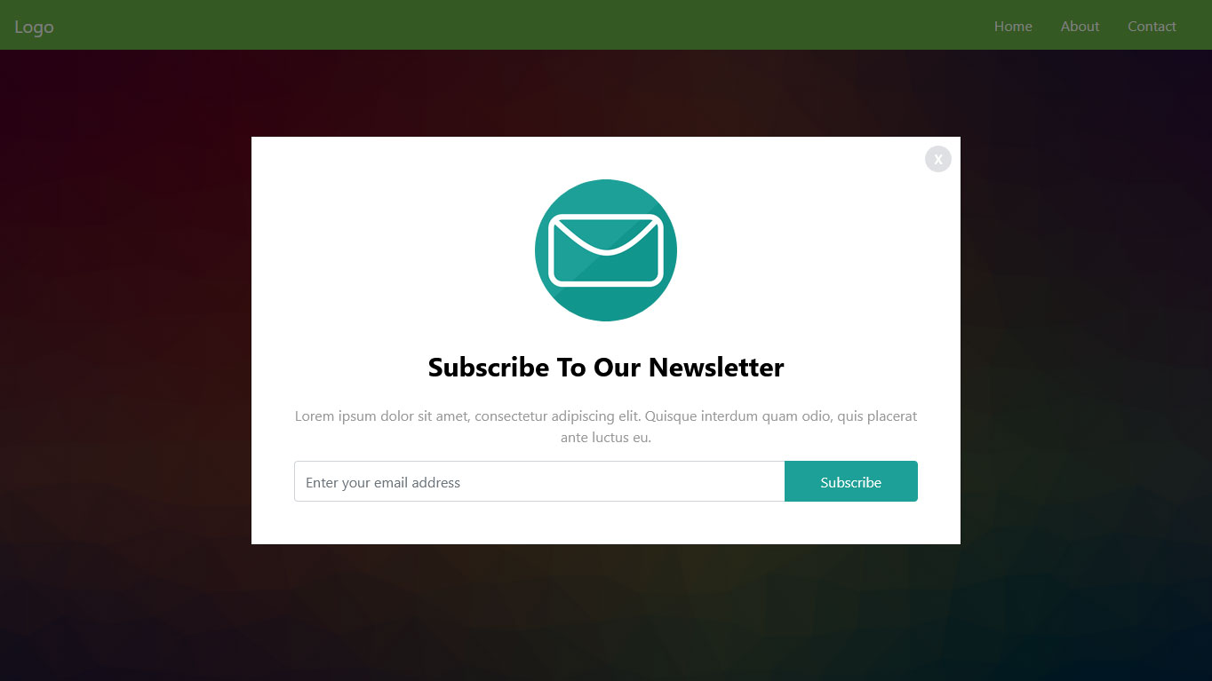
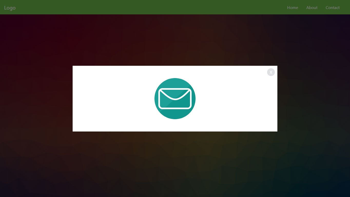
Fill It With Content
Alright, on to make it prettier. Next up, we want to create a modal header with an image inside as well as the button to close the popup. You can do this by placing this markup here inside modal-content:
<div class="modal-header">

    <img class="rounded-circle mx-auto" src="images/email-icon.png" alt="modal image">

    <button type="button" class="btn-close" data-bs-dismiss="modal" aria-label="Close"></button>

</div>
Note the mx-auto class for the image. It’s a Bootstrap utility class for centering all sorts of elements. More on it here. For the close button, notice that Bootstrap 5 uses a dedicated btn-close class instead of the old <span>x</span> approach. You also need to include data-bs-dismiss="modal" (with the bs namespace) so that it actually closes the popup.
Here’s what we have so far:
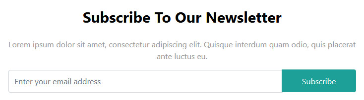
Now on to the modal body, which we will place underneath modal-header and that will include a heading, text and the form to include your email address. Here’s the markup:
<div class="modal-body text-center">

    <h4>Subscribe to our newsletter</h4>

    <p>Lorem ipsum dolor sit amet, consectetur adipiscing elit. Quisque interdum quam odio, quis placerat ante luctus eu.</p>

    <div class="input-group">

        <input type="email" class="form-control" placeholder="Enter your email address" name="email">

        <input type="submit" class="btn" value="Subscribe">

    </div>

</div>
If you’ve been following along the Bootstrap tutorial, the modal-body and text-center classes should be self-explanatory. However, note the input-group at the bottom. This is a Bootstrap class that allows you to place inputs like form fields and buttons next to each other.
In Bootstrap 5, the button placed after the input inside an input-group will automatically appear appended. The separate input-group-append wrapper from Bootstrap 4 has been removed — you simply place elements in order inside the input-group.
Here’s what it comes out as:
Alright, looks like the only thing that’s left is styling. So, include this markup in your main.css style sheet to achieve the look above:
#demo-modal .modal-content {

    border-radius: 0;

    padding: 2rem;

}

#demo-modal .modal-header {

    border-bottom: none;

}

#demo-modal h4 {

    color: #000;

    font-size: 30px;

    margin: 0 0 25px;

    font-weight: bold;

    text-transform: capitalize;

}

#demo-modal .btn-close {

    position: absolute;

    right: 26px;

    top: 26px;

    opacity: 0.5;

}

#demo-modal .modal-body p {

    color: #999;

}

#demo-modal .form-control,

#demo-modal .btn {

    min-height: 46px;

}

#demo-modal .btn {

    background-color: #1da098;

    border: none;

    color: #fff;

    min-width: 150px;

    transition: all 0.4s;

}

#demo-modal .btn:hover,

#demo-modal .btn:focus {

    background-color: #12968d;

}
15. Upload Your Website to a Web Host
If you have been following along, you should now be set with a finished website (plus optional modal) that is also completely responsive.
However, so far, nobody but you can see it. To change that, you need a web host and domain. That way, people can input your website address into their browser and then access your newly minted Bootstrap website online.
In order to allow them to do so, you need to upload the site to your server. You can do that with an FTP client like FileZilla. Collect your FTP host address, username, and password from your hosting provider to connect to your server remotely. When you do, you should be able to see the files and directories currently on there.
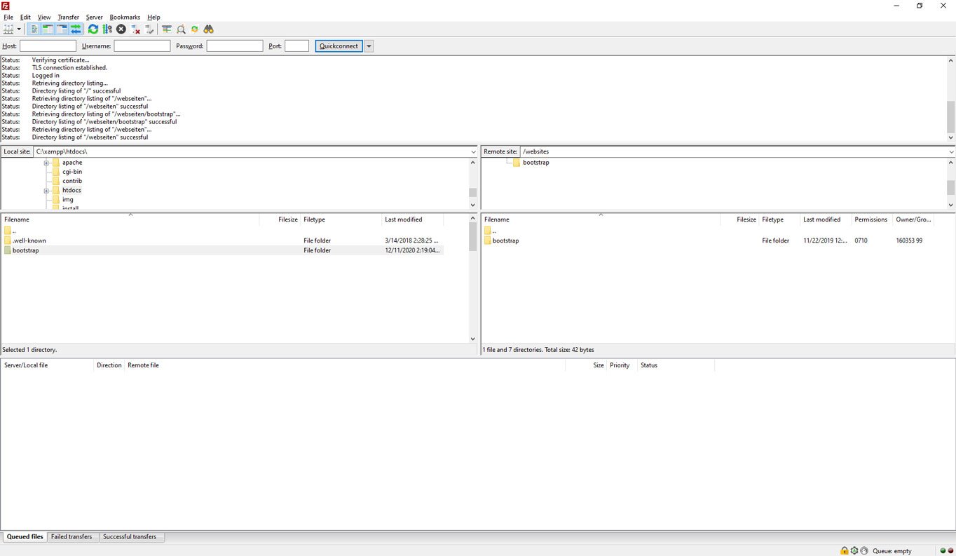
Navigate to the directory your domain is pointed to (usually the root directory). Once you have done that, simply find the folder with your Bootstrap files on your hard drive, mark all the files inside, and then drag them over to the server to start the upload. The process will take a while to finish depending on your connection speed as well as the number and size of your files.
However, once it’s done, when you access your domain, you should be able to see the finished site in your browser window.
Not bad for a few lines of code, right?
Speaking of which, if you want to have the entire Bootstrap code from the tutorial including the custom CSS, JavaScript, and images, you can download them all below. With this, you have all you need to create a landing page with Bootstrap.
Bootstrap Tutorial FAQ
Is Bootstrap still worth learning in 2025?
Yes. Bootstrap remains one of the most widely used front-end frameworks. It’s actively maintained, has a massive community, and is used by companies of all sizes. While newer frameworks like Tailwind CSS have gained popularity, Bootstrap is still an excellent choice – especially for beginners – because of its pre-built components and gentle learning curve.
Do I need to know JavaScript to use Bootstrap?
Not necessarily. You can build many layouts and pages using only Bootstrap’s HTML and CSS classes. However, if you want to use interactive components like modals, tooltips, carousels, or dropdowns, a basic understanding of JavaScript is helpful. Bootstrap 5 handles most of the heavy lifting through data attributes, so you often don’t need to write JavaScript yourself.
What’s the difference between Bootstrap and Tailwind CSS?
Bootstrap provides pre-designed, ready-to-use components (buttons, navbars, cards, etc.) that you can drop into your page and customize. Tailwind CSS takes a utility-first approach, giving you low-level utility classes to build custom designs from scratch. Bootstrap is generally easier for beginners and faster for prototyping, while Tailwind offers more design flexibility at the cost of a steeper learning curve.
Can I use Bootstrap with WordPress?
Absolutely. Many WordPress themes are built on Bootstrap. You can also create your own custom Bootstrap-based WordPress theme. If you’d rather use Bootstrap without WordPress, this tutorial shows you how to build standalone HTML pages. But if you want a CMS to manage your content, WordPress and Bootstrap work very well together.
Should I use Bootstrap 4 or Bootstrap 5?
For new projects, use Bootstrap 5. It’s the current stable version, no longer requires jQuery, has better utilities, and includes modern features like RTL support and an updated grid system. Bootstrap 4 is still functional but is in maintenance mode and won’t receive new features.
Final Thoughts: Bootstrap Beginner Tutorial
Bootstrap is an open-source, front-end development framework anyone can use for free. It allows you to quickly prototype designs, create web pages, and generally hit the ground running.
As you have seen in this Bootstrap tutorial for beginners, it only needs basic knowledge of HTML, CSS, and some optional JavaScript. While not as comfortable as using WordPress, Bootstrap is still a valid alternative to create a website.
By now, you know how to set up and install Bootstrap 5 and its components, create a simple landing page, include some basic content, and style it. You can create navigation menus, set background images, include buttons, columns, and contact forms. You even know how to use the Bootstrap card and modal functionality.
Of course, there is more to learn.
Thanks to this basic Bootstrap tutorial, you have learned enough to keep moving forward by yourself. So, if you want to dive deeper into the framework, a good starting point is the official Bootstrap documentation that we have referenced throughout this post. You can also use our bootstrap cheat sheet for beginners to learn more. It is downloadable as PDF and PNG.
Aside from that, we hope you liked this beginner tutorial and would love to hear your thoughts and experience working with Bootstrap.