Want to learn how to create a website with HTML and CSS?
You’re in the right place. In this guide, we show you all the steps to get from a blank screen to a working website that’s optimized and quite good-looking at the same time.
But first, what is HTML and CSS?
Well, you could just look up both terms in Wikipedia, but those definitions aren’t very reader-friendly. Let’s simplify things a bit:
- HTML (Hypertext Markup Language) defines the structure and contents of a web page – where things go, how they are laid out, and what’s on the page
- CSS (Cascading Style Sheets) defines the styling/presentation of a web page and the elements on it
You can’t really have one without the other – the two work together to make up the final web page, its design, and the content that’s on it. HTML always represents content and structure. CSS always represents appearance and presentation. Keeping these two separate is a best practice you’ll want to follow from day one.
Note; when we say “a web page,” what we mean is a single HTML document – a single page that’s part of your website. Whereas, “a website” is the complete thing – your whole site with all its individual web pages.
Table of contents
- Learn the basics of HTML
- Understand HTML document structure
- Get to know CSS selectors
- Put a CSS stylesheet together
- Get Bootstrap
- Pick a design
- Customize your website with HTML and CSS
- Add content and images
- Fine-tune colors and fonts
- Create additional pages
If you think this is too complicated, we recommend either creating a website using WordPress or choosing one of the website builders.
Before You Start, Gather Your Resources:
So, the first thing you need even before creating a website with HTML and CSS is a web server (hosting). Don’t worry, though; you don’t have to buy your own machine. Many web hosting companies will sell you a simple hosting service on their machines. Just google for “web hosting” and pick something that isn’t too expensive or check our web hosting reviews.
With the server sorted, the next thing you need is a domain name. The domain name is what the website is identified on the web. For example, this site’s domain name is websitesetup.org.
When you have both a domain name and a server, you can connect the two together.
To have this sorted out with no pain on your end, we recommend signing up with a company like Bluehost.
They will handle all the setup for you. Meaning that they will: (a) set up a hosting account for you, (b) register a domain name on your behalf, (c) configure everything to work together, and (d) give you access to an easy-to-use dashboard.
Go ahead and sign up with any of the web hosting services, we’ll wait. When you’re back and have your web server configured and ready to go, scroll to the next step.
P.S. If you just want to experiment with an HTML website on your computer, and don’t intend to make it public, use a local development setup. The quickest option is to install Visual Studio Code (VS Code) and add the free Live Server extension – it lets you preview your HTML files in a browser with automatic reloading every time you save. Alternatively, you can use a local web server software called XAMPP. It has versions for both Mac and PC. Here’s a guide on how to install it on your computer.
1. Learn the Basics of HTML
The main building blocks of an HTML structure are elements, tags, and attributes.
Tags
A tag, for example, looks like this:
<b>SOMETHING</b>
Here, we’re dealing with a <b> tag. This one will bold a piece of text that’s between the opening tag (<b>) and the closing tag (</b>). In this case, that piece of text is SOMETHING.
But there are other tags, just to name a few:
<i>...</i>will italicize the text between the opening and closing tags<u>...</u>will underline it<p>...</p>is a paragraph of text<h1>...</h1>is the main header on the page
Apart from those simple tags, there are also more complex tags. For example, if you want to build a list like the following:
- Item 1
- Item 2
- Item 3
… you can do that with the following HTML code:
<ul>
<li>Item 1</li>
<li>Item 2</li>
<li>Item 3</li>
</ul>
Or, if you want to add a link to another page, like this one:
This is a link to our homepage
… you can do that with this piece of code:
<a href="https://websitesetup.org/">This is a link to my homepage</a>
Attributes
You may have noticed the href="..." part inside that <a> tag above. That’s an attribute – extra information you provide inside the opening tag to control how the element behaves.
The most common attributes you’ll encounter include:
href– specifies the URL a link points to (used with<a>tags)src– specifies the source file for an image or script (used with<img>,<script>tags)class– assigns a CSS class to an element (we’ll use this a lot)id– gives an element a unique identifieralt– provides alternative text for images (important for accessibility)
Attributes always follow the format name="value" and go inside the opening tag. You’ll see them in action throughout this guide.
Semantic HTML Elements
Beyond basic tags like <p> and <h1>, HTML also includes semantic elements – tags that describe the meaning and purpose of the content they contain. These help browsers, search engines, and screen readers understand your page’s structure.
Here are the most important ones you’ll encounter:
<header>– defines the header area of a page or section<nav>– contains navigation links<section>– groups related content together<article>– represents a self-contained piece of content<footer>– defines the footer area of a page or section
You’ll see these tags used heavily in the Bootstrap templates later in this guide. Understanding them now will make the template code much easier to read.
Read this to get the full list of HTML tags. It’ll become useful as you’re creating a website with HTML and CSS.
2. Understand HTML Document Structure
Think of your HTML page as if it was built of Legos. You put different bricks on top of one another to end up with a given bigger structure.
But instead of Lego bricks, you get HTML tags…
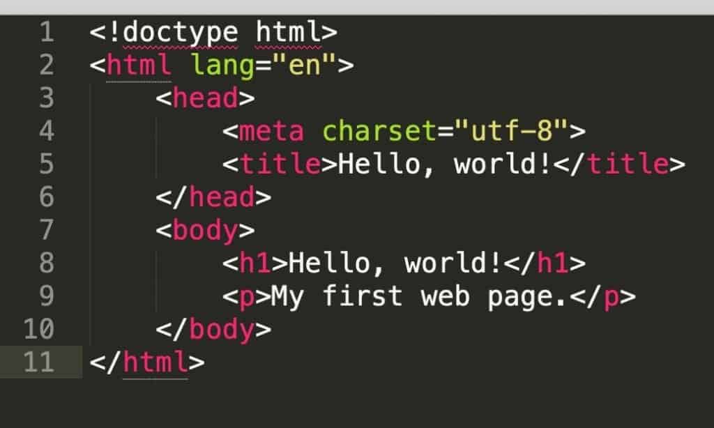
Here’s the simplest HTML document structure:
<!doctype html>
<html lang="en">
  <head>
    <meta charset="utf-8">
    <title>Hello, world!</title>
  </head>
  <body>
    <h1>Hello, world!</h1>
    <p>My first web page.</p>
  </body>
</html>
You can take the code above, copy and paste it to a new file, save the document as index.html, and it’s going to be a perfectly valid HTML page.
Let’s explain the individual parts of this code:
<!doctype html>– the initial declaration of the document; tells the browser this is an HTML5 page<html lang="en">– another declaration; says that what’s to come next is an HTML document written in English<head>– marks the start of the head section; the head section is where all the basic parameters of the page go; most of those are not going to be shown on the screen; they just define what’s going on under the hood<meta charset="utf-8">– defines what character set is used to write the document; no need to spend too much time on this; just use this declaration as is<title>Hello, world!</title>– the title of the page; this is what people will see in the title bar of their browsers, e.g.:
<body>– marks the start of the body section; this is where all the content of the page goes; it’s the main part of an HTML document; let us emphasize this, this section is where you’re going to be including all the content that’s meant to appear on the page<h1>Hello, world!</h1>– the main header on the page<p>My first web page.</p>– a simple paragraph of text</html>– the closing tag of the whole HTML document
An important note here. Working on an HTML file in a basic text app or a complex text processor like MS Word is not a good experience. To make things easy on yourself, install a code editor. We recommend Visual Studio Code (VS Code) – it’s free, works on Mac, PC, and Linux, and is by far the most popular code editor today. It color-codes your HTML syntax, offers auto-completion, and has thousands of helpful extensions (like the Live Server extension we mentioned earlier).
Another solid option is Sublime Text, which is lightweight and fast. You can also check out our full list of the best HTML editors.
Why is a code editor better than a plain text app? Among other things, it will colorize the syntax of an HTML file. Meaning, it’ll visually distinguish your HTML tags from text content, tag parameters, and other values. Basically, it’ll all become readable. Here’s what our simple HTML structure looks like in a code editor:
Okay, back on topic. You can take that new index.html file of yours, copy it to where the main directory of your web server is (or open it with the Live Server extension in VS Code), and then see that page by navigating to it through a web browser. Don’t get too excited, though; this page will be rather ugly (see below).
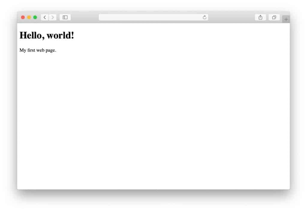
Okay, so the page is ugly, how to make it not so?
3. Get to Know CSS Selectors
Just like HTML has its tags, CSS has selectors.
Selectors describe how a given element should behave appearance-wise. Here’s an example of a CSS selector:
p {
    font-size: 18px;
}
This selector indicates that all HTML <p> tags within the document will have a font size of 18px.
However, a more practical way of using CSS selectors is not to restrict all tags of a given type to a certain styling, but rather create different “classes” and assign them to tags one by one.
For example, a class selector in CSS looks like this:
.normal-text {
    font-size: 18px;
}
Notice the dot (.) before the name of the class (normal-text). With the “normal-text” class defined, we can now assign that class to those specific HTML tags that we want to make 18px in size.
For example:
<p class="normal-text">This text is going to be 18px.</p>
Let’s take one more minute to explain all the elements of that piece of CSS code above:
.normal-text– class definition; everything after the name of the class and between the opening and closing brackets{}defines what the elements assigned to this class will look likefont-size– an example CSS property18px– a value assigned to the property
There’s also the ID selector, which targets one unique element. ID selectors use a hash sign (#) instead of a dot:
#main-title {
    font-size: 36px;
}
In HTML, you’d use it like this:
<h1 id="main-title">Welcome</h1>
The difference? A class can be reused on multiple elements, while an id should only be used once per page. For most styling work, you’ll use classes.
There’s a ton of CSS properties apart from the above font-size. Here’s the complete list if you’re curious.
4. Put Together a CSS Stylesheet
An HTML document is very structural – every element has its place, and the order of elements is crucial for the final construction and appearance of the web page in question. A CSS document is a lot less so.
CSS documents are often referred to as stylesheets. Basically, a CSS stylesheet is a list of all the class definitions that are being used in the corresponding HTML document. The order of the class definitions is not that crucial most of the time (at least for simple designs).
The way you put a CSS stylesheet together is by defining each class one by one, and then testing if the outcome in your page design is what you wanted.
This sounds like tedious work, and it is.
How to Reference CSS in HTML
Before going further, let’s quickly cover how you actually connect a CSS file to your HTML page. You do this by adding a <link> element inside the <head> section of your HTML document:
<head>
  <meta charset="utf-8">
  <title>My Page</title>
  <link rel="stylesheet" href="style.css">
</head>
The rel="stylesheet" attribute tells the browser you’re linking to a CSS file. The href attribute points to where that file is located. If your CSS file is inside a folder called css, the path would be href="css/style.css".
This is the standard way to apply CSS styling to your web pages. It keeps your HTML and CSS separate, which makes both easier to manage as your site grows.
Now, we’ll make things easier on you, and not force you to learn CSS design entirely by hand. Instead of teaching you everything from scratch, we’ll take a living organism and dissect its elements.
This is where a thing called Bootstrap comes into play.
5. Download/Install Bootstrap
Bootstrap is an open-source toolkit for creating a website with HTML and CSS.
In plain English, Bootstrap takes care of the basic structure of an HTML document and CSS stylesheet for you. It delivers a framework that makes sure that the main scaffolding of your web page is ready and optimized for further development. It also handles CSS resets and cross-browser consistency, so your page will look similar across Chrome, Firefox, Safari, Edge, and other browsers.
Basically, Bootstrap lets you not start from scratch, and instead go right into the fun part. With it, you don’t have to work on the often boring early stages of creating a website with HTML and CSS.
There are two paths you can take:
- Option (a): learn Bootstrap – go to the Bootstrap homepage, download the main Bootstrap package and start building on top of it.
- Option (b): take a shortcut – get a starter pack for Bootstrap with a good-looking design and a demo web page already built.
Option (a) might have some learning curve at the beginning, but it’s not in any way the worse way to approach creating a website with HTML and CSS. Once you master the core Bootstrap structure, it might be easier for you to build new pages and make them look exactly as you want them. The Bootstrap documentation is a great place to get started with this path.
We’re going to go with Option (b) for this guide. We’re doing this for a couple of reasons, chief of them:
Starting with a ready-made structure saves a lot of pain in trying to figure out the basic necessities of an HTML document. This lets you focus on the interesting stuff – like laying out content and making it look good.
In short, learning things this way will give you a better-looking result quicker, which we guess is what you want.
Note: Bootstrap 5 is the current major version. If you find older tutorials referencing Bootstrap 4 or Bootstrap 3, be aware that there are significant differences – most notably, Bootstrap 5 no longer requires jQuery.
6. Pick a Design
When you’re creating a website with HTML and CSS, you are free to use any Bootstrap template you like. They should all work similarly enough.
However, for this guide, we’re going to use one of the templates by Start Bootstrap. They have a nice selection of free templates that are optimized, work trouble-free, and are also very well designed.
The theme we’re going to use is called Creative. The final effect we’re going for will look something like this:

To begin with the Creative template, click on the Free Download button that’s on the right (on this page) and save the zip package to your desktop.
Unzip the package and move its contents to the main directory of your local web server or your web hosting account. If you’re using VS Code with the Live Server extension, simply open the unzipped folder in VS Code and click “Go Live” in the bottom status bar.
Now open that location through your web browser. You’ll see the stock version of the template:

It’s already quite good-looking, but now it’s time to learn how to use HTML and CSS to make it into exactly what you want it to be.
7. Customize Your Website With HTML and CSS
Let’s work on the homepage of the design first. This is going to show us how to replace the graphics, texts, and tune everything up in general.
We’ve talked about the head section of an HTML document briefly above. Let’s have a more in-depth look into it here.
When you open the index.html file of your Bootstrap site in your code editor, you’ll see a head section like this (we removed all the non-crucial things from this code for clarity *):
<head>

  <meta charset="utf-8">
  <meta name="viewport" content="width=device-width, initial-scale=1, shrink-to-fit=no">

  <title>Creative - Start Bootstrap Theme</title>

  <!-- Theme CSS - Includes Bootstrap -->
  <link href="css/styles.css" rel="stylesheet">

</head>
* Apart from the above, there may also be code to load Google Fonts, Bootstrap Icons or Font Awesome icons, and a lightbox module for the images displayed on the page.
Most of the declarations here we already know, but there are a couple of new ones:
- First off, everything between the
<!-- ... -->brackets is an HTML comment. It doesn’t show up on the final page. <meta name="viewport" content="width=device-width, initial-scale=1, shrink-to-fit=no">– this is a responsive design declaration. It tells mobile browsers to set the page width to the device’s screen width, ensuring your site looks good on phones and tablets.<link href="css/styles.css" rel="stylesheet">– this line loads the CSS stylesheet of the Creative template, which also includes Bootstrap’s default styles.
Now scroll down to the very bottom of the index.html file. You’ll see lines like the following right before the closing body tag:
<!-- Bootstrap core JS -->
<script src="https://cdn.jsdelivr.net/npm/bootstrap@5.2.3/dist/js/bootstrap.bundle.min.js"></script>

<!-- Core theme JS -->
<script src="js/scripts.js"></script>
These are responsible for loading JavaScript files that handle some of the more visual interactions of the design. For instance, when you click on a link in the top menu, you’ll be taken smoothly to a section on the same page – this is done via JavaScript. Notice that Bootstrap 5 no longer requires jQuery, so the setup is simpler than older versions. We don’t need to trouble ourselves understanding this code right now. Let’s leave this for another time.
Instead, let’s work on adding our own content to the page:
8. Add Content and Images
The first thing you’ll want to do is change the title of the page.
1. Change the Title
Find the title tag in the head section and replace the text between the tags to something of your own:
<title>My HTML Site</title>
2. Customize the Hero Section
The hero section is what we call this block:

It would be cool to have our own content inside of it. To modify this block, go back to your index.html file and find this section:
<!-- Masthead -->
<header class="masthead">
  <div class="container px-4 px-lg-5 h-100">
    <div class="row gx-4 gx-lg-5 h-100 align-items-center justify-content-center text-center">
      <div class="col-lg-8 align-self-end">
        <h1 class="text-white font-weight-bold">...</h1>
        <hr class="divider" />
      </div>
      <div class="col-lg-8 align-self-baseline">
        <p class="text-white-75 mb-5">...</p>
        <a class="btn btn-primary btn-xl" href="#about">Find Out More</a>
      </div>
    </div>
  </div>
</header>
This whole block of code controls what’s in the hero section.
There are some new tags here:
<header>– this is a semantic tag defining that this whole section is the header of the page; this tag has siblings in the form of the<section>tag and<footer>tag (we covered these in the semantic elements section earlier)<div>– is a general-purpose HTML tag that indicates what follows is a separate section (aka division) in the HTML document; using it makes it easier to group and style individual blocks on the page
You’ll also notice that some of the other tags (which we already know) look to be a bit more complex, with multiple CSS classes assigned to them. For example:
<h1 class="text-white font-weight-bold">...</h1>
The classes assigned to the <h1> tag here are text-white font-weight-bold.
These classes have been created by Bootstrap and by the Creative theme’s developer. The good news is that you too can use them freely when creating a website with HTML and CSS.
Quite frankly, you can customize any tag you add to your page’s structure by assigning any number of classes to it.
If you want to see the complete list of the classes available, you can open the main CSS file that’s in the css subdirectory of the Creative theme.
Getting a grasp of all these classes can seem intimidating at first, but it’s actually way easier than it looks.
For example, one of the classes assigned to some of the paragraphs in our index.html file is font-weight-light. When you jump into the CSS file and search (Ctrl+F or Cmd+F) for that class name, you’ll see that it simply sets the font-weight parameter like so:
.font-weight-light {
  font-weight: 300;
}
Modifying the default texts in the index.html file is very simple. Just find the tag that you want to edit and change what’s between the opening and closing tags.
For example, to change the main headline, just change this:
<h1 class="text-white font-weight-bold">Your Favorite ...</h1>
To something like the following:
<h1 class="text-white font-weight-bold">Admire my HTML website!</h1>
You can do the same to all the paragraphs and other tags on the page.
What’s important is that you can also add new paragraphs freely. For example, we can take the paragraph that’s already on the page, make a copy of it and paste it right below the original paragraph; like so:
<p class="text-white-75 font-weight-light">Start Bootstrap can ...</p>
<p class="text-white-75 font-weight-light">Paragraph 2</p>
Now, with the texts taken care of, let’s replace the image that’s in the background.
This is a bit more complicated to do since it requires us to go into the CSS stylesheet file and do the modification there. As you can see in the HTML code of the Masthead section, no tag would indicate including an image to the page in any way. This is all done via CSS.
When you take another look at the whole block of code handling the Masthead section, you’ll see that it’s assigned to a class called masthead. This line of code handles the class assignment:
<header class="masthead">
The masthead class is the one that puts an image in the background of the whole block.
Let’s open the CSS file and look for the “masthead” class:
header.masthead {
  padding-top: 10rem;
  padding-bottom: calc(10rem - 72px);
  background: linear-gradient(to bottom, rgba(92, 77, 66, 0.8) 0%, rgba(92, 77, 66, 0.8) 100%), url("../assets/img/bg-masthead.jpg");
  background-position: center;
  background-repeat: no-repeat;
  background-attachment: scroll;
  background-size: cover;
}
This code does all kinds of fancy things to our image (like adding an overlay, shading, etc.), but the important part is this: url("../assets/img/bg-masthead.jpg"). This is the line that indicates where to find the background image.
To change this background image, take any image of your own, copy it to the assets/img subdirectory and then copy and paste its name in place of the original bg-masthead.jpg file. In short, change this: url("../assets/img/bg-masthead.jpg") to this: url("../assets/img/YOURFILE.jpg").
3. Customize the Other Blocks on the Page
As you go through the index.html file, you’ll notice that there’s a lot of different sections already on the page. We have a section for the navigation, an about block, some services, a portfolio, a call to action, a contact block, and a footer.
While there’s different content in all these sections, the sections themselves are similar in structure. They all have roughly the same set of HTML tags – just different CSS classes assigned to them.
The best way to modify the page to fit your needs is to go through the blocks one by one and experiment by changing things around.
Apart from modifying the texts, you can also move whole sections around (the parts between the <section> tags). Granted, you do have to do that by hand (by cutting and then pasting elements into place), it still is straightforward to do.
4. Test and Validate Your Code
As you make changes, it’s a good idea to regularly test your work. Here are three habits that will save you time and frustration:
- Preview often. After each meaningful change, save the file and refresh your browser. If you’re using VS Code with Live Server, the page updates automatically.
- Use browser DevTools. Right-click any element on your page and select “Inspect” to see the HTML and CSS behind it. This is incredibly useful for debugging – you can even test CSS changes in real time before editing your actual files.
- Validate your code. The W3C provides free validators for both HTML and CSS. Paste your code in, and they’ll flag any errors or warnings. This helps ensure your pages display consistently across different browsers.
With that being said, there are two quite basic modifications that we haven’t talked about yet. Let’s cover these next:
9. Fine-Tune Colors and Fonts
Changing colors or fonts is very easy to do in HTML and CSS. The simplest thing you can do is assign some in-line styling to an HTML tag. For example:
<p style="color: #FF0000;">Red text</p>
In HTML, colors are represented by their hex values; “#FF0000” is red. Here’s a table of all the other standard colors.
A better way to assign colors is to do it via the CSS stylesheet. For example, to get the same effect as the code above, we could put this in our CSS stylesheet:
p.red {
color: #FF0000;
}
And then use the following piece of HTML code in the main document:
<p class="red">Red text</p>
That second method is basically how things are done in Bootstrap.
To change the color of any text on the page, first find the tag responsible for styling that text, and then go into the stylesheet and modify the corresponding class, or create a new class.
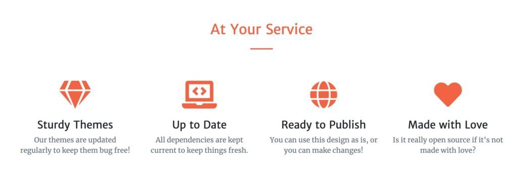
Here’s an example; say you want to change the color of the header saying “At Your Service.” Currently, it’s black, and this is the code handling it:
<h2 class="text-center">At Your Service</h2>
To change its color, the best way is to create a new class called, say, .text-orange and set the color value there, like so:
.text-orange {
  color: #f4623a !important;
}
* The !important will make sure that this color setting will overwrite any other color setting that came before it.
Now, we can go back to our header, and change its code to:
<h2 class="text-center text-orange">At Your Service</h2>
With these changes, the header will now be orange:
To change the font and its size, you can do something very similar. But first, an example of what a font definition block looks like in CSS:
.SOMECLASS {
font-family: "Merriweather", Roboto, sans-serif;
font-size: 18px;
}
- load fonts Merriweather, Roboto, and a system-default sans-serif font (read this to learn about web-safe fonts)
- set the font size to 18px
This sort of definition can be placed into any CSS class, just like the color definition. Actually, font and color definitions are often found in the same class declarations.
Going back to our previous example, to change the font size for that header that says “At Your Service,” we could first create a class like this:
.text-xxl {
  font-size: 50px;
}
And then assign this class to the header:
<h2 class="text-center text-orange text-xxl">At Your Service</h2>
When changing the colors or fonts in your Bootstrap-made template, first look through the CSS stylesheet for classes that might already provide you with alternative sizes or colors. Bootstrap includes a rich set of utility classes for colors, spacing, typography, and more – use those where available before creating your own.
10. Create Additional Pages
Now that you have the homepage customized, it’s time to start working on some additional pages and then link them to the homepage.
When creating a website with HTML and CSS, you can build any number of sub-pages and then link them all together.
Here are some of the common pages that most websites need:
- about page
- contact
- portfolio
- products/services
- team
- policies (privacy policy, terms, etc.)
1. Start With the Layout
When building a new web page, the first decision you have to make is what you want the layout to be.
When creating a website with HTML and CSS, nothing is stopping you from crafting whatever layout you want. The only difficulty is actually putting it together.
HTML and CSS can be tough to deal with when starting from a blank screen, so we’re going to use Bootstrap here as well. First, we’re going to show you some principles of crafting a layout and then demonstrate how to do it with Bootstrap.
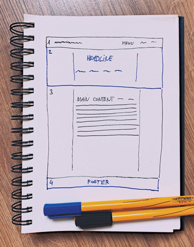
The way you can think of your web page’s layout is to consider it a sequence of individual blocks – one on top of another. Something like this (notice the four distinct blocks):
The great thing about Bootstrap is that it handles the basic layout principles and appearance details for you so that you can just focus on putting those blocks in the right places.
In this section of the guide, we’re going to create a new “about” page.
To begin, we’ll create just a very basic project of the layout. Something like the one above.
- there’s a navigation menu at the top,
- a full-width headline block below the menu,
- the main content section in the middle, boxed in the center of the screen (not full-width),
- and a footer.
Now let’s build this layout in HTML.
2. Build a New Page
The easiest way to start working on a new page is to duplicate an existing page and use it as a template. That’s what we’re going to do.
Create a copy of the index.html file and rename it about.html.
Just to make the pages easier to distinguish at this early stage, edit the new about.html file and change what’s in the <title> tag. For example, <title>About Me</title>.
Now let’s go through the file line by line and decide what we’ll leave and what we’ll remove:
- The navigation menu (below
<!-- Navigation -->). You probably want to keep this section intact, just to make the navigation experience uniform on all pages. - The main hero section (below
<!-- Masthead -->). This one we won’t need according to our layout project. You can go ahead and erase the whole section. - The about section (below
<!-- About Section -->). We’re going to reuse this section as our main headline block. - The services section, portfolio section, call to action section, and contact section (everything between
<!-- Services Section -->and<!-- Footer -->). We don’t need these sections at all. You can go ahead and erase them. - The footer section and everything below it (below
<!-- Footer -->). This we’ll need to keep.
This makes our current code quite simple. It basically is just this:
<!DOCTYPE html>
<html lang="en">

<head>

<!-- all head definitions ... removed for clarity -->

</head>

<body id="page-top">

  <!-- Navigation -->
  <!-- actual navigation tags removed for clarity -->

  <!-- About Section -->
  <!-- ... -->

  <!-- Footer -->
  <!-- ... -->

  <!-- Bootstrap script imports -->
  <!-- ... -->

</body>

</html>
The thing that we’re missing here is the main content section. To build it, we’re going to reuse the about section.
Go ahead and make a copy of the about section. This one:
<!-- About Section -->
<section class="page-section bg-primary" id="about">
  <div class="container px-4 px-lg-5">
    <div class="row gx-4 gx-lg-5 justify-content-center">
      <div class="col-lg-8 text-center">
        <h2 class="text-white mt-0">...</h2>
        <hr class="divider divider-light" />
        <p class="text-white-75 mb-4">...</p>
      </div>
    </div>
  </div>
</section>
Now change the first two lines to this:
<!-- Main Content Section -->
<section class="page-section" id="main-content">
Since we don’t need the <h2> header there and the <hr> element, let’s just remove them. The only thing left inside this whole block is going to be a paragraph of text. Like so:
<!-- Main Content Section -->
<section class="page-section" id="main-content">
  <div class="container px-4 px-lg-5">
    <div class="row gx-4 gx-lg-5 justify-content-center">
      <div class="col-lg-8 text-center">
        <p>A paragraph of text.</p>
      </div>
    </div>
  </div>
</section>
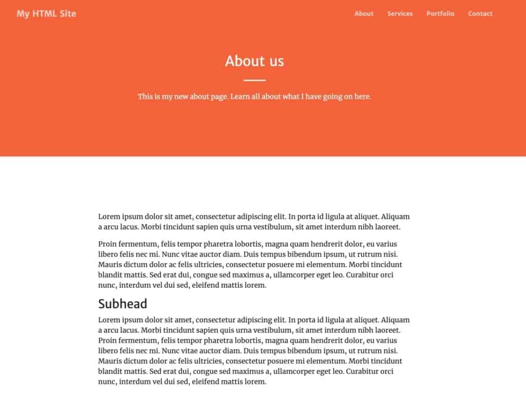
When you save the file and navigate to it via your browser, you’ll see that you basically have two very similar blocks one below the other. Notice we already removed the bg-primary class from the main content section so it gets a white background instead of the colored one:
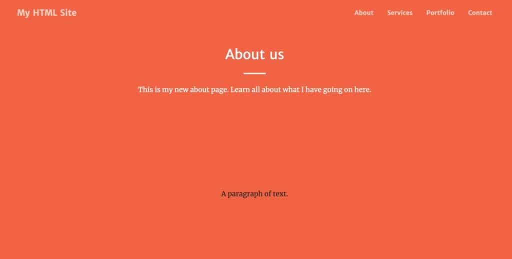
That gives us a clean separation between the headline block and the content area:
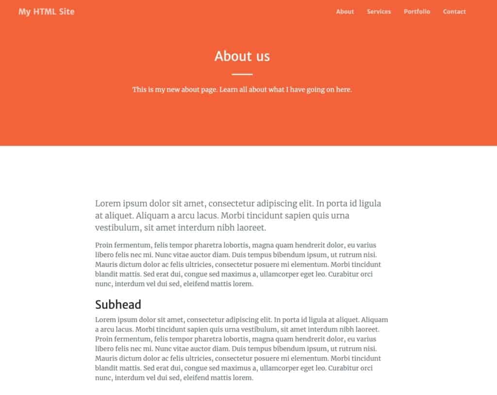
Let’s add some dummy paragraphs to the page to populate it some more, plus maybe a sub-head:
<!-- Main Content Section -->
<section class="page-section" id="main-content">
  <div class="container px-4 px-lg-5">
    <div class="row gx-4 gx-lg-5 justify-content-center">
      <div class="col-lg-8 text-center">

        <p>Lorem ipsum dolor sit amet, consectetur adipiscing elit...</p>

        <p>Proin fermentum, felis tempor pharetra lobortis, magna quam hendrerit dolor...</p>

        <h3>Subhead</h3>

        <p>Lorem ipsum dolor sit amet, consectetur adipiscing elit...</p>

      </div>
    </div>
  </div>
</section>
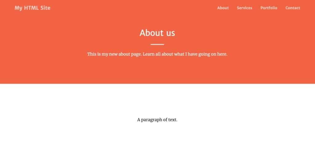
Here’s what this looks like on the page:
If you don’t like the text to be centered then just remove the text-center class from one of the <div> tags.
If you want to put some more flair on these blocks of text, you can create new CSS classes (like before) and assign them to the paragraphs in the block. Or, you can have a peek into the current stylesheet and see what classes are already there for this purpose. Here are the ones we assigned to the <p> and <h3> tags:
<p class="lead text-muted">Lorem ipsum dolor sit amet...</p>

<p class="text-muted">Proin fermentum, felis tempor pharetra lobortis, magna quam hendrerit dolor...</p>

<h3 class="h3 mt-4">Subhead</h3>
And here’s the effect:
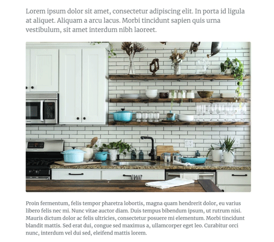
One more thing we’re going to do here is add an image somewhere on the page.
Here’s what an example image tag in HTML looks like:
<img src="image.jpg" alt="description of the image">
Fairly simple, right? The src parameter points to the image file, and the alt parameter provides a text description (important for accessibility and SEO). To keep things nicely organized, you can put your image in the assets/img directory. In such a case, the image tag will be:
<img src="assets/img/image.jpg" alt="description of the image">
That being said, the image tag in this particular configuration is fairly limited. To make it a bit more refined, let’s assign some Bootstrap classes to it. Particularly:
<img src="assets/img/image.jpg" alt="description of the image" class="rounded img-fluid">
These two classes will give your image rounded corners and will also make sure that the size of the image doesn’t exceed the size of the block where it sits (making it responsive).
You can now add a tag like this somewhere in the main content section of your about page. For example, here:
<p class="lead text-muted">Lorem ipsum dolor sit amet...</p>

<img src="assets/img/image.jpg" alt="description of the image" class="rounded img-fluid">

<p class="text-muted">Proin fermentum, felis tempor pharetra lobortis, magna quam hendrerit dolor...</p>

<h3 class="h3 mt-4">Subhead</h3>
And here’s the final effect on the page:
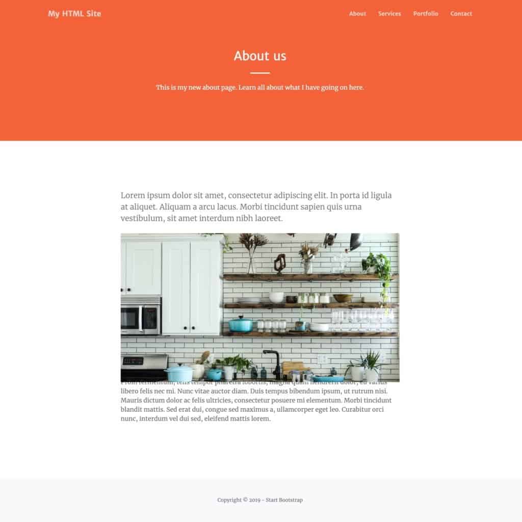
Here’s our about page in all its glory:
3. Link to the New Page
With the new page done, let’s now link it from the homepage (the index.html file). Naturally, the best place to add this link is in the navigation menu (below <!-- Navigation -->).
In particular, look for this line:
<a class="nav-link" href="#about">About</a>
We’re going to change it to this:
<a class="nav-link" href="about.html">About</a>
This is something we haven’t talked about yet, but the <a> tag is a link tag in HTML. Using it, you can link to any web page by providing the address of that page in the href parameter. The text of the link – the clickable part of the link – will be the text between the opening and closing <a></a> tags.
When you refresh the homepage now, you’ll see your new link pointing to the about page.
Frequently Asked Questions
Do I need to learn HTML and CSS to build a website?
Not necessarily. Tools like WordPress and website builders let you create a website without coding. However, learning HTML and CSS gives you full control over your site’s design and helps you troubleshoot issues. Even a basic understanding is valuable.
What’s the difference between HTML and CSS?
HTML defines the structure and content of a web page (headings, paragraphs, images, links). CSS defines the appearance (colors, fonts, spacing, layout). They work together but should be kept in separate files.
Is Bootstrap necessary for building a website with HTML and CSS?
No, Bootstrap is optional. You can write all your HTML and CSS from scratch. However, Bootstrap saves significant time by providing a responsive grid system, pre-built components, and consistent styling across browsers. It’s especially helpful for beginners who want a professional-looking result quickly.
What code editor should I use?
We recommend Visual Studio Code (VS Code). It’s free, works on all operating systems, and has excellent features for HTML and CSS development including syntax highlighting, auto-completion, and the Live Server extension for instant previews. Sublime Text is another solid choice. See our full list of HTML editors.
How do I make my HTML website responsive (mobile-friendly)?
The easiest way is to use Bootstrap, which includes a responsive grid system that automatically adjusts your layout for different screen sizes. If you’re coding from scratch, you’ll need to use CSS media queries and flexible layouts (like Flexbox or CSS Grid). Always include the viewport meta tag in your <head> section: <meta name="viewport" content="width=device-width, initial-scale=1">.
Further Reading
At this stage, you’ve basically built yourself a simple website consisting of two pages – a homepage and an about page.
What you should do now is rinse and repeat by creating new pages, tuning them up, adding content to them, and then linking everything from the navigation menu.
Other things worth doing as you’re going through these steps is further learning HTML and CSS principles, going through the checklist, and also learning Bootstrap and its structures and classes. Some resources for that:
Mastering Bootstrap is highly likely the best path currently available to building optimized and beautiful websites with HTML and CSS.
If you have any questions about creating a website with HTML and CSS, don’t hesitate to submit them in the comments.